

Kerning
The spacing between letters sometimes doesn’t look quite right to the eye. Kerning is the art of adjusting the spacing between individual letters in order to improve visual appeal.
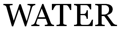
Certain pairs of letters can be especially problematic. For example, consider the word WATER written in uppercase letters. If you look closely, you will see a noticeable gap in the pair WA, while the letters TE are nearly touching.

Contents
- Kerning Example
- Does it Matter?
- Kerning in Word
1. Kerning Example
Inconsistent spacing between letters arises from the shape of the letters. The W is slanting toward the A, which slants away from the W. The process of typing generally creates each letter in its own little block. The W and A blocks force a minimum separation, unless kerning is applied. See the image below.

Through kerning, the space between the W and A can be decreased, as in the following picture.
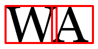
Note that the font above (Georgia) has a serif (that small line at the ends of each letter). When the WA pair is kerned, the space between the letters is decreased such that the end of each letter without the serif matches up with the end of the serif of the other letter. That is, look at the two red lines in the middle of the picture above and how they line up with the two letters.
See how kerning the WA pair improves the word WATER:

But it still isn’t perfect: It looks like there is too much space between AT, while TE seems crowded. These are adjustable, too:
Does it look right to your eye now? It’s better, but for perfectionists, there is still a little room to work with.
2. Does it Matter?
The eye can tell when the font isn’t kerned properly. Even if you know nothing about kerning, if the letter-spacing is off, your eye realizes that something isn’t quite right. You may not know what it is if you’re not knowledgeable about typography, yet you know that something seems funny.
Kerning is most important on the book cover. The cover makes the first impression. If the shopper is thinking, “Something seems funny here,” this factors into that first impression.
The text inside the book is important, too, but the font on the cover is usually quite large (so that it can be read in the thumbnail image), such that improper kerning tends to stand out more.
When the interior is properly kerned, the design of the book offers a better reading experience and may even be easier on the eyes.
However, the more people read electronic text without kerning (although kerning is performed on some web-based text, for example), the more they are accustomed to not reading kerned text.
A book may have a hundred thousand words, whereas the cover only has a few. Manually kerning every word carefully in the interior file would be a tedious process. If kerning is important, using a desktop publisher with automatic kerning is highly convenient. When kerning manually, searching for letter pairs that are the worst offenders will help make the task more efficient.
There is a danger. Expert typesetters know what they are doing. It is possible for a novice to do more harm than good, with a result that’s worse than no kerning at all.
Here are my suggestions:
- You should examine your title, subtitle, and author name on your cover. If there is significant inconsistency among letter spacing, try to resolve this. Get feedback from others about how the result looks compared to the original.
- If you don’t have a program with automatic kerning, either don’t apply kerning or just look for the most notorious letter pairs, such as Te and ry. Note that a letter and punctuation mark may warrant kerning, as in T followed by a period or colon.
3. Kerning in Word
I will describe how to apply kerning in Microsoft Word. I will do this specifically for Microsoft Word 2010, which is very similar to 2007 and 2013.
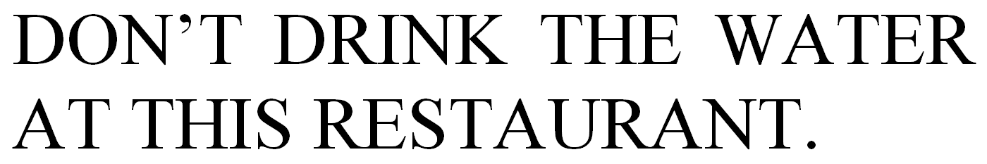
Consider the following sentence (written in Times New Roman). Kerning is off, which is the default in Microsoft Word.
In the sentence below, automatic kerning has been turned on:
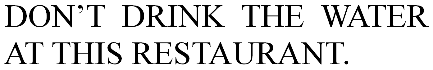 Notice that the word WATER looks much better. Automatic kerning is more efficient than working with one pair of letters at a time. Another significant improvement is that the period moved closer to the T.
This is actually automatic kerning (which involves pairs of letters) and not manual tracking (which lets you manually adjust the spacing between letters, not necessarily letter pairs). Word has both options, but first I’ll explain how to adjust the manual kerning.
Here is how to apply kerning in Microsoft Word 2007 and up:
- If the text has already been typed, highlight the text (use Select All at the right of the Home tab if you wish to highlight the entire document).
- Click the funny icon in the bottom right corner of the Font group on the Home tab (this is illustrated below).
- Select the Advanced tab (the default is the Font tab).
- Check the box next to Kerning for Fonts. You can specify a minimum font size.
- If you want to get technical, for Open Type fonts you can play with the dropdown boxes at the bottom of the pop-up window.


Should you prefer to apply kerning manually to specific letter pairs, you can effectively do this through the manual tracking option (which technically is different from kerning, but if you apply it to the first letter of a single pair of letters, it effectively serves the function), highlight a single letter, then follow the instructions above, but instead of checking the box for Kerning, set the Spacing to Expanded or Condensed. (When you apply Spacing to an entire word, it’s called tracking, but when you expand or condense the space between a single pair of letters only, it’s called kerning.) Tracking can come in handy when you need to adjust the number of words on a specific line, e.g. to avoid a widow or render justification with smaller gaps between words.
If Microsoft Word doesn’t support automatic kerning for a font that you are using, you can still use the manual method.
Another option is scaling, but beware that Word’s scaling option (set by adjusting the percentage) in some cases also affects the line spacing (or the space between lines). I recommend trying automatic kerning first, then attempting manual tracking if that doesn’t satisfy your needs, and saving scaling as a last recourse (and check the vertical spacing carefully when you adjust the scaling, not just with what you see on the screen, but by printing it out, too).
Chris McMullen, Author of A Detailed Guide to Self-Publishing with Amazon and Other Online Booksellers
- Volume 1 on formatting and publishing
- Volume 2 on marketability and marketing
