Optimizing Amazon’s Free Kindle Textbook Creator Publishing Tool

KTC Trig

KINDLE TEXTBOOK CREATOR

Amazon’s new free tool, the Kindle Textbook Creator, is very convenient for e-textbooks and other e-books with rich formatting and complex layouts.

(Illustrated children’s e-books work better with another free tool, the Kindle Kids’ Book Creator, and comic books work best with the free Kindle Comic Creator. However, books that primarily consist of paragraphs of text, such as novels, function best as a simple conversion following Amazon’s free guide, Building Your Book for Kindle.)

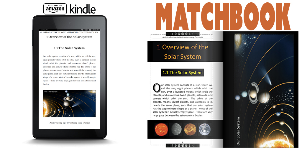
I recently published my trigonometry book, Learn or Review Trigonometry: Essential Skills, using the Kindle Textbook Creator.

I did more than simply upload my print PDF to the Kindle Textbook Creator. I spent a little time modifying my file in order to optimize it for the Kindle Textbook Creator. Later in this article, I will show you exactly how I did this.

If you would like to see an example of an e-textbook created using the Kindle Textbook Creator, feel free to check out my trigonometry e-book and see how it looks: https://amzn.com/B0106X7NL4. Note that the Look Inside shows the paperback edition. (Update: That may change soon, as KTC published books are beginning to generate automatic Look Insides.) If you want to explore the Kindle e-textbook, download the free sample to a device, or download the free sample with one of the Kindle apps (like Kindle for PC); you’ll get the best experience with a Kindle Fire HD.

But remember, your book won’t look quite the same unless you take similar steps to optimize your file before publishing.

PROS AND CONS

Here are the benefits of using the Kindle Textbook Creator to format an e-textbook:

  • The strongest benefit is convenience. You put a PDF in and very quickly get a Kindle-friendly e-book out. (Unlike conventional Kindle e-books, PDF actually converts very well in this context.) The alternative, converting a complex layout with rich formatting into a reflowable e-book, is very tedious and time-consuming. Many e-textbooks don’t sell frequently enough to warrant weeks of work on the e-book conversion (or paying a hefty fee to have the conversion done for you).
  • The output is amazingly good for starting from a PDF file (usually, PDF is the worst file to begin with to create an e-book, but this is an exception). The structure of each page is preserved, which preserves the complex design and layout of most textbooks, yet it’s much better than just converting every page to a picture. The device will recognize the text on each page, which would never happen in an image. In my experience, images can come out nice and sharp, much better than converting each page to an image (but you need good quality to begin with).
  • Students can highlight text, make notes, and use similar features that are very handy with e-textbooks. For example, if you highlight a word on the screen, the device will pull up windows for a dictionary, Wikipedia, and even translation. There is even the potential for flashcards.
  • The e-book will support pinch-and-zoom. This is a necessity when text or images wouldn’t be readable on the screen, which is possible, since the screen size may be much smaller than the page size of the printed textbook. Pinch-and-zoom is what makes the Kindle Textbook Creator viable.
  • You can add navigation to your PDF file so that Kindle devices will have a working table of contents on the device (but not a clickable table of contents in the e-textbook).
  • Audio and video clips can be added into the e-textbook using the Kindle Textbook Creator. That’s pretty cool.
  • A new feature recently added is an image pop-up. Most of your images you probably want to show on the page rather than to pop-up, but if for some reason you want to insert an image file and have the image pop-up, that is possible now.

Not everything is ideal, of course:

  • E-textbooks created using the Kindle Textbook Creator are only supported on limited devices:
    • Kindle Fire HD 8.9″
    • Kindle Fire HD
    • iPad
    • Android Tablet
    • PC/laptop using Kindle for PC
    • Mac using Kindle for Mac
    • Smartphones: maybe (Kindle for iPhone and Kindle for Android Phone are listed on my product page, but these options were removed from the Kindle Textbook Creator’s preview, so they may not be available for all e-textbooks made this way)
    • First and second generation Kindle Fire: maybe (these formats are listed on my product page, but again, they don’t show up in the preview)
    • The Kindle Textbook Creator does not support e-Ink devices, such as Kindle DX and Paperwhite
  • Audio and video features are not yet fully supported. Presently, they are only supported on third-generation Kindle Fire tablets.
  • No Look Inside is available for e-textbooks created using the Kindle Textbook Creator. Update: As of December, 2015, KTC published books are beginning to generate automatic Look Insides. I published a KTC book on December 18, and on December 19 it had its own Look Inside on Amazon’s website (FYI: there is no print edition, and it has no ISBN). The Look Inside is an important selling feature. Customers can download a free sample to supported devices, though it’s not nearly as convenient as a Look Inside. The remainder of this paragraph may now be irrelevant. [However, if you have a print edition of your textbook (you can make one using CreateSpace), you can get the print and Kindle editions linked, in which case customers will see the Look Inside of the print edition. (This may not be automatic. You might have to place a request through the Contact Us feature of KDP. It can also take weeks for this to be activated. Be very clear in your request. If they think you’re asking for a Look Inside, they will tell you that e-books made with the Kindle Textbook Creator don’t get a Look Inside. What you want is instead for the Look Inside of a linked print edition to show for your Kindle e-textbook on Amazon.)]
  • If the text is so small that customers must pinch-and-zoom to read, this can become quite tedious if customers must pinch-and-zoom to read every page of the e-textbook. Some textbooks are very expensive in print, so substantial savings with an e-textbook may help to offset possible inconvenience. However, if the text is somewhat small, it’s not too hard to enlarge the text. I’ve done this and will show you how later in this article.
  • Kindle’s page numbering may differ from your page numbering, so if your pages have numbers or if you include a table of contents with page numbers, this can be confusing. However, it’s not too hard to either remove your page numbers all together (as you don’t really need them in an e-book) or at least change your page numbering to match Kindle’s page number assignment in the navigation. I go into further detail later in this article.
  • File size is a possible issue, but it depends. I just published a 127-page trig e-textbook with about 60 images, and file size wasn’t an issue for me. My PDF file was 3 MB, the Kindle Textbook Creator made a 6 MB file, but all that really matters is that the final converted .mobi file size was back down to 3 MB. (It’s common for the final .mobi file size that you find on page 2 of the publishing process at KDP to be significantly smaller than the .kpf file that you upload to KDP. When you see the .kpf file size, don’t worry about it: Wait until you reach the pricing info page to find out what the file size really is.) If you have a very large .mobi file size, the file size will cut into your delivery cost if you choose a 70% royalty (for an extremely large file size, you might see if the 35% royalty is actually better since that involves no delivery fee); the delivery cost is 15 cents per MB (subtracted from your 70% royalty; the customer doesn’t pay a delivery fee) in the US. You can upload a file as large as 650 MB. I’ve never had a file larger than 50 MB; I suppose if you add a bunch of video clips that generous limit will come into play (and that would be a hefty delivery fee, definitely needing the 35% royalty option). It’s not just the delivery fee that matters. At some point, it takes significantly longer for customers to download and takes up more room on the customer’s device. A few MB aren’t a problem. 50 MB is rather significant. Somewhere in between, maybe around 20 MB, is where you might start to have concerns, but if your book provides good features, like awesome images or video clips, the content may make it worthwhile.

OPTIMIZING TEXT FOR THE KINDLE TEXTBOOK CREATOR

With regard to text, I changed a few things (see the list at the end of this section for more details):

  • larger font size for easier reading without having to pinch-and-zoom to read
  • removing the gutter (i.e. it looks funny to have a larger inside margin in the e-book)
  • narrower margins to maximize the use of the space on a limited screen size
  • narrower page size to more closely match the target e-reader device
  • use of color to help key terms stand out better

Many textbooks have 8.5″ x 11″ pages with a size 12 font. That’s great for the printed page, but just imagine if that page gets compressed onto a smaller screen. In that case, the text would be unreadable on many devices except when the customer uses pinch-and-zoom. If the customer must pinch-and-zoom (and then scroll around to read left to right, top to bottom) to read every page in a long e-textbook, that will quickly become tedious.

For many textbooks, it wouldn’t be too much work to reformat the file with a larger font. It depends in part on the complexity of the design and in part on how much attention you like to put into typographic features like widow and orphan control. (A nice thing about using the Kindle Textbook Creator is that you can use the same font from your print book—though you should check on the font licensing, which may be more strict for an e-book than it is for print books—and you can preserve typographic features like kerning and hyphenation. However, it wouldn’t be suitable for a book that mostly consists of text, like a novel.)

I originally published two print editions. One of the print editions has large print. The cool thing about increasing the font size and making a second version of your print file is that you can use it (A) for a large print paperback edition and (B) optimizing the text for the Kindle Textbook Creator.

However, I still made some changes to the file from my large print paperback edition to my Kindle Textbook Creator edition. I’ll get to that shortly.

My original file was a Word document (.docx). I first formatted this for a 6″ x 9″ paperback, and converted this to PDF.

Next, I saved my Word file with a new filename, increased the font size for the large print edition, went page by page through the file to improve the formatting (since the layout changed significantly after increasing the font size—I also made the large print edition 8.5″ x 11″, which is very transparency and document camera friendly on top of having larger print), and converted this to PDF for the large print paperback.

Finally, I saved my Word file with a third filename, and reformatted this for the Kindle Textbook Creator edition. Here is what I did to optimize the text:

  • I made the font size very large. I used a font size of 24-pt for the body text. This may have been overkill: Size 16 or 18 pt may work well enough, depending on the font style. Try out a test page, convert the test page to PDF, upload that to the Kindle Textbook Creator, and preview how it looks on different screens; and repeat as needed until you’re satisfied with how the size looks. If the font size is readable across most devices, customers won’t have to pinch-and-zoom on every page just to read your e-book.
  • If you used Word’s built-in styles (in 2007 and up for Windows, you find these on the top right half of the Home ribbon), changing font size is very simple. I simply changed the body text styles to 24 pt and those sections updated automatically, then I changed headings to size 36 pt, and so on. Presto, Change-o!
  • I also changed the page size from 8.5″ x 11″ to 7″ x 11. Most print textbooks are 8.5″ x 11″, but that’s much squarer than most e-readers. The result will be large gaps at the top and bottom of the screen on a Kindle device. 7″ x 11″ is close to the aspect ratio of the Kindle Fire, but may be a little too narrow: It leaves small gaps at the right and left sides on an iPad. Obviously, you can’t get the aspect ratio to match every device, since e-readers have a variety of aspect ratios. 6″ x 9″ is common among trade paperbacks and probably comes out right without any adjustment. What’s your target device? You could either make the page size match your target aspect ratio, or you can compromise and use an aspect ratio that’s somewhere in the middle of what e-readers have to offer.
    • Kindle Fire HD’s have an aspect ratio of 5:8. Starting with an 8.5″ x 11″ book, if you change your page size to 6.875″ x 11″, it will match the Kindle Fire HD.
    • iPads have an aspect ratio of 3:4. Starting with an 8.5″ x 11″ book, a page size of 8.25″ x 11″ matches the iPad. It’s probably not worth the hassle if your main target is iPad, but 8.5″ x 11″ will look very square on the skinny Kindle Fire.
    • Somewhere in between, like 7.5″ x 11″ may offer a good compromise.
    • Another option is to find a Mac, format a separate file for iBooks designed around the iPad, and publish a Kindle edition designed for the Kindle Fire HD. (Note that iPad users do buy Kindle e-books and use the Kindle for iPad app, though if you use a Mac to format an iBook, this gives you some nice formatting options for iBooks.)
  • I made the margins narrower for the e-textbook than I did for the print editions. Wider margins come in handy for making notes in a print book; that margin is pretty useless in an e-book (where you can add notes without having to use the margins). I left a small margin for aesthetic reasons.
  • Most print books have a larger inside margin than outside margin, sometimes referred to as a gutter (though Word lets you make a wider inside margin, add a gutter, or both). This looks funny in an e-book. If your print book is like this, you can adjust your inside margin to match the outside margin (with the gutter field in Word set to zero).
  • In the print edition, I used boldface to help key terms stand out. In the Kindle edition, I used color text to make them stand out even more.
  • I removed the page headers from the Kindle edition. I could have kept them: Sometimes it’s nice to look at the top of the page to see what chapter you’re reading. But it would be silly to have the name of the book on odd-numbered pages and the chapter title on even-numbered pages in the e-book. If I had opted to keep the page headers, I would have made every page header show the chapter name (which really isn’t hard to change).
  • I plan to add video clips for a separate interactive edition at some point. Presently, it looks like video is only compatible with third-generation Kindle Fire devices, so I’ve saved my interactive edition for last since that narrows the audience significantly. On the other hand, there aren’t many e-books with video, which could help yours stand out. (You might want to add clear notes in the description and near the first video clip so that customers on other devices aren’t surprised to learn about features not working for them.)
  • I also made changes for images and for navigation, as I describe in the following sections.

If you have a very complex layout, or if you are meticulous with the subtleties of typography, changing font size, page size, or margins can become very tedious. But for many books, it’s not too much work to make a better reading experience.

Toward the end of this article, you can find some images that illustrate the changes that I made to my file for the e-textbook version. And, of course, you can check out my Kindle e-book (find the link in the first section—see above, and also read the note near the link regarding the Look Inside and sample).

OPTIMIZING IMAGES FOR THE KINDLE TEXTBOOK CREATOR

Amazingly, KDP’s FAQ’s for the Kindle Textbook Creator don’t specify a recommended image size.

I’ve spoken with the Kindle Educational Team, and with a few other authors who have asked Amazon, and those recommendations were insane, like 4000 pixels, which is overkill. I suspect those recommendations are made with future-proofing in mind. Even in the reasonable future, 2000 pixels should be ample resolution, maybe even that’s too much. Many images 1000 pixels across forced to display full-screen appear fine on a screen 2000 pixels across, and right now it’s hard to find a screen measuring more than 2000 pixels across.

Most authors using the Kindle Textbook Creator already have a PDF file for their print book, and almost all print books require or recommend 300 DPI. If your image is 300 DPI, even a small book size like 5″ x 8″ will be 2400 pixels along the longest dimension if the image is full-page. You don’t really need 300 DPI.

But let me back up. Forget DPI for a moment.

Here’s what I do: I take my print-ready PDF, upload it to the Kindle Textbook Creator, save it as a .kcb file (you don’t have a choice), don’t change the file at all, check how the images look in the preview, package the book for publishing (this creates a .kpf file; you don’t have a choice), login to KDP, upload the .kpf file, preview the images there also, complete the minimum info so that I can move onto page 2 of the publishing process, and look underneath the pricing table to find the converted .mobi file size. (Don’t waste time doing anything to your file or filling out the fields carefully. All this work is just to see what the file size is, to help you determine whether or not it’s even worth fussing with the images. We’ll go back to square one and do everything right later.)

If your print PDF was 300 DPI and your converted .mobi file size that you see on page 2 of the publishing process is reasonable, leave well enough alone. 300 DPI on paperback sized pages should have ample resolution for your e-book, and if the file size is reasonable, it’s probably not worth a lot of effort redoing images to try to trim the file size. (But if you noticed problems with how your images appeared in your preview, that might be worth addressing. It could be because the device you’re viewing the preview on has limited resolution, though most monitors should measure enough pixels across for that not to be an issue, so chances are that if your images look blurry, it’s worth looking into the cause. Do they look sharp in print?)

In most cases, your print-ready PDF’s images will be fine for your e-textbook, and you won’t need to resize them.

Of course, what really matters for an e-book is the number of pixels. DPI is irrelevant for e-books. But what I’m saying is that if you already have 300 DPI images suitable for a print book, that’s probably plenty of pixels for the e-book.

Now forget the file that you just made. Go back to your source file, save it with a new filename for your e-book version, and touch it up for the e-book. At the end of the previous section, I listed a variety of features that you might change for the Kindle edition. If you also want to adjust any images, make these changes when you change the page size, margins, font size, or anything else that you elect to change.

If you want full-screen images for the e-book, first you have to realize that it’s inherently impossible for them to fill the screen on every device because different devices have different aspect ratios. The best you can do is choose on device to target, like the Kindle Fire HD 8.9″, which is 1200 x 1920. But that will look narrow on an iPad, which is 1536 x 2048. But the iPad size will look short and wide on the Fire.

For the image to be full-width or full-height on a device, it must be full-page in your PDF file, i.e. there should be no margins around it. Unlike a print book, you can actually have pages of different size. So you could take your .jpeg image file and convert it to PDF, then insert that PDF image into your .kcb file with the Kindle Textbook Creator, and that image size can be, say, 6.875″ x 11″ (with the Kindle Fire HD aspect ratio), while your other pages are 8.5″ x 11″. (It might look a little funny to suddenly see a different size page though. That’s something you can test out and get feedback on. I’m not saying you should do this; just that you can.)

In most cases, what images are good enough for print are more than good enough for e-books, so you probably don’t have much work to do with your images. Unless… unless you have a lot of square images, like for an 8″ x 8″ book, and you want to redesign them to be tall and narrow like the Kindle Fire. Square images don’t make effective use of the narrow Kindle Fire screen, so this could be worthwhile. But then you have a lot of work to do. It might not be worth all that work if you have many images. (Don’t just change the aspect ratio as that will distort your pictures: You need a redesign, or just accept the square images and leave it at that.)

Design Tip: Browse for print replica e-textbooks on Amazon and check them out. You can see the different possibilities. You’ll probably see some samples (remember, any Look Inside may be showing the print edition; if so, you need to download the sample to check the formatting out). Traditional publishers don’t use the Kindle Textbook Creator, so you may find some print replica files that were made another way, but you’ll be able to find design ideas. And you’ll probably encounter some design problems, too. Sometimes it’s good to experience those as a customer before designing your own e-book.

The absolute best measure of how your images look comes from actually seeing your e-textbook on a device. The preview helps, but nothing is better than the real thing. Once you publish your e-book, the best thing is to be your own first customer and see exactly how it looks. (In the worst-case scenario, you can quickly unpublish until you can resolve the issue.) Of course, there are many different devices, but something is better than nothing. If you don’t have a Kindle or iPad, maybe you can find a family member, friend, or even a coworker who does.

OPTIMIZING NAVIGATION FOR THE KINDLE TEXTBOOK CREATOR

Note that there is a distinction between a table of contents and navigation.

  • A table of contents is an actual page in your book. In many e-books, the table of contents has clickable hyperlinks (but not when you use the Kindle Textbook Creator).
  • Navigation refers to a different sort of table of contents. Not one appearing as a page in your book, but one that shows up on the device itself when the customer accesses the navigation feature. Customers can click on the navigation links to jump to any chapter of the book.

Note that Amazon refers to Table of Contents in the Kindle Textbook Creator when it’s really talking about device navigation.

This causes some confusion. You can’t make a clickable table of contents with the Kindle Textbook Creator. Update: The latest version of the Kindle Textbook Creator now supports hyperlinks (provided that you upload a PDF with fully functional hyperlinks), though this is still different from device navigation.

What you can do is build in navigation for the device. This is what Amazon is referring to when they mention Table of Contents in the Kindle Textbook Creator.

Adding device navigation is easy. Don’t bother trying to do this in your PDF; most likely that won’t translate to the Kindle Textbook Creator anyway.

When your PDF is ready for Kindle publishing, open it up in the Kindle Textbook Creator.

Go to the pages you’d like to bookmark for navigation, such as pages with chapter headers (like Chapter 5), and important front or back matter sections, like the Introduction. On that page, you’ll find a checkbox on the right side of the Kindle Textbook Creator, which says, “Include page in Table of Contents.” Check that box on any page you’d like to work in device navigation. In the space below the box, type the name of the chapter or section (like Chapter 4 or Introduction). Check your spelling carefully; you’d hate to have a typo in the navigation menu.

Remember, this won’t give you a physical table of contents as a page in your book, and this won’t give you a clickable table of contents. (You can still have a physical table of contents page in your e-textbook; that’s up to you. If you want one, you should put it there before you make your PDF. For the e-book, it’s not as helpful as a print book, since there is device navigation. But you can’t make the table of contents page clickable.)

Now there is a peculiarity in the way that the Kindle Textbook Creator numbers pages for the device navigation: The Kindle Textbook Creator numbers every page in order starting with 1. But many print textbooks number the front matter with Roman numerals (while some pages typically aren’t numbered at all), and then call page 1 the first page of Chapter 1. If your print book follows that convention, the page numbers shown on the pages won’t match the page numbers shown in the navigation menu.

You may not like Kindle’s page numbering, but you can’t change that (well, you can send in a suggestion to KDP). You can, however, change your book.

Here are your options:

  • Eliminate the page numbers from your file before uploading your PDF. E-books don’t really need page numbers. Unless your textbook frequently says things like, “See page 42.” Then you either need page numbers, or you need to change it to say something like, “See Chapter 2,” or, “See Sec. 4.2.1.”
  • Renumber your pages to match what the Kindle Textbook Creator does. (You don’t have to number every page. If there is a page number, change the numbering.)
  • Leave it the way it is. Many customers probably won’t even realize that there is a difference. I wouldn’t pick this option unless changing the page numbers would be a major hassle. If you have many instances of page references like, “See page 101,” it could turn into a major hassle. (I now have the habit of writing textbooks where I’m very reluctant to refer to pages by number. I generally prefer to write things like, “as shown in Chapter 8,” as it’s more Kindle-friendly.)

Here is one more thing to consider: Did you insert any pages into, or remove any pages from, your file for the Kindle edition? If so, that will add to the challenge of making actual page numbers match up with the navigation page numbers.

Personally, I prefer to use Roman numerals for front matter, but then call Chapter 1’s first page whatever that number happens to be. For example, if I have 8 pages of front matter, they would be pages i thru viii, and the first page of Chapter 1 would be page 9 (but I don’t put actual numbers on all of those pages; check some traditionally published books to see what some of the common conventions are). Then this matches up with the Kindle Textbook Creator. Many textbooks begin Chapter 1 with page 1, however, and then it’s an issue.

You can check the navigation functionality in the Kindle Textbook Creator’s built-in preview function (but don’t expect to find it in KDP’s preview after you upload your .kpf file).

ADDING SPECIAL NOTES TO CUSTOMERS

You don’t have to, but you can add a note to customers, either in the description, a page in your e-book, or both.

Not all customers know how to use their devices. Not all customers are familiar with print replica format (that’s what the resulting e-textbook created from the Kindle Textbook Creator is called).

I would avoid including a note about the format or features unless there is a specific issue in your e-book that makes this worthwhile.

Let’s say that you have images that look great when the e-textbook is held in landscape mode, but on most devices are hard to make out in portrait mode. Some customers are in the habit of holding the device only one way, and it just doesn’t occur to them to try it a different way. On the page after your first picture where this is significant, you could insert a new page with note suggesting that a better reading experience will result from holding the device in landscape. (For most books, that won’t be the case; this is just an example.) You could even add a picture showing the device held both ways as a visual illustration of this.

Or maybe you’re using the new audio or video features that are only available on limited devices. You might want to clarify both in the description and in the e-book where the first audio or video clip is reminding customers that these features only work on certain devices (to try to prevent frustration).

EXAMPLE ILLUSTRATIONS

Here are some illustrations of how I modified my print file to create a different PDF to use with the Kindle Textbook Creator.

KTC Trig Q4

The image above shows a few differences:

  • I used grayscale for the paperback, but color for the Kindle edition.
  • The page numbering is different with my Kindle version redesign.
  • I removed the page header for the Kindle edition.
  • The image appears slightly larger on the Kindle screen.
  • (Although the text appears slightly larger in the Kindle edition, it’s actually more than it seems in this side-by-side picture.)

KTC Trig m

In the above image, you can see that the Kindle edition has narrower margins than the paperback. That’s not automatic. I specifically changed my file to have narrower margins on the Kindle edition, where those margins are less relevant, but which waste valuable space.

KTC Trig p

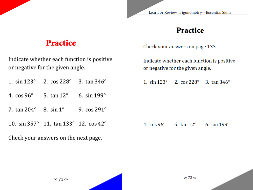
The print edition includes practice exercises at the end of the chapter. You can write in the paperback, so customers may want space here for their solutions. However, you can’t write solutions in an e-book, so I removed this extra space from the Kindle edition, as shown above.

Also, the answer key for the paperback is at the end of the book, which is inconvenient for the Kindle edition, so I put the answers on the page after the problems for the Kindle version. Customers just have to turn the page to find the answers in the e-book. It’s easy to bookmark the answer key for the paperback though, so I tabulated the answers in their own section for the paperback.

KTC Trig F

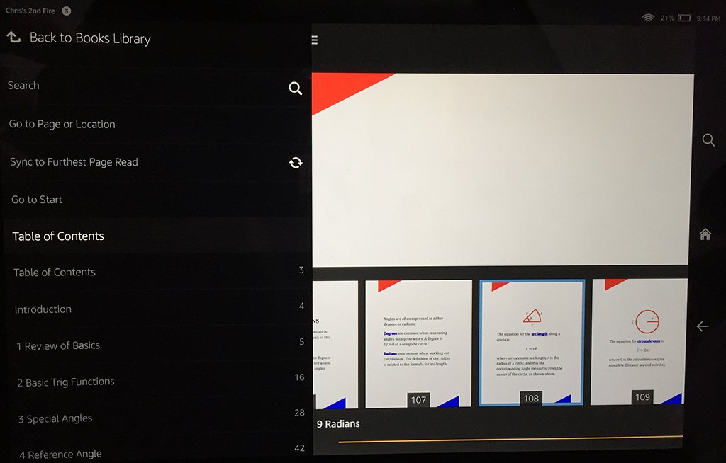
You can see what I mean about navigation built into the device in the above illustration. I took this picture with my iPhone’s camera; it shows my Kindle Fire HD 8.9″ with the navigation window open. On the bottom left, you can see the Introduction followed by the chapter names, with corresponding page numbers to the right. Note that these page numbers are automatic, and only match the actual numbers shown on your pages if you go to the trouble to make them match.

Inside Outside Margins

The above picture isn’t a Kindle Textbook Creator e-book. It’s a paperback book showing that some print books have a wider inside margin than outside margin. That might look funny if not changed for the Kindle edition of an e-textbook made using the Kindle Textbook Creator.

Write happy, be happy. 🙂

Chris McMullen

Copyright © 2015

Author of A Detailed Guide to Self-Publishing with Amazon and Other Online Booksellers

  • Volume 1 on formatting and publishing
  • Volume 2 on marketability and marketing
  • 4-in-1 Boxed set includes both volumes and more
  • Kindle Formatting Magic (now available)

Email to Amazon Followers: What to Write?

Image from ShutterStock.

Image from ShutterStock.

FOLLOWERS AT AMAZON

Kindle Direct Publishing (KDP) has a new feature.

When you publish a new Kindle e-book, in a couple of weeks (or so) Amazon sends you an email (to whatever email you have linked to your KDP publishing account).

The email subject is: A Question about Your Book (followed by the title of your book).

It’s not an advertisement. It’s not a problem. (Unless you get a different email!)

It’s an opportunity.

When you publish a new Kindle e-book, you can send a personal message to your Amazon followers.

Amazon will approve your message and send it out to your Amazon followers, letting them know about your new release.

This message may go out a few days after you submit it.

WHAT SHOULD YOU WRITE IN YOUR MESSAGE TO YOUR AMAZON FOLLOWERS?

Here’s your chance to include that personal touch in your message about your new book.

There is more than one way to do it, and it needs to agree with your author persona.

There is also an easy way to get a lot of good ideas for how to do this well.

Follow several successful authors at Amazon so you can see what kinds of ideas they use in their personal messages.

The next time they publish a Kindle e-book through KDP, you’ll receive (in a few weeks) their personal message to their Amazon followers (assuming they accept Amazon’s offer to do so).

While you’re browsing for top selling authors on Amazon, also find them on Twitter, Facebook, and their blogs.

This will also let you see how they use social media. You may get to see some of their marketing tactics firsthand. You can learn a lot by following successful authors.

Ideally, you want to follow KDP authors at Amazon. If they publish through KDP, they will receive this opportunity.

AMAZON FOLLOWERS

When a customer visits your Author Central page at Amazon.com, there is a large yellow Follow button on the left-hand side, under your primary author photo.

This lets customers follow you at Amazon. (Too bad it doesn’t include a brief explanation of what this is in a way that would encourage more follows.)

Unfortunately, it doesn’t show you how many followers you have. If you receive an offer to send a personal message to your Amazon followers about your new release, then you know you have at least one follower.

Follow yourself. This way, when you send out your personal message, you’ll also be able to see how it looks from the customer’s side.

GET MORE AMAZON FOLLOWERS

Yes, you want to do this:

  • Many customers are reluctant to sign up for an author’s email newsletter. But how about signing up through Amazon to receive email updates via Amazon? Customers who already shop at Amazon are more apt to trust Amazon’s email system.
  • Similarly, many customers are reluctant to follow authors via Twitter, Facebook, or the author’s blog. Some people don’t like social media. Some people follow authors, but don’t read most of the messages that they get from hundreds of people they follow.
  • Amazon lets customers follow their favorite authors directly on Amazon. Authors can send a personal message to their Amazon followers when they release new books. Customers sign-up directly at Amazon. The emails come from Amazon, not the author. Authors don’t receive the customer’s email address, so they don’t have to be worried about being contacted frequently by the author. The only time they will hear from the author is when the author publishes a new book.
  • You’re not trying to drive traffic away from one site to go to Amazon. These are Amazon followers hearing about your book from Amazon itself.

So how do you get more Amazon followers?

Put a note at the end of your book letting customers know that they can follow you directly at Amazon. Explain how to do it, and show them why it’s valuable.

  • Explain that they can follow you directly at Amazon.
  • Just visit your Amazon author page. Provide a link to your Author Central page.
  • Tell them to look for the large yellow Follow button on the left. It’s as simple as that.
  • Explain that Amazon won’t give out their email address to you. The only time they will hear from you is when you publish a new book, and the message will come directly from Amazon, not from you.
  • Start off with something like, “Would you like Amazon to notify you by email when I release a new book?” (For a series, finish with “the next book in the series.”) This helps to show why they should follow you.

Write happy, be happy. 🙂

Chris McMullen

Copyright © 2015

Chris McMullen, Author of A Detailed Guide to Self-Publishing with Amazon and Other Online Booksellers

  • Volume 1 on formatting and publishing
  • Volume 2 on marketability and marketing
  • 4-in-1 Boxed set includes both volumes and more
  • Kindle Formatting Magic (coming soon)

Follow me at WordPress, find my author page on Facebook, or connect with me through Twitter.

Comments

Click here to jump to the comments section.

Where is your avatar? What happened to your featured image?

Image from ShutterStock.

Image from ShutterStock.

MISSING AVATAR?

What happened to the avatar for your blog in the WordPress reader?

The recent update to the WordPress reader now shows your blog avatar, or blavatar, instead of your Gravatar.

So if you had an image for your Gravatar, but haven’t yet set an image for your blavatar, that would explain why your avatar image appears to be missing in the WordPress reader.

That’s easy to fix:

  • Go to your blog’s Admin page.
  • Click on Settings (look on the left column toward the bottom). Choose General.
  • At the top right, find Blog Picture / Icon.
  • Click the Browse button. Find the image file you’d like to use for your blog avatar (blavatar).
  • Click the Upload Image button.
  • Crop your image. (Or just leave it the way it is and click Crop anyway.)

PROBLEMS WITH THE READER IMAGES

If no image shows with your post in the Reader, here is why:

  • Either you didn’t include any images with your post.
  • Or the feed is set to Summary instead of Full Text under Admin > Settings > Reading > “For each article in feed, show ____.”

Unfortunately, the recent updates to the WordPress reader cause posts with the feed set to “summary” to not display an image with the post in the reader.

The solution is to change the feed setting to “full text” instead of summary. It may not be ideal, but for now, you must choose one or the other.

If you would like to use a featured image, you must set a featured image (in the new Add Post layout, you find this option on the left; in the classic layout, which you can find under Admin > Posts, you find this option at the bottom right).

Note that a gallery is presently showing underneath the post in the Reader. For posts that have multiple images, all of the images are showing in this gallery.

Click on View Gallery to quickly check out all of the images.

FOLLOW YOURSELF

Yes, you should follow your own blog.

This way you can see how your posts appear in the WordPress reader.

When you open the Reader, click the gear icon next to Following to view the list of blogs that you follow. If you already follow your blog, click on your blog’s name on the list. Then you can see how your recent posts look in the new WordPress Reader.

I find that the Reader looks much nicer on my iPhone using the WordPress app than when I view it on my pc monitor.

WORDPRESS POETS

Do you post any poetry on your blog?

If so, I’d like to link to one or more of your poems from a page that will be dedicated (on Read Tuesday) to showing by example the different forms of poetry.

The page will include a variety of poetry terms and forms, with links to blog posts that show examples of what the terms mean. (I won’t copy your poem; I’ll just link to your blog post.)

Find more information here:

http://readtuesday.com/2015/07/10/poetry-a-chance-for-poets-to-get-exposure-for-their-poems/

Blog happy, be happy. 🙂

Chris McMullen

Copyright © 2015

Chris McMullen, Author of A Detailed Guide to Self-Publishing with Amazon and Other Online Booksellers

Follow me at WordPress, find my author page on Facebook, or connect with me through Twitter.

Comments

Click here to jump to the comments section.

Where Are The Stats Pages on wordpress.com Blogs? by Lo

Such valuable info. Find your classic stats page.

Dandelion Salad

Old Stats with Map on wordpress.com Blogs Image by Dandelion Salad via Flickr

by Lo
Editor, Dandelion Salad
April 6, 2015

In December 2014, wordpress.com launched a “new” Stats page in Beta form. If you’d prefer to use the old Stats page with the map, this is the link: https://wordpress.com/my-stats.

View original post 496 more words

WordPress Reader Changes—Do they know how you feel?

Image from ShutterStock.

Image from ShutterStock.

WORDPRESS READER CHANGES

You may have noticed a major update to the WordPress Reader recently.

There have been a few minor improvements since, which is a good sign. It shows that WordPress staff is listening.

  • Word count is now showing for all posts. Approximate time no longer shows for short posts, but appears in parentheses after the word count for longer posts.
  • It’s now possible to see who wrote the post more clearly, as a larger site icon (or blavatar—but no longer the Gravatar) appears at the top of the post followed by the name of the site.
  • The age of the post now appears at the top of the post. This makes it much easier to find where we had previously left off.

DOES WORDPRESS KNOW HOW READERS FEEL?

I wrote a post on the WordPress Reader changes a few days ago when the big surprise hit, I visited a few other blogs and read about the changes there, and I’ve discussed these changes with other bloggers. However, nobody claimed to be a fan of the new changes, whereas there were several complaints. Last night I visited the WordPress support forums, where of course I found more complaints about the new Reader.

But a comment from WordPress staff on the forum suggests that most people must be content or pleased with the changes to the Reader. That doesn’t appear to be the case from anyone I’ve interacted with (if you’re happy with the change, I’d like to hear from your perspective).

WordPress staff seems to be under the impression that only a few people are frustrated with the changes, and those few have visited the forum to complain. However, I’ve heard several complaints outside of the forum, and most of those people haven’t visited the forum. So if you’re frustrated with the changes, but haven’t let WordPress know, well, the assumption may be that you’re at least content with the changes, if not a big fan of them.

Feel free to visit the WordPress forums to voice your opinion (for, against, or neutral).

https://en.forums.wordpress.com/topic/reader-view?

Feel free also to repeat a suggestion or comment. If only one person voices an opinion, they may think that only one person is unhappy about it.

If you’ve had any technical issues with the new Reader, please report them. WordPress staff does try to offer solutions or resolve issues, but they need to know about them.

IS IT FUNCTIONAL?

When I open a post in the Reader, the Like button appears at the top right, the back button appears at the top left, and the comments field is way down below. That seems like the road to maximum inconvenience. Plus, most of my pc screen space is wasted, and these control buttons extend beyond that wasted space.

If you proceed to scroll down to read more of the post within the Reader or to leave a comment, be careful not to miss the scrollbar slightly or the post will close on you.

WHERE IS THE VISUAL APPEAL?

On a large screen, or with the aspect ratio of a typical laptop or pc monitor, most of the Reader is wasted space.

I see very large white sidebars, empty. The post image is tiny compared to my screen. The text background is white, which blends into the sidebars seamlessly.

To me, it looks so bland. The post’s image is so small on my screen, it no longer has the same visual attraction for me as images used to.

CUSTOMIZATION?

I’m not reading a magazine. When I read a print magazine, I understand that the pages are set in stone.

When I read online, why can’t I, the reader, have some control over the layout, design, and style?

The layout and design in the Reader is set in stone by WordPress. Neither the reader nor the blogger have control over the Reader’s display.

If they’re intent on taking control of this from the blogger, why not offer it to the reader, instead?

That would be reader-centric. Give the reader some choice for how the Reader works.

ALTERNATIVES

For now, the best solution may be to either:

  • Visit your favorite blogs’ homepages and add them to your Favorites toolbar so you can visit those sites directly.
  • Follow your favorite blogs with the Follow by Email option and read the posts in your email.
  • Click the link to read more to visit the post directly on the website, rather than in the Reader.
  • There are other reading apps that can be used to read WordPress blogs. You don’t have to use the WordPress Reader. You can feed your favorite blogs into a different blog reader. (I haven’t tried these, so I can’t recommend one. Try searching for an RSS reader with Google. For example, Feedly is one.)

Indeed, I have heard from a few of my followers who said that they were glad that they read my posts via email, so that they haven’t had to deal with the Reader updates.

Go to WP Admin > Appearance > Widgets and make sure that Follow by Email is an option on the sidebar of your blog.

AT LEAST THEY’RE LISTENING

They have made a few minor improvements since the last major update.

That’s a good sign. It shows that they are listening and considering ideas.

Maybe they could listen better. A little heads-up would show that they care. An invitation to beta-test the changes would make some experience bloggers feel involved.

It would be good marketing for WordPress to engage bloggers when updates roll out.

Are they watching? It seems like they would have engagement stats for reading habits with the Reader. I wonder what these stats are showing. One person left a comment on my blog that he had stopped reading as a result of these changes.

(But I wonder if there may be more activity than usual, and if so, this would create deceptive stats. For example, a few times, I accidentally wound up at the top of my Reader and had to scroll back down to where I had been. Several times, I’ve accidentally closed a post and had to reopen it. I’d loathe to think that WordPress feels that we’re reading more when we’re technically reading less.)

I LOVE WORDPRESS

I’m not a fan of the new Reader changes.

I didn’t like the last major Reader update either.

But I do love WordPress. I recommend it to authors looking to start a new website.

But I’d love it even more if the Reader went back to the way it was.

Write happy, be happy. 🙂

Chris McMullen

Copyright © 2015

Chris McMullen, Author of A Detailed Guide to Self-Publishing with Amazon and Other Online Booksellers

Follow me at WordPress, find my author page on Facebook, or connect with me through Twitter.

Comments

Click here to jump to the comments section.

Ideas for Children’s Books in Kindle Unlimited

Image from ShutterStock.

Image from ShutterStock.

CHILDREN’S BOOKS IN KINDLE UNLIMITED

Now that Kindle Unlimited is paying KDP Select books based on the number of Kindle Edition Normalized Pages (KENP) read, children’s books—especially illustrated kids’ books—appear to be among those most affected.

Illustrated children’s authors with books enrolled in KDP Select basically have three options:

  • Opt your illustrated children’s books out of KDP Select. (Uncheck the automatic renewal box. Wait until the 90-day period has expired. Now you can publish elsewhere. But beware that not all other e-book platforms are equally picture-friendly. You might want to do some research and formatting before you decide to make the switch.)
  • Leave your books enrolled in KDP Select, and either complain about the change or feel frustrated without complaining—or try your best to ignore it—or hope that your book will be engaging enough to help get more pages read. (You probably don’t want to complain publicly in such a way that it may hurt your brand among your potential audience. Sending a polite suggestion to Amazon KDP or organizing a petition are private ways to express your opinion and try to instigate a little change.)
  • Leave your books enrolled in KDP Select, and find ways to make the most of the new program.

For those who choose option three, I have a few ideas that may help. Maybe my suggestions will inspire yet another idea of your own.

HOW TO GET MORE USE OUT OF YOUR PICTURES

This is something I saw in some books before Kindle Unlimited changed, but the idea has even greater value now.

A couple of Kindle Unlimited books that I borrowed for my daughter found a creative way to get more mileage out of the pictures.

It has marketing potential, and also helps with the new KENP read policy.

The idea is simple: Show how the pictures were made.

It’s easy to do: When you create your images—or when your illustrator makes your images—take pictures of those images to show the stages in which they are made.

Here’s what you do with them: Add them to the end of your book, showing one step at a time how to draw the pictures. You can add a little text, too, describing the process.

It’s a win-win-win situation:

  • Kids to get read a book and learn how to draw pictures.
  • Parents get added value in that their kids practice reading and learn drawing skills.
  • Authors benefit by adding several extra pages to their Kindle e-books.

It’s not just stuffing pages at the end of the book. These pages offer valuable content—showing how to draw pictures—which potentially adds to reader engagement.

More pages read means a greater royalty earned through Kindle Unlimited.

HOW TO ADD ENGAGING CONTENT TO YOUR CHILDREN’S BOOK

Here is another way to add engaging content to your children’s book.

How do parents know if their children paid attention or understood the story?

A few multiple choice questions following each story could help parents assess reading comprehension. They can check their answers if you use a footnote or endnote for the answer key.

You can also add a vocabulary key after the story to review important terms, or test if kids can figure out the meaning from the context.

There are all kinds of ways that you can add questions or exercises to add educational value to your entertaining stories. This might help differentiate your KDP self-published book from similar traditionally published books that only have stories.

BUNDLING CHILDREN’S BOOKS TOGETHER

Bundling doesn’t help by simply adding pages. Those extra pages are more work, and only pay if the pages are read.

Furthermore, whether you write one 200-page book or eight 25-page books, either way you write 200 pages—and if a customer reads all 200 pages, you get paid the same whether they are bundled or not.

But where bundling can help is with (A) convenience and (B) perceived value.

It’s more convenient to read another story when it’s already in the same book. It’s inconvenient to have to return to the Kindle Store to buy the author’s next book.

If your stories are engaging, you’re more likely to get your next story read if the customer doesn’t have to find your other book.

Kindle Unlimited customers also see more value in downloading a collection than borrowing one short story.

The bundle may even help with sales, if there is a discount compared to buying the individual titles.

I would sell both the individual titles and the bundle. It gives you more exposure. The individual titles are more likely to be discovered in searches on Amazon, as you can customize 2 categories and 7 keywords for each individual title. Once they click on your author name, customers can then discover your bundle.

You can also mention your bundle after the story in your individual books. If they liked the story, maybe they will try your bundle.

But note this:

  • If your bundle is in KDP Select, your individual titles must be exclusive to Amazon.
  • If your individual titles are in KDP Select, the bundle must also be exclusive to Amazon.

Write happy, be happy. 🙂

Chris McMullen

Copyright © 2015

Chris McMullen, Author of A Detailed Guide to Self-Publishing with Amazon and Other Online Booksellers

  • Volume 1 on formatting and publishing
  • Volume 2 on marketability and marketing
  • 4-in-1 Boxed set includes both volumes and more
  • Kindle Formatting Magic (coming soon)

Follow me at WordPress, find my author page on Facebook, or connect with me through Twitter.

Comments

Click here to jump to the comments section.

How many books were borrowed through Kindle Unlimited?

Image from Shutterstock.

Image from Shutterstock.

KINDLE UNLIMITED BORROWS

Amazon KDP now shows the number of pages read (KENP read, or Kindle Edition Normalized Pages read).

The KDP reports no longer show the number of books borrowed through Kindle Unlimited or Amazon Prime.

Although it’s nice to see the number of pages read, this data would be more meaningful if we knew how many books were borrowed.

That way, if you saw 200 KENP read in your report, you would know if 1 person read 200 pages or if 4 people each read 50 pages.

There is a way to get more information, though not quite as much as you might like:

  • Visit your Sales Dashboard at KDP by clicking Reports.
  • (Note the blue circle with the question mark at the top right. It doesn’t work presently, but it may be a sign of more information to come.)
  • Scroll down to the very bottom and click the Generate Report button.
  • Open the spreadsheet in Microsoft Excel (for example).
  • Scroll down to the very bottom of the spreadsheet.
  • Note that there are three tabs: (1) Royalty Report (2) Orders Report (3) KU-KOLL Unit Report.
  • Click on the middle tab, Orders Report.
  • This shows the breakdown of KENP read per book per country per day. (It also breaks down your sales.)

Unfortunately, the third tab (KU-KOLL Unit Report) stops after June 30. It sounds like what you want, but it’s not for July.

The middle tab (Orders Report) provides a helpful breakdown. But it’s inconvenient to get there, and it still doesn’t show you quite what you want.

Maybe this will improve. I’ve heard from hundreds of authors who would like to see the number of borrows in the reports.

But it doesn’t help to tell me. Visit Amazon KDP and click on the Contact Us button in the corner. It took a long time and a large number of requests, but reporting has changed in the past and we have pre-orders—authors have requested these features for years and they finally came. If you want something, ask for it. Otherwise, how will they know what you want?

Why doesn’t the report show the number of borrows?

There are a few theories for why the reports don’t show the number of Kindle Unlimited (or Amazon Prime) borrows.

Perhaps they just forgot or didn’t realize its importance. That seems doubtful. But perhaps.

Maybe most customers don’t start reading the book after they download it, and Amazon doesn’t want authors to freak out when they see several borrows, but zero pages read.

But that has an easy fix: Don’t show all borrows; just show borrows where the book has actually been opened.

However, what if many customers only read a few pages and discard the book. It could happen, since there really is no incentive for Kindle Unlimited customers to check out the Look Inside. Since they can read for free, they might just download it and skip the middle man.

It might not be a sign that the book is bad. It might just be a matter of taste. Oh, I didn’t realize this was a mystery. Oops! A mere 3 pages read.

Knowledge is power, though. If we see that most customers are only getting partway through our books, wouldn’t we feel inclined to try to make our books more engaging?

Write happy, be happy. 🙂

Chris McMullen

Copyright © 2015

Chris McMullen, Author of A Detailed Guide to Self-Publishing with Amazon and Other Online Booksellers

  • Volume 1 on formatting and publishing
  • Volume 2 on marketability and marketing
  • 4-in-1 Boxed set includes both volumes and more
  • Kindle Formatting Magic (coming soon)

Follow me at WordPress, find my author page on Facebook, or connect with me through Twitter.

Comments

Click here to jump to the comments section.

Amazon Matchbook Offer for Kindle (nice surprise)

Matchbook New

Amazon, Kindle, and Fire and all related logos are trademarks of Amazon.com, Inc. or its affiliates.

MATCHBOOK OFFER

Note: As of October, 2019, the Matchbook program has been canceled.

After I purchased some print books today on Amazon, I found a nice surprise.

At the top of the next page was a large Matchbook offer, large enough to include the thumbnail of one of the books and a message.

It informed me that since I had purchased the print edition, I could add the Kindle edition for $1.99.

This way, the Matchbook offers are getting a little exposure.

They are slightly easier to spot on the product page than they once were, yet they still aren’t too visible there.

But after you buy the print book, now the Matchbook offer is highly visible.

WHAT’S MATCHBOOK?

The Amazon Kindle Matchbook program allows publishers to offer the Kindle edition at a discounted price to customers who have already purchased the print edition.

The idea is to entice customers to buy both editions, and to offer savings to customers who do so.

KDP authors can check a box on the second page of the publishing process to enroll in the Matchbook program.

You must have a print edition of the same Kindle e-book, and the two editions must be linked together on the Amazon product page for this to work.

I get some Matchbook sales every month.

But many authors don’t see many Matchbook sales.

For one, I sell many more print books than Kindle e-books. If you sell mostly Kindle e-books, you probably won’t see as many Matchbook sales.

Unless you find an effective way to take advantage of a little marketing potential.

You have to let your prospective customers know about the benefits of Matchbook.

For example:

  • Buy the print edition at Amazon and get the e-book edition at a discount.
  • Keep the Kindle edition for yourself and give the print edition as a gift. (Great holiday idea.)

Many customers don’t know about Matchbook, and those who do often don’t fully realize how it could benefit them.

The way around this problem is to help educate your customers.

But like all other marketing, it’s never easy.

Write happy, be happy. 🙂

Chris McMullen

Copyright © 2015

Chris McMullen, Author of A Detailed Guide to Self-Publishing with Amazon and Other Online Booksellers

  • Volume 1 on formatting and publishing
  • Volume 2 on marketability and marketing
  • 4-in-1 Boxed set includes both volumes and more
  • Kindle Formatting Magic (coming soon)

Follow me at WordPress, find my author page on Facebook, or connect with me through Twitter.

Comments

Click here to jump to the comments section.

Is Amazon Prime Day better than Black Friday?

Images from ShutterStock.

Images from ShutterStock.

PRIME DAY, JULY 15, 2015

July 15, 2015 is Amazon Prime Day.

It’s a special one-day sale event like Black Friday, but just for Amazon Prime customers.

It was advertised to have more deals than Black Friday. But is it better than Black Friday?

Visit the Prime Deals page. Just go to the home page, and if July 15, 2015 hasn’t passed yet (Pacific time, I suppose), you should see the offers.

If you’re a Prime customer, you can take advantage of them.

  • It’s a great day to subscribe to Kindle Unlimited. You can buy subscriptions up to 40% off up to 2 years in advance, if you’re an Amazon Prime member. (Click on the Lightning Deals banner from the Prime Deals page, look to the left and scroll down.)
  • Some Kindle readers are still available, as of now. The one I wanted was gone, but there are others at good savings. One of them is just on sale; not all are Lightning Deals.
  • Prime Exclusive Lightning Deals are limited-time offers with limited quantities available. You can find a list of these from the Prime Deals page.
  • A separate list shows upcoming Prime Exclusive Lightning Deals so you can be ready when they start.
  • There is also a list of Prime Exclusive Sales and Savings. These aren’t Lightning Deals. Most appear to expire at 2:00 a.m. (probably Pacific time).
  • Amazon music has deals going on.
  • Clothing and jewelry has Prime Exclusive Offers.
  • There is an offer to save money on Amazon gift cards, which always come in handy.
  • There are more deals than just these.

I wound up buying several print books.

I didn’t see books listed on the Prime Deals page.

And most of my print books weren’t on sale; at least, not most of my bestsellers. A few of my print books were on sale today, though not as many as usual.

But I was browsing for advanced math books, and a few of the Dover editions caught my eye. A couple were on sale for $3.99 with list prices over $20. Dover editions tend to be less expensive math books. I’m not sure how $3.99 compares to the usual Amazon price, but it looked pretty good to me. I bought a whole library of advanced math books today (not all were as cheap at $3.99).

While e-books may not have been featured on Prime Day, there is good news for authors:

  • Many Prime customers purchased Kindle Unlimited subscriptions of up to 24 months, saving 25% to 40%. They will be reading a lot of books in the coming months. This helps KDP Select authors.
  • Many Prime customers purchased Kindle readers today. They will need to find e-books to read in the coming months. This helps all e-book authors.

There were a lot of deals today, most of them Lightning Deals. Was it as good as Black Friday? Maybe it depends on what you were shopping for. Maybe it depends on whether you missed out on a Lightning Deal that you really wanted.

What do you think of Prime Day?

AMAZON TURNED MY FROWN UPSIDE DOWN

I admit, I was a bit frustrated at first.

This morning, I checked the Prime Deals.

I wanted to buy another Kindle reader, and the one I wanted seemed to be on sale at a very good price.

But it turned out to be a Lightning Deal.

(Note: There is at least one Kindle reader on sale that’s not a Lightning Deal, and at least one other Kindle reader with a Lightning Deal that had only been 14% claimed last I checked. It’s just the one I had my eye on that had already expired.)

And I had already missed out.

This didn’t make much sense to me:

  • The more Kindle readers Amazon sells, the more Kindle e-books Amazon will sell, right?
  • So why limit the number of Kindle readers for sale?
  • Why not have any kind of sale on the Kindle reader after the Lightning Deal ends?
  • This morning, thousands of customers had already missed out on this Lightning Deal for a new Kindle.
  • Then the price shot up to regular price.
  • So thousands of people started their Prime Day with the “Sorry, you missed it!” feeling.
  • It would have been better to have a sale price, with lesser savings, follow the Lightning Deal, so you could at least get some savings on the Kindle reader, and not completely miss it.

I waited 15 minutes to chat with an agent, who informed me that many other Prime customers had made a similar inquiry on the missed Lightning Deal.

Just think of all the Prime customers who were frustrated over this who didn’t contact Amazon.

However, the 15 minutes turned out to be worth it. They couldn’t honor the Lightning Deal, but they did make an offer that changed my frown into a smile.

I didn’t wind up buying another Kindle today, but I did buy several other items.

Amazon does provide good customer service. I’m glad I contacted support.

I could have been frustrated over the Kindle reader and purchased nothing at all on Prime Day, but they made me happy and I wound up buying a small library’s worth of math books instead.

Write happy, be happy. 🙂

Chris McMullen

Copyright © 2015

Chris McMullen, Author of A Detailed Guide to Self-Publishing with Amazon and Other Online Booksellers

Follow me at WordPress, find my author page on Facebook, or connect with me through Twitter.