
The self-publishing revolution has brought forth a generation of cover art critics. It seems that there are many more cover art critics than there are art critics.
To be fair, they also criticize traditionally published covers, and a few of the best covers out there are actually on self-published books. However, the reality is that the vast majority of lousy covers are on self-published books.
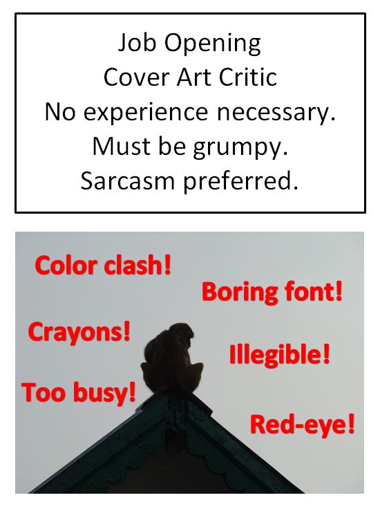
Anyone can be a cover art critic. No talent for cover design is needed to form an opinion.
But that’s the point. Don’t create a cover to satisfy the critics. Instead, create a cover that will please potential readers. Back to the point: All potential readers are cover art critics! Complaints that are common among the cover art critics tend to deter sales because many readers feel the same way.
Here are some common complaints:
(1) Can’t tell what the book is about!
(2) Text is illegible!
(3) Colors don’t work well together!
(4) People look deformed!
(5) Used crayons or colored pencils!
(6) Photo-bombing image!
(7) Used Comic Sans for font!
(8) Aspect ratio is distorted!
(9) Illustrator’s name appears on a lousy cover!
(10) Image appears blurry or pixelated!
(11) Cover is too busy!
(12) Fonts are boring!
(13) Hard to read fonts!
(14) Wrong words emphasized in title!
(15) Three different fonts used!
(16) Images have nothing in common!
(17) Settled for image that doesn’t quite work!
(18) Doesn’t look good both full-size and as thumbnail!
(19) Red-eye!
(20) Typo in title!
(21) Poor drawing skills!
(22) Poor photography skills!
People do judge books by their covers. As they should! At least to the extent that buying a book where the author or publisher didn’t put much effort into the cover is a risk: If little effort was put into the cover, there isn’t any reason to expect that greater effort was put into writing, editing, and formatting.
The cover is a marketing tool. Customers do browse for books in search results and click on thumbnails that interest them. Trying to avoid common cover design mistakes may pay off. It’s challenging to design a perfect cover, and any cover – no matter how good – can still be criticized. It’s much easier to find fault in a cover than to make a cover without fault. (No wonder there are more cover art critics than there are great covers.) But the cover is very important, so striving to design a great cover is worth the effort.
Chris McMullen, self-published author of A Detailed Guide to Self-Publishing with Amazon and Other Online Booksellers (Volume 2 now available)

Bad covers are a great way (in my opinion) to screen through self-pubbed books — if the cover is egregiously bad, the author obviously didn’t respect the material inside the book enough to get a decent cover artist. If the author doesn’t respect their own writing, then there’s no reason for readers to respect them by reading the book. We all as authors need to recognize the cover as a marketing tool and utilize it that way. Great post!
Hi Chris,
I think you follow my blog anyway, so may have seen this, but I wanted to let you know I’ve included your blog in my selections for the Versatile Blogger Award. It’s just a way for bloggers to support each other, as far as I can see, but your blog really helps me, so I wanted to publically acknowledge you!
Just click on my website, where you will see your nomination, and the rules, should you decide to play the game! http://youaresunshine.wordpress.com/2013/04/24/winning-the-versatile-blogger-award
Jules
Yes, I do, and I check your blog out periodically, too. 🙂 Congratulations on your nomination, and thank you for thinking to acknowledge my humble blog. Good luck with the award.
Thanks Chris,
Keep up the excellent posts – I find them so helpful and inspiring! 🙂
Jules