Finding Fonts for Books or Covers (allowing Commercial Use)


FONTS FOR BOOKS AND BOOK COVERS

I’ve been using the Adobe Creative Cloud for years now, which includes Photoshop, Illustrator, InDesign, and many other great tools for publishing books or graphic design.

One of my favorite tools is Adobe’s Typekit. It is included with my Creative Cloud subscription, but you can get Typekit even with a small subscription (you don’t need the whole Creative Cloud to get it).

What’s cool is that Adobe comes right up front and tells you that their fonts permit commercial use, and it clearly states that this includes books (with no limit on the number of sales). If you’re a graphic designer making book covers, for example, the author who purchases your finished product doesn’t need a separate license (provided that the author doesn’t need to edit your design).

With Typekit, you don’t actually install the fonts on your computer. (Note that if you did install the fonts on your computer, the same licensing would no longer apply.)

Rather, you just install the Adobe app, and the Typekit fonts automatically work with Adobe products and Microsoft Word (for other software, there may be limitations; you should look into that if using other programs). Just make sure that you’re logged into the Adobe app before you open Microsoft Word (if that’s what you’re using); otherwise, Word will automatically substitute another font without even telling you. You don’t need to remain online while you work, once you’ve successfully logged into the Adobe app.

There are several great fonts at Typekit.

For the body text of most books, including novels as well as nonfiction, you want a font that reads well. Adobe has some Garamond fonts, including Garamond Premier, and Garamond is one of the popular fonts for novels. You can get an entire family of Garamond fonts, so if you normally feel that Garamond is a bit light, you can find a darker version.

Another good font for body text is Minion, which I was excited to discover was included with Typekit.

If you’re designing an educational book for K-12, you might consider SchoolBook. There are a few other fonts similar to SchoolBook, too.

But there are numerous fonts that would work for body text paragraphs. I have a few tips for searching for fonts for body text:

  • Serif fonts are commonly recommended for body text.
  • Think of letters and punctuation marks that are important to you. I’ve encountered fonts where I didn’t like the lowercase r, the lowercase a, the lowercase f, the uppercase R, the colon, or the curly apostrophe (don’t type a straight apostrophe from your keyboard, that’s different; first get one in Word and then copy/paste), for example. If you may be typing digits, remember to check the numbers, too. Type these in the sample text.
  • Once you narrow it down to a few fonts, add them all. Open a file with plenty of sample text and test each font out. It just takes one letter or punctuation to spoil a font, and you want to catch that before you format an entire book that way.

(For fonts inside of the book, my recommendations are for paperback books. For ebooks, I recommend not trying to embed fonts. But for ebook covers, see below.)

For headings, you might go with a sans serif font. Myriad is a good simple sans serif font, but there are plenty of others to choose from.

For book covers, you might want a very bold font for keywords, such as Azo Sans or Jubilat, to really help the two or three most important words to stand out, especially for a nonfiction book where it’s really important for the cover to spell out the most important words.

For novels, you want to find a font for the book cover that spells out a particular genre, like Lust or one of the script-like fonts for romance. But remember that it’s more important that the font can be read easily on the small thumbnail. If you get carried away, you can wind up sacrificing the readability. Try to avoid having more than three different fonts included on the front cover.

Another option is to search through websites dedicated to free fonts.

Good luck and happy font searching.

Write Happy, Be Happy

Chris McMullen

Author of the Improve Your Math Fluency series of math workbooks and self-publishing guides

Are you getting the most out of your fantastic book cover? Let’s see…

This cool image was created by The Story Reading Ape: http://thestoryreadingapeblog.com/tsra-3d-books/.

This cool image was created by The Story Reading Ape: http://thestoryreadingapeblog.com/tsra-3d-books.

BOOK COVER PROMOS

If you have a great book cover, you want to take advantage of it.

While I designed most of my own book covers, my best book covers were designed by a professional. For example, the cover you see below was designed by Melissa Stevens at http://www.theillustratedauthor.net. (This is a lower resolution version for my blog.)

Book cover designed by Melissa Stevens at http://www.theillustratedauthor.net.

This cool book cover was designed by Melissa Stevens at http://www.theillustratedauthor.net.

Just imagine your cover on a big city billboard like the one below, put together by The Story Reading Ape at thestoryreadingapeblog.com/tsra-3d-books.

This cool image was created by The Story Reading Ape: http://thestoryreadingapeblog.com/tsra-3d-books.

This cool image was created by The Story Reading Ape: http://thestoryreadingapeblog.com/tsra-3d-books. The background image was licensed through http://shutterstock.com.

If you’re thinking, “Sure, that would be cool, but I could never afford that, and even if I could, I would never recover my investment,” then you’re missing the point.

What you can do is create 3D versions of your cover, like the one below (designed by The Story Reading Ape at thestoryreadingapeblog.com/tsra-3d-books), or put your cover in some unexpected, cool-looking place, like on a billboard in downtown Hong Kong.

This cool image was created by The Story Reading Ape at http://thestoryreadingapeblog.com/tsra-3d-books.

Take your cool book cover and make it pop even more.

Compared to the price of a typical book cover, getting a 3D promo cover can be quite reasonable. The Story Reading Ape’s services are quite affordable, in my opinion.

You can use these book promo covers:

  • on your blog
  • on your Author Central page (you can add images)
  • on bookmarks (through overnightprints.com, for example)
  • on letterhead (through overnightprints.com, for example)
  • on promotional items like t-shirts or coffee mugs
  • on exclusive items readers could win through contests
  • on Facebook, Twitter, and other forms of social media

Or you can take things a step further, and get fans to take photos of themselves doing something (zany? fun? smart?) with your book, posting the images on their own sites.

If you like the billboard idea:

  • When searching for big city billboards on stock photo sites like ShutterStock, beware that most of the results are for editorial use only. Filter the search results by clicking the option to Refine Your Search, selecting the Non-Editorial option.
  • You might want to make a disclaimer that says, to some effect, that your book isn’t really displayed on a Manhattan billboard, and that the image is for entertainment purposes only. But I’m not an attorney, so if you want legal advice, you should consult an attorney.

Write happy, be happy. 🙂

Chris McMullen

Copyright © 2016

Chris McMullen, Author of A Detailed Guide to Self-Publishing with Amazon and Other Online Booksellers

Click here to view my Goodreads author page.

  • Volume 1 on formatting and publishing
  • Volume 2 on marketability and marketing
  • 4-in-1 Boxed set includes both volumes and more
  • Kindle Formatting Magic (coming soon)

Follow me at WordPress, find my author page on Facebook, or connect with me through Twitter.

Comments

Click here to jump to the comments section.

Check out these Cover Reveals (good variety)

Curtains from ShutterStock; cover designed by Melissa Stevens at theillustratedauthor.net

Curtains from ShutterStock; cover designed by Melissa Stevens at http://www.theillustratedauthor.net

COVER REVEALS

Why do a cover reveal for just my own book?

Why not do a cover reveal for a variety of new books by different authors?

So that’s exactly what I’m doing.

I was fortunate to get some really cool covers when I asked for volunteers for my multi-cover reveal. I might be reading a few of these books soon.

It’s not just me, apparently: A few of these authors had some impressive sales ranks of their other books (one has an author rank in the top 100 in the category). Thank you to everyone who participated.

Check out the cool new books below.

CURSIVE HANDWRITING FOR MATH LOVERS

Julie Harper and Chris McMullen

Know someone who could use some handwriting practice, who is more interested in math than language? This unique book might be just the thing. Julie Harper has written a number of popular handwriting workbooks, such as Wacky Sentences.

Find this book on Amazon: http://amzn.com/1512181323

Julie Harper’s writing website: http://wackysentences.com

Chris McMullen’s math blog: http://improveyourmathfluency.com

ICHABOD BROOKS & THE CITY OF BEASTS

Charles E. Yallowitz

This fantasy adventure was released on June 1. The author also has a popular sword and sorcery fantasy series:

Find this book on Amazon: http://amzn.com/B00YLUHQRK

Charles E. Yallowitz’s blog: http://legendsofwindemere.com

See the original cover reveal: http://legendsofwindemere.com/2015/05/15/cover-reveal-ichabod-brooks-the-city-of-beasts

RIDGETOP

Carol Ervin

The byline is A Mountain Women Thriller. Carol Ervin is a popular author in the historical fiction genre (though this new release is a contemporary suspense).

Find this book on Amazon: http://amzn.com/B00WZXA6RM

Carol Ervin’s website: http://carolervin.com

See the original cover reveal: http://carolervin.com/2015/05/01/contemporary-suspense

THE FAMILY DIVIDED

Anne Allen

This is Book 4 of the Guernsey Novels, a popular mystery series by Anne Allen.

Find this book on Amazon (available for pre-order): http://amzn.com/B00WZXA6RM

Anne Allen’s Facebook page: https://www.facebook.com/anne.allen.12327

SEARCH FOR THE GOLDEN SERPENT

Luciana Cavallaro

This looks like mythological and historical fiction with a modern-day hero—an intriguing blend.

Find this book on Amazon: http://amzn.com/B00TO8TT9W

Luciana Cavallaro’s blog: http://luccav.com/blog

See the original cover reveal: http://luccav.com/2015/03/27/up-up-and-away

THE MADNESS ENGINE

Paul B. Spence

This is the third book of the Awakening sci-fi series.

Find this book on Amazon: http://amzn.com/B00WLGX4TK

See the original cover reveal: https://northofandover.wordpress.com/2015/04/24/and-the-new-one-too

ONCE BURNT, TWICE BLIND

Christine Plouvier

This is the sequel to Irish Firebrands.

Find this series on Amazon: http://amzn.com/1484165705

Christine Plouvier’s blog: https://irishfirebrands.wordpress.com

See the original cover reveal: https://irishfirebrands.wordpress.com/2015/03/16/irish-firebrands-sequel-gets-title-and-cover

DEATH BEFORE DAYLIGHT

Shannon A. Thompson

Coming in September, but you can get started with Book 1 of the series, Minutes Before Sunset.

Check out Shannon A. Thompson’s other books: http://www.amazon.com/Shannon-A.-Thompson/e/B00AXANG76

See the original cover reveal: http://shannonathompson.com/2015/05/20/deathbeforedaylightcr

HOW LONG ARE THE BOOKS THAT YOU READ?

Have time for a quick survey?

You can view the results when you’re done.

https://chrismcmullen.wordpress.com/2015/05/31/how-long-are-the-books-that-you-read-survey

Write happy, be happy. 🙂

HAVE A COVER REVEAL?

Authors, have you done a cover reveal recently? Doing one soon?

If so, please leave a comment to let me know.

Once your cover reveal goes live, provide a link to it so I can include your cover reveal the next time I do a post like this.

Chris McMullen

Copyright © 2015

Chris McMullen, Author of A Detailed Guide to Self-Publishing with Amazon and Other Online Booksellers

  • Volume 1 on formatting and publishing
  • Volume 2 on marketability and marketing
  • 4-in-1 Boxed set includes both volumes and more
  • Kindle Formatting Magic (coming soon)

Follow me at WordPress, find my author page on Facebook, or connect with me through Twitter.

Doing a Cover Reveal Soon? Done one Recently?

Curtains from ShutterStock. Kindle Formatting Magic cover designed by Melissa Stevens.

Curtains from ShutterStock. Kindle Formatting Magic cover designed by Melissa Stevens at http://www.theillustratedauthor.net.

SHARE YOUR COVER REVEAL

You can catch a glimpse of a cover reveal that I’ll be doing soon (for a book on Kindle Formatting Magic).

This gave me an idea: Why just reveal my own cover?

This is an opportunity for me to reveal other authors’ recent covers alongside my own.

I actually have a couple of new books coming out soon (including one with mathematical puzzle patterns), so I’ll have a couple of cover reveals coming in the next few weeks.

Have you done a cover reveal recently?

Will you be doing a cover reveal soon?

If so, let me know.

Just leave a comment on this post with a link to your cover reveal.

I don’t need your image file; I’ll just use WordPress’s option to link to your image, so that clicking the image leads to your cover reveal post.

Write happy, be happy. 🙂

Chris McMullen

Copyright © 2015

Chris McMullen, Author of A Detailed Guide to Self-Publishing with Amazon and Other Online Booksellers

  • Volume 1 on formatting and publishing
  • Volume 2 on marketability and marketing
  • 4-in-1 Boxed set includes both volumes and more
  • Kindle Formatting Magic (coming soon)

Follow me at WordPress, find my author page on Facebook, or connect with me through Twitter.

Which FONT Should You Use for Your BOOK? #pubtips

Images from ShutterStock

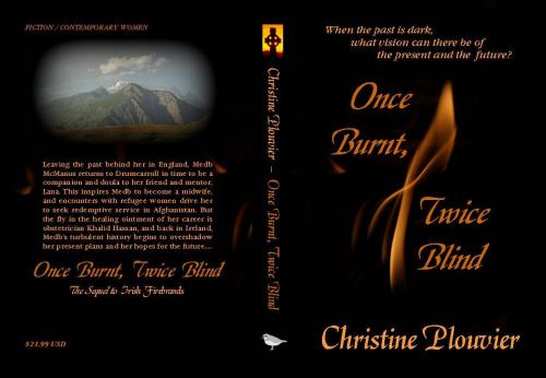
Mock covers created using ShutterStock images.

FONT SELECTION

Whether designing a book or just the book cover, the choice of font is a very important design element.

  • The right font on the book cover helps to attract the specific target audience.
  • The wrong font anywhere on the book can be a sales deterrent.
  • Overused fonts, like Times New Roman, Arial, Papyrus, Algerian, etc. can make an unfavorable impression with those who recognize them.

Fonts come in many different shapes, from rectangular to curvy. They can be simple or complex. They can be serif or sans serif (the little decorations that you see on the ends of letters). They can be thin or thick, light or bold.

So which font should you use for your book or book cover? That’s the million-dollar question. It’s worth taking time to consider it carefully.

It’s not hard to find a free or low-cost font that allows commercial use. It just takes a little knowing what you’re looking for and investing the time to do a thorough search.

CONTENTS

I will begin with a discussion of font use in book design, both inside and on the cover, including font tips.

Then I will focus on genre-specific fonts, including:

  • sci-fi fonts
  • fantasy fonts
  • romance fonts
  • horror fonts
  • western fonts
  • and other fonts

In addition, I will illustrate this with several examples of genre-specific fonts.

BOOK FONTS

Different fonts are used in different parts of the book design:

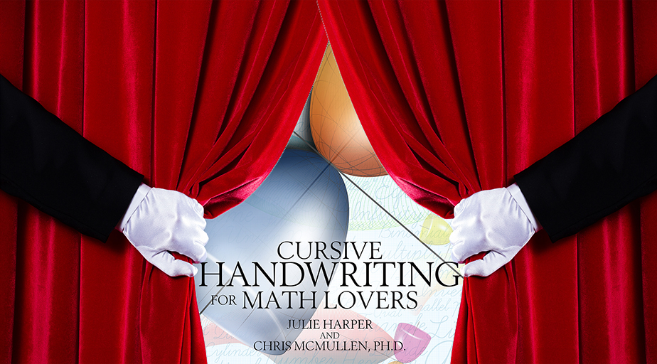
  • The cover font may be different for the title, subtitle, author name, and back cover blurb. The title keywords and the author name should be abundantly clear in the thumbnail. The title may use a fancy font to convey the genre, but not at the cost of inhibiting readability. The other fonts should be simple, so as not to clash or detract from the main font. All the fonts need to go together. Avoid using more than three fonts on the front cover (two may be better, in general).
  • The body font used inside a print book needs to be clear and easy on the eyes. Don’t use a fancy font for the body text. It may be worth going with a popular novel font like Garamond or Minion, rather than a genre-specific font, since the main feature of the body font is easy reading.
  • Inside the book, you may also have a different font for headings and drop caps, for example. The drop cap is typically fancier, but should fit the genre, yet still needs to be clear. Especially, any drop caps in the Look Inside must be very legible. Focus more on clarity than fanciness for the headings.
  • It may be best not to embed a font for the body text of an e-book, as readers are accustomed to having the freedom to choose a font of their liking.

FONT TIPS

  • Study the covers and interiors of top-selling books, including self-published books, in your specific subgenre. This will help give you a feel for how the font style should look on the cover, drop caps, headings, and body text.
  • Black fonts on white backgrounds are probably easiest to read (but you have to choose the font color that’s appropriate to the visual element and background). Keywords in the title really need to stand out in the thumbnail. Red text on black often doesn’t come out clear enough (and it’s a common mistake because red, black, and white make for a good three-color rule, just not with red text on a black background).
  • Some fonts require kerning. This refers to the space between letters. An extreme example is the Papyrus font, which is not only overused, but very difficult to kern properly. Kerning is most important for your cover fonts and heading fonts. There is an option to kern fonts in PhotoShop or InDesign, for example. Even Microsoft Word has kerning options. Place your cursor between two letters, click on the funny-looking arrow-like icon in the bottom right corner of the Font group on the Home tab, select the Advanced tab, change Spacing to Expanded or Condensed, and play with the point value. Some letter combinations are more extreme than others, such as the WA in WATER.
  • Don’t rely on the font selection to convey the genre all on its own. Phrase your title so that the genre is clear from the wording. Then the right font helps to reinforce this signal. (A subtitle can help, when necessary.)
  • Take the time to research cover fonts and drop cap fonts that suit your genre. Google things like, “perfect font for a romance novel,” and variations like that. Also, see below for some tips on selecting fonts for a few popular genres. Check the font license to ensure that commercial use is permitted (in some cases, you can purchase a license directly from the font designer or from a website that sells fonts; there are also many fonts that allow free commercial use). You do need good anti-virus software and caution when downloading any fonts.
  • Title keywords are even more important for nonfiction books. These need to be large so as to be clear in the thumbnail. Readability is most important.
  • Emphasize the right words. Essential keywords should be larger (or at least no smaller) than unimportant words like “to,” “the,” “and.”

FONT MISTAKES

  • Don’t use a cover font that signifies the wrong genre. That makes it difficult for your book cover to attract people who may actually be interested in your book.
  • Avoid overused fonts like Times New Roman, Arial, Papyrus, Algerian, etc. Though the much bigger mistake is an inappropriate font or using a font that’s too extreme, fancy, or unreadable.
  • Make sure that your fonts are clear and readable. The body text font should be very clear and easy on the eyes.
  • Keep fanciness to a minimum. Readability is more important. If a font is too fancy, you might use it just for one keyword, or one letter (but the corresponding fonts better be a great match).
  • Avoid arranging text vertically, diagonally, and in ways that impair easy reading.

SCIENCE FICTION FONTS

Sci-fi fonts need to look futuristic in some way. A common way is for the letters to be made up of mostly straight lines, i.e. no curves (or only subtle curves).

Think like a rocket. The sides of a rocket are straight, like most of the letters of sci-fi fonts. If there are curves, they need to feel spacey, perhaps like the smooth arch of the rocket’s apex. A metallic feel for the color may help (but not necessarily).

You wouldn’t want to use a sci-fi font for an entire novel (unless it’s subtle enough that it’s very clear and readable), but a good sci-fi font can help the cover send a harmonious signal.

The following Space Age font illustrates the spirit, though note that not all of the letters are clear. Avoid this font for non-obvious words, or when many of the letters of a word happen to be hard to read. (This particular font doesn’t allow free commercial use, though the cost may be affordable. You can find out here: mickeyavenue.com/fonts/spaceage/license.php. I have no connections with the font licenser; I simply found this font during my research. Personal use is free, however.)

Font Sci Fi Space AgeThe Space Marine font below is bolder and easier to read, though not quite as suggestive.

Font Sci Fi Space Marine

The following Orbitron font has sci-fi character, and is still fairly easy to make out.

Font Sci Fi Orbitron

My last example of a sci-fi font is Mashine, but don’t simply pick one of the few examples I used. There are dozens of others to choose from.

Font Sci Fi Mashine

FANTASY FONTS

Unlike sci-fi, fantasy fonts tend to be curvier, but not as much as romance fonts. This gets a bit more complicated with paranormal romance, for example. Remember that the color scheme can help a little with the differentiation (red, for example, is common in romance, though it may be the image that’s red, not the font).

A fantasy font may have a magical or other-worldly feel to it.

You have to be careful with the most extreme fantasy fonts, which can be harder to read.

There are different kinds of fantasy books, so the specific font you choose needs not just to be a good fit for fantasy, but for your specific content.

My first example of a fantasy font is Auriol (which is not free, by the way, but I purchased a commercial license for $30):

Font Fantasy Auriol

The Endor font shown below has some extreme touches. It’s more readable with some words than with others, so use it wisely.

Font Fantasy Endor

This Merienda font illustrates how the shape of the font can look more like fantasy than like romance. The strokes themselves are indicative of some romance fonts, but the shape makes it fantasy instead.

Font Fantasy Merienda

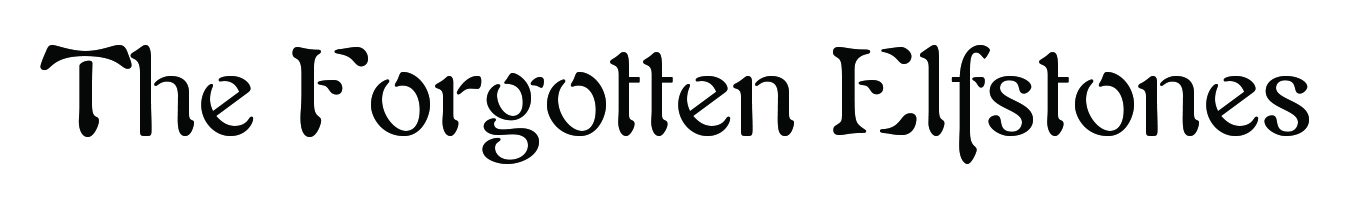
My last example of a fantasy font has some straight edges typical of sci-fi, yet the shapes of the letters look more ancient than futuristic, which makes it fantasy. Remember, there are many other kinds of fantasy fonts than just the brief sample shown here.
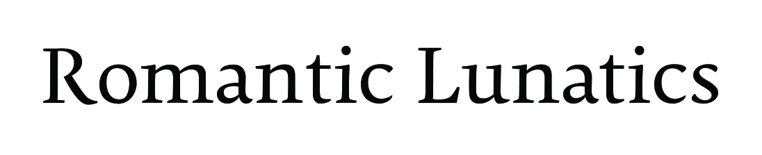
Font Fantasy Becker

ROMANCE FONTS

Romance fonts tend to be curvy, sometimes in a script, but not always. Beware that the script fonts are often harder to read and aren’t always available with a bold stroke.

Another consideration is that teen romance, paranormal romance, contemporary romance, historical romance, etc. are different subgenres, which may require different title fonts on their covers. It’s worth researching the top-selling books, especially those that are self-published, in your specific subgenre.

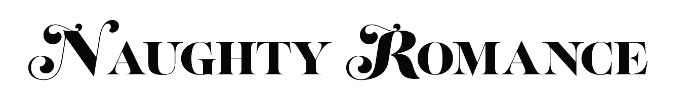
The Lust Script font below illustrates some of the curviness of romance fonts, along with some of the touches that you often see on capital letters and the ends of some letters like r’s and v’s. This font won’t come out well in all caps, by the way (though there is a non-script variation).

Font Romance Lust Script

Here, I used the same Lust Script font for the first letters and combined it with Lust (the non-script companion) at a reduced size. The result serves as a good reminder that you need to manually kern the title fonts (compare the large gap between the NA of Naughty and the RO of Romance).

Font Romance Lust and Script

The following Pollen font is more subtle. You may not want to use an extreme romance font for the title, subtitle, and author name. You need to do some research to find combinations that work well together.

Font Romance Pollen

There are many, many romance fonts to choose from, and some fonts work better in some romance subgenres than others. It’s worth doing some research to see what your options are. Script is not uncommon, but place emphasis on readability and ensuring that all your cover fonts work well together.

I made the following fancier option using pictures from ShutterStock (artist Augusto Cabral). You wouldn’t want to make much text fancy like this, but one short keyword that is easy to read might work.

Font Romance ShutterStock

Of course, you could do the same in other genres, too. But you really have to be careful not to go overboard. Using images or very fancy fonts can be hard to read, and they can detract from the main visual element of the cover. Keeping the cover fonts simple, but relevant, is a good philosophy.

But let me illustrate one more example of using imagery within the font itself. The following image is also from ShutterStock (artist Mr. High Sky).

Font Romance ShutterStock 2

WESTERN FONTS

Western fonts should look like something you’d see in a wanted poster or in a western movie, for example.

They should have a more rugged feel. The color scheme might look more like a desert or the sun (red, orange, yellow), though that doesn’t mean to make the font one of these colors. Search for some authentic western posters, books, movies, etc. to see what is common.

The following Rosewood font has some familiar western character.

Font Western Rosewood

So does this Smokum font.

Font Western Smokum

There are a variety of other kinds of fonts that clearly have a western style. Do some research to find the best one for your needs. But beware of a few that go overboard (like being entirely made out of rope).

HORROR FONTS

One way to illustrate horror is a small degree of fading. Too much fading renders the font unreadable.

Another way is to add dripping blood, but it’s not easy for that blood to look right.

Fortunately, there are many bloody, faded, and other chilling fonts to choose from, so you can find the font that fits your book perfectly with a little research. Filter out the ones that are overdone or which don’t quite pull the effect off correctly.

This Misproject font illustrates a small amount of fading away. It’s still readable.

Font Horror Misproject

Here is one more example of a horror font. This is American Shopworn.

Font Horror HWT American

While the Chiller font installed on your computer might seem convenient, it may be worth taking time to find something more appropriate. Again, don’t just limit yourself to one of the two examples that I provided to help illustrate the horror genre: Explore your options thoroughly, and also browse top sellers in your subgenre.

BODY TEXT

The body text needs to be very clear and easy to read.

Times New Roman may be overused.

Garamond, shown below, is a popular alternative.

Font General Garamond

There are other good fonts for body text, like Minion, which follows. Look at the ‘a’ and the ‘e’ to see the difference. Both of these are serif fonts, which have little marks at some letter ends to help aid in the reading.


Font General Minion

Georgia is a bolder font than Garamond, but is sometimes confused with Times New Roman.

OTHER GENRES

Another consideration, besides the genre, is the book’s era and setting. For historical fiction, it may help to signify the period more than the subgenre. For example, you might find a good font to represent the Victorian era for a Victorian novel.

The distinction between mystery, thriller, and suspense can get a little tricky. For mystery, you may be able to find a few icons to help serve as a guide, especially if your novel is similar. For example, check out the fonts used in the Murder She Wrote t.v. series or Agatha Christie’s mysteries. Whatever your genre is, you want to browse the covers of top sellers to get a feel for what the font is trying to convey and how they pull it off. Use my examples as a guide to get you thinking (e.g. sci-fi is futuristic, western is rugged, fantasy is magical or other-worldly).

For nonfiction, a very clear light serif or sans serif font is common on the cover. Clearly conveying the keywords in the thumbnail can be a valuable marketing tool for many nonfiction books.

There are many places to browse for fonts, but it may be best to start with a variety of genre-specific inquiries with Google, and remember to browse the covers of top sellers in your subgenre. Be careful where you download material from the internet. There are many sites, like Font Squirrel, Da Fonts, and fonts.com, offering free or low-cost fonts for commercial use, or you can buy font collections. Even Adobe offers a selection of fonts through TypeKit (Creative Cloud users can use TypeKit for free).

Chris McMullen

Note that I made up the names of the sample titles used to illustrate fonts. Any resemblance to any covers of books that actually use these titles or similar ones is purely coincidental.

Chris McMullen, Author of A Detailed Guide to Self-Publishing with Amazon and Other Online Booksellers

  • Volume 1 on formatting and publishing
  • Volume 2 on marketability and marketing
  • 4-in-1 Boxed set now available for Kindle and in print

Shutterstock and other Stock Photo Collections

Background image licensed through Shutterstock.com

Background image licensed through Shutterstock.com. You may not reuse, share, or download this image to your computer. If you wish to use this image, visit Shutterstock and license the image through them. 🙂

STOCK PHOTOS

If you design book covers, or even if you need images for the interior of the book, you either need to:

  • make your own images (illustrations or photographs)
  • find stock images to use
  • hire an artist to make images for you

If you make your own images, you can potentially customize your cover exactly as you want it… with the limitation of your ability to draw illustrations, take photographs, and use image-editing software. There is an art to photography, e.g. eliminating red-eye, getting the lighting and shadows just right, capturing the right facial expression, etc. It’s not as simple as it might seem.

If you hire an artist, you still need to question where the images come from. If the artist is using stock photos, for example, you want to know that they are properly licensed.

If you find your own stock images, here is what this entails:

  • other books may be using the same images (some very popular images appear on many self-published covers)
  • you still need to be able to incorporate them into a good design (it shouldn’t look like a simple cut-and-paste or a bulletin board layout, beware that filters may do more harm than good, multiple images must work well together, you have to find the ‘right’ image, and the font is important, too)
  • take time to search thoroughly; try various keywords and keyword phrases to help filter the results
  • a large image may work well by simply adding text, but then another cover that uses the same image will look very similar to yours; combining multiple images gives you a better chance for a unique design (even if the image is used on another book, the layout may be different), but it’s more challenging to combine separate images well
  • you need to read the licensing agreement thoroughly and carefully so that you understand the restrictions (you need stock photos that may be used for commercial purposes, specifically for e-books or print-on-demand books if you self-publish)
  • check the DPI of the image (300 DPI is desired; 96 or 72 DPI is likely to appear noticeably blurry and pixelated); also check the overall pixel dimensions for an e-book (and compare with your target screen size) and the size in inches for a print book (if you must enlarge the image for your intended use, that will greatly lower the resolution)
  • if you need just the central image, life will be simpler if the background is plain white; you need some photo-editing skills to remove an image from a background, especially a complicated background (well, all you really need to do is Google how to do this in PhotoShop and follow the instructions)

Don’t just use any image that you find on the internet; it’s probably protected by image use guidelines. Also, most of what you find on websites has very limited resolution (under 100 DPI).

What you really want is to find a collection of stock photos, which clearly spells out the licensing agreement so that you know if you can (or can’t) use the image for your intended purpose.

There are free stock photo collections, but you may be more likely to find quality images that fit your needs well with high enough resolution from low-cost stock image providers.

A couple of popular sites include Shutterstock and iStockphoto, but you can find more via Google.

http://www.shutterstock.com

http://www.istockphoto.com

Here are a few examples of relevant notes in licensing agreements. The numbers below correspond to Shutterstock’s licensing agreement (but you should read the actual and complete terms on any stock image provider’s website before using their images):

  • 2.b. In e-books and print-on-demand books. (Though if it’s primarily a photo book consisting of stock photos, one of the restrictions may apply.)
  • 2.b. Up to 250,000 reproductions. (If you’re planning to sell more books, you can consider the extended license, or maybe you can afford a custom cover from a top designer.)
  • You can use images on a website according to 2.a., but the use appears to be restricted in 6, 7, 8, and 10. For example, if you simply put the image as-is on your website, others would be able to download and use the image without paying for it (and you can be sure the company wants to prevent this possibility).

Most of the stock photo companies wish to prevent cover designers from displaying pre-made covers using their stock photos. Their fear is that some designers may then sell the same covers to multiple authors. Read the restrictions carefully. It may also be wise to contact the company for a written decision on the matter.

Be sure to read all of the restrictions to see if any apply to you. (I’m not an attorney and I can’t offer legal advice. If you wish to seek legal advice, consult with an attorney.)

I’ve been using ShutterStock recently. The images I’ve been browsing through are amazing. They often have 50 to 200 pages of the images that I’m searching for, and all of the images are impressive. Still, it takes careful and thorough searching to find the right image to meet your needs.

At ShutterStock, for example, you can either buy images on demand or sign up for a subscription. Buying 5 images for $49 works out to a reasonable cost (about $10 per image). You have 365 days to download all 5 images (note that you also need to use the image within 1 year of downloading it). Thus, it’s very easy to design a cover for under $100; it can be as little as $9.80 if you only need one image. Choose your images wisely. (And make sure that you don’t have the brand of the stock photo supplier on your image; if so, you either didn’t pay for the standard license for that image or you didn’t download the image properly.)

MORE STOCK PHOTO TIPS

If you plan to use stock photos, the following article has some very handy tips, like how to find out if the same image is available cheaper from another site.

http://mmjayewrites.com/2014/11/21/time-saving-tips-for-using-stockphoto-sites-plus-casting-for-fate-accompli

Chris McMullen

Copyright © 2014 Chris McMullen, Author of A Detailed Guide to Self-Publishing with Amazon and Other Online Booksellers

  • Volume 1 on formatting and publishing
  • Volume 2 on marketability and marketing
  • 4-in-1 Boxed set now available for Kindle and in print (both at special introductory prices)

Follow me at WordPress, find my author page on Facebook, or connect with me through Twitter.

Comments

Click here to jump to the comments section:

https://chrismcmullen.wordpress.com/2014/12/18/shutterstock-and-other-stock-photo-collections/#comments

Getting Squeezed (images on the new Author Central page at Amazon)

Squeezed

AUTHOR CENTRAL CHANGES

Have you checked out your Author Central page at Amazon recently?

The layout changed. (Well, every once in a while I see the old layout, but most of the time the new layout shows.)

If the new layout is showing, you’ll see a row of your cover images at the top, your blog or Twitter feeds below that, then your list of books.

You can view my page as an example, if you wish:

http://www.amazon.com/author/chrismcmullen

(Note the link above. Doesn’t that look better than http://www.amazon.com/Chris-McMullen/e/B002XH39DS? If you print your link on a bookmark, for example, the above format is simpler. The ‘secret’ is to log into Author Central, click Author Page, and follow the instructions where you see Author Page URL.)

Do you see the problem with the new author page layout? Every image is the same aspect ratio. Unfortunately, not all books have the same aspect ratio. So some book covers are getting squeezed at the top of the author page. You can really see it with my astronomy book above: The actual book cover is square, and so it appears noticeably distorted at the top of my author page.

In many ways, a wide image makes for an attractive thumbnail at Amazon, but not at the top of the new author page. Also, a narrower image works better for Kindle e-books when customers shop from a Paperwhite and other devices.

So what aspect ratio works best for the top of the author page? The ‘trick’ is to right-click an image and view the image info. I did this and learned that every image is scaled to 158px × 248px, which is an aspect ratio of 1:1.57. That’s pretty close to the Kindle Fire screen size, 1:1.6. In print, 5.5″ x 8.5″ and 5″ x 8″ are near enough matches, while 6″ x 9″ isn’t bad.

If you use 5″ x 7″, this will get squeezed a bit (since it’s 1:1.4). Large print books like 8″ x 10″ and 8.5″ x 11″ get squeezed significantly (these are less than 1:1.3). Square books, like 8.5″ x 8.5″ look quite distorted. If you have a landscape boxed set, that’s a disaster (unless the only text appears on sides of a box that don’t lie in the plane of the screen, then nobody can tell).

Does it really matter? Probably not too much. This is just an issue on the author page. It doesn’t affect the product page at all. Somebody has to click on your author profile from the product page just to get to your author page. Even then, it’s only the row of books at the top of the author page—the thumbnails that appear below are fine.

Read Tuesday

Imagine a Black Friday type of event just for book lovers.

You don’t have to imagine it. It’s called Read Tuesday, and it’s free: www.readtuesday.com.

Please support the Read Tuesday Thunderclap. This will help spread awareness on the morning of Read Tuesday (December 9, 2014). It’s easy to help:

  • Visit http://thndr.it/1CkO2Bg.
  • Click Facebook, Twitter, or Tumblr and sign in.
  • Customize the message. (Optional.)
  • Agree to the terms. All that will happen is that the Thunderclap post about Read Tuesday will go out the morning of December 9.
  • (The warning message simply means that Facebook, Twitter, or Tumblr need your permission to post the Thunderclap message on December 9. This is the only post that Thunderclap will make.)

Chris McMullen

Copyright © 2014 Chris McMullen, Author of A Detailed Guide to Self-Publishing with Amazon and Other Online Booksellers

  • Volume 1 on formatting and publishing
  • Volume 2 on marketability and marketing
  • Boxed set (of 4 books for less than the price of 2) now available for Kindle

Follow me at WordPress, find my author page on Facebook, or connect with me through Twitter.

Comments

Click here to jump to the comments section:

https://chrismcmullen.wordpress.com/2014/11/20/getting-squeezed-images-on-the-new-author-central-page-at-amazon/#comments

What Size Is Best for the Kindle Book Cover?


KINDLE COVER SIZE

You must choose both the size and the shape of your Kindle book cover:

  • What aspect ratio is best?
  • How many pixels should each dimension be?

ASPECT RATIO

You might think that the aspect ratio depends on the device. Not so fast! Which matters more?

  • How the cover appears among other thumbnails.
  • How the cover looks on the device itself.

Note that customers won’t even see the cover on the device until they buy the book. (And even then, the ‘start’ location will bypass the cover.)

Therefore, it seems more important to consider how the cover looks as a thumbnail.

So here is my suggestion:

  • Choose an aspect ratio that will look great as a thumbnail when customers are shopping.
  • Choose the pixel dimensions based on the device(s) that you’re targeting.

Of course, the dimensions must match the aspect ratio. The second point really means, “How many pixels should the height be?” (Once you know the aspect ratio and height, the width follows.)

THUMBNAIL

How do customers shop for Kindle books?

That’s the question that determines what aspect ratio will work best for the thumbnail.

Really, you want to ask how ‘your target audience’ will shop for Kindle books. That’s even better than knowing the general answer.

However, with most target audiences, customers shop for Kindle books a few common ways:

  • Even when customers own a Kindle device, they often prefer to browse for Kindle books at Amazon.com. It’s convenient, there are more options, you see more results on the screen, and you can send the book wirelessly to your device.
  • Many customers also browse for Kindle books on the device itself, which may be a Fire tablet or an iPad, for example. These thumbnails can be quite small, and on some devices they will show in grayscale.
  • Other customers will first see your Kindle book cover on your blog, advertised promotion, giveaway, bookmark, or other marketing tool.

What does this mean? It means that your Kindle book cover has to look good with a variety of possibilities in mind:

  • It should look great as a thumbnail at Amazon.com.
  • It should still look great as a smaller thumbnail on a Fire, iPad, iPhone, etc.
  • It should still look great as a black and white thumbnail on a Paperwhite, Kindle DX, etc.
  • It should also look great as a thumbnail on your website, in an advertisement, in a contest, on a bookmark, etc.

Actually, that’s only half the battle:

  • You want your book cover to look great all by itself.
  • You also want your book cover to be effective when it appears among several other thumbnails.

The thumbnail isn’t the only thing that matters. The full-size image matters, too.

But nobody will even check out your full-size image until the thumbnail does its job.

Once you find a design that works for your thumbnail, then you work toward perfecting the full-size image.

RESEARCH

So how do you decide what works best?

Go shopping. You don’t have to buy anything. Go window shopping:

  • Browse Kindle book covers at Amazon.com on your pc or laptop.
  • Also browse Kindle book covers on a Fire tablet. Borrow one, if necessary.
  • Also browse Kindle book covers on a black-and-white Kindle device.

Here are some important considerations (remember to look at the Kindle editions):

  • Note books where the title was very easy to read.
  • Note books where the central image really stood out.
  • Note books that had very clear titles and strong central images.
  • Note books where the cover looked great in color, but not in grayscale.
  • Note books where the cover looked great in grayscale, too.
  • What’s most common among books very similar to yours?

This will help you choose a font style and size that read well even in small thumbnails.

This will also help you choose a color scheme that creates great contrast both in color and in grayscale.

But we still have the issue of selecting the best aspect ratio.

So here are more points to consider:

  • Which aspect ratios look better to your eye? Does wider or narrower look better? (What you really want to know is, “Which looks better to your target audience?”)
  • Do wider or narrower covers seem out of place among other thumbnails?
  • Is it easier to read the title on wider or narrower thumbnails?

RECOMMENDATIONS

Let’s begin with Amazon’s recommendation.

The KDP help pages recommend an aspect ratio of 1.6 for your cover. This means that the height is 60% larger than the width.

  • This is ideal for fitting the cover in a Fire device. But no customers will see how it looks on your device until the thumbnail draws them in. So it’s more important to choose the right aspect ratio for your thumbnail than for the device.
  • On the other hand, multitudes of authors are using Amazon’s recommended 1.6 aspect ratio for their covers. So your cover may seem out of place (perhaps not in a good way) if you choose a different aspect ratio.

Amazon has recently raised its suggestion for pixel size to 4500 pixels on the longest side.

If you want an aspect ratio of 1.6 and 4500 pixels for the height, your cover should be 2813 x 4500 pixels.

Amazon will actually accept up to 10,000 pixels on the longest side, but that may be overkill.

A smaller cover may be fine, as most devices don’t have more than 2000 pixels across their screens. (Perhaps Amazon’s recommendation is partly looking toward the future.)

So 1250 x 2000 pixels or 1563 x 2500 pixels may be sufficient, at least until higher-resolution devices become much more common.

However, Amazon’s recommendation receives some criticism, such as:

  • An aspect ratio of 1.6 is very narrow.
  • It’s much narrower than most traditionally published print books, with which most readers are familiar with.
  • There is less room across on which to place your title. Wider covers make it easier to achieve a very readable title.
  • If you also publish in print, you probably can’t just use the front cover of your print book for your Kindle book if you wish to have an aspect ratio of 1.6.

Thus, other aspect ratios are also fairly popular.

An aspect ratio of 1.5 may have some merit:

  • It’s not as narrow as Amazon’s recommendation.
  • It provides a little more width for the title.
  • It matches the aspect ratio of the fairly popular 6″ x 9″ book (which is convenient if you publish a paperback of this size at CreateSpace, for example).
  • It will only be a little wider than the multitude of covers that follow Amazon’s recommendation, so it probably isn’t wide enough to seem out of place.

For an aspect ratio of 1.5, your cover could be 3000 x 4500, 1667 x 2500, or 1333 x 2000, for example.

If 1.5 doesn’t seem wide enough for you, a wider alternative is an aspect ratio of 1.33. This matches a printed 6″ x 8″ book, for example.

(Of course, inches are irrelevant to e-book cover design. What matters is the pixel count.)

An aspect ratio of 1.33 is wide enough to stand out among the popular 1.6 (and not necessarily in a good way, although to some it seems better—mostly, it may seem out of place if it’s badly outnumbered in thumbnail searches: that’s the key point, see what’s common among Kindle books very similar to yours). Going even wider than 1.33 is risky. Especially, landscape covers tend to stand out like a sore thumb.

For an aspect ratio of 1.33, your cover could be 3383 x 4500, 1880 x 2500, or 1504 x 2000.

PROMOTION

As you can see above, I used a picture of the Kindle book cover (as seen on the Paperwhite) for Julie Harper’s new release, Reading Comprehension for Girls, for this post. The cover was designed by Melissa Stevens (at theillustratedauthor.net).

It includes 48 fun short stories divided in 3 parts. Each story is followed by 4 multiple choice questions; answers can be found in the back. The print edition has 130 pages.

Chris McMullen

Copyright © 2014 Chris McMullen, Author of A Detailed Guide to Self-Publishing with Amazon and Other Online Booksellers

  • Volume 1 on formatting and publishing
  • Volume 2 on marketability and marketing

Feedback on Cover Design

feedback

The Importance of Cover Design

A great cover can do wonders for great content:

  • An appealing cover helps to get a book discovered among millions.
  • A cover that quickly signifies the genre and content helps attract the target audience.
  • A fantastic cover catches attention when sorting through several thumbnails.
  • A professional cover suggests that the content may also be professional.
  • Cover appeal can have a positive impact on a buyer’s mood and mindset.
  • Book covers play an important role in branding the book’s image.

However, a great cover won’t sell a lousy book. Once the target audience discovers the book, it’s up to the blurb and Look Inside to generate the sale. Once the book is sold, it’s up to excellent content to generate recommendations. Lousy content with a great cover will backfire with negative reviews.

A lousy cover can have a negative impact on good content:

  • If the cover doesn’t seem professional, shoppers will wonder if the content also lacks effort or quality.
  • If it attracts the wrong audience, the people who discover the book won’t buy it.
  • Covers are fashionable. People are reluctant to buy books with covers with styles they don’t like.
  • When a cover isn’t good, it has a negative impact on a buyer’s mood and mindset.

Feedback on Cover Design

Consider these thoughts:

  • Wouldn’t it be nice to know how your target audience reacts to your book before you publish your book?
  • Wouldn’t it be nice to know how your book cover rates in terms of the various elements of cover design?

The only thing that prevents you from doing these things is you.

It’s wise to research cover design to learn about the various elements. Even if you hire an illustrator, you should understand what the illustrator is trying to achieve (and communicate clearly with your designer).

But even if you master the theory, practice is another matter. Show your cover to people and get feedback. If you can get a few people with expertise in cover design to look at your cover, that will help you assess any issues that your cover-in-progress may have. The most important thing is to seek honest feedback from your target audience.

With successful premarketing, you may have some fans and followers starting out to help provide feedback for stages of your cover reveal. When publishing subsequent books, you may already have a fan club in place.

Cover feedback helps you build buzz for your book. It serves two purposes, so how could you possibly skip this valuable pre-publishing step?

Check out this new website: http://covercritics.com. It allows you to post a cover for the purpose of receiving a critique of the design. It’s worth checking it out and exploring the comments on covers already there, as you can learn helpful information about cover design from the comments. I can’t make any warranties or recommendations on posting your potential cover on this site, as I haven’t used this service myself, but I can emphasize the importance of receiving feedback. Even more important is learning how your target audience reacts to your cover.

Publishing Resources

I started this blog to provide free help with writing, publishing, and marketing. You can find many free articles on publishing and marketing by clicking one of the following links:

Chris McMullen, Author of A Detailed Guide to Self-Publishing with Amazon and Other Online Booksellers

Follow me at WordPress, find my author page on Facebook, or connect with me through Twitter.

What Does a Good Cover Do?

Cover designed by Melissa Stevens at http://www.theillustratedauthor.net

What a good book cover should do depends on your primary objective. For example,

  • If your main goal is to interest relevant readers in your book, then the cover is effective if it attracts your target audience.
  • If your main goal is to create fashion for your book, then the cover is effective if readers appreciate its style.
  • If your main goal is to please your family, then your cover should be geared to them.

I will focus on cover design geared toward attracting the target audience. This is what most authors and publishers strive to achieve.

The Importance of Cover Design

100% of readers see your book’s cover before they open the book. Some won’t open the book unless it looks inviting.

There are several ways that an effective cover may help to inspire interest or deter sales:

  • Customers see thumbnails in search results. Most covers have just a few seconds to catch the shopper’s attention and appeal to the shopper’s interests.
  • People see your cover in your various marketing endeavors. Your cover is a big part of your branding process.
  • Your cover makes the first impression on a buyer. You only get one chance to make a good first impression.
  • Books are read on airplanes, in trains, on park benches, and left on coffee tables. The cover is a marketing opportunity.
  • A readers will set the book down periodically. A good cover helps to renew interest in the story.

Designing the Cover

Focus on attracting the target audience:

  • It’s not just to grab attention. It needs to appeal to the specific target audience.
  • It needs to clearly signify the genre and content. Three seconds or no deal.
  • The cover must look professional. Buyers expect it to reflect the quality of the content.
  • The text must be easy to read. Key words should be especially clear.
  • The colors need to work well together.

How to Do It

Here are some tips:

  • Research and study the covers of top-selling books similar to yours, especially those which aren’t selling because of the author’s or publisher’s name recognition. This is what your target audience is accustomed to seeing. When they see covers like these, they ‘know’ (in three seconds) that these books are a good fit.
  • The main image (and cover as a whole) must attract the target audience and signify the genre and content. This image can make or break the sale. If your book has highly marketable content, it’s well worth the extra time or reasonable expense to find the ‘right’ image.
  • Don’t make the cover too busy. One central image sends a quicker, clearer signal.
  • Placing the main image according to the rule of thirds may attract more interest than placing it in the center of the front cover.
  • Many top covers follow the three-color rule: 60% primary, 30% secondary, 10% accent. Study color coordination (there are many free online resources) to find colors that work well together. If designing a paperback cover, note that colors often print much darker than they appear on the screen.
  • Select a font that fits the cover, genre, and content well. The font style plays a more pivotal role than most people realize. Buyers themselves often pass up a book based on font without even realizing it.
  • Get feedback from your target audience. This may also help you create a little buzz for your book.

When your cover is finished, remember your main objective. What matters most is whether or not it will attract the target audience.

Example

Look at the thumbnail that I included with this post. It’s for Cursive Handwriting Practice Workbook for Teens by Julie Harper; the cover was designed by Melissa Stevens (www.theillustratedauthor.net).

I’ll admit that when I first saw this book, I wondered if the artist and author had taken a risk with this cover. Then I realized that I’m not in the target audience. I think the art does appeal to teens. Especially, if you consider what typical educational resources look like, this might be a ‘cool’ alternative. The cursive element might be a little subtle: You see this with the first word in the title, a few words of the title written in cursive, and less obvious in the background. Most handwriting workbooks emphasize the handwriting element with a few very large handwritten letters or words. This cover went against the grain, which generally can be a risk. But the most important thing is if the book appeals to the specific target audience. This book does a good job of saying, effectively, “If you’re looking for a handwriting workbook that isn’t geared toward small children, check me out.”

Let me emphasize that this cover wasn’t designed (that’s my impression) to go against the grain. It was designed to attract the specific target audience. Focus on this element of cover design. It might also break a couple of the ‘rules’ of cover design. Remember, what matters most is how the cover appeals to the target audience and signifies the proper genre and content. Everything else is just a guideline.

Publishing Resources

I started this blog to provide free help with writing, publishing, and marketing. You can find many free articles on publishing and marketing by clicking one of the following links:

Chris McMullen, Author of A Detailed Guide to Self-Publishing with Amazon and Other Online Booksellers

Follow me at WordPress, find my author page on Facebook, or connect with me through Twitter.