

Amazon’s Look Inside
Kindle Direct Publishing (KDP) offers previews for how your e-book may look on the Kindle, Kindle Fire, Kindle Fire HD, Paperwhite, iPad, iPhone… but not the Look Inside.
Yet prospective customers checking out your book on Amazon see your book’s Look Inside before making the purchase.
The Look Inside can significantly impact sales.
At the same time, Kindle authors tend to experience more formatting issues with the Look Inside than on the Kindle, Kindle Fire, and most other devices.
In fact, it’s not uncommon for a book to look great on a Kindle device, but format incorrectly in the Look Inside.
This problem plagues indie authors self-publishing their books on Kindle. Once they finally master Kindle formatting, the Look Inside is the last big hurdle.
In this article, we’ll explore how to format for the Look Inside. One example we’ll examine in detail is how to create non-indented paragraphs that don’t indent in the Look Inside.
Why Doesn’t the Look Inside Format Right?
Well, the technical answer involves a discussion about what is “right.” The Look inside is ultimately generated by a program following instructions. In the end, the Look Inside is “right.”
It often seems like the formatting is wrong when the author compares the original Word file with the Look Inside.
Some of the formatting that may look right in Word can get lost in translation on the way to the Look Inside.
The Look Inside sees a set of HTML instructions generated from the Word file.
Note: Even though you may submit a Word document to KDP, what the device reads is a set of HTML instructions that tell it what to display—ultimately, your submitted file is converted into a mobi file, which essentially contains a set of HTML instructions based on the Word file that you submit.
Often, what the Look Inside displays from reading those instructions differs from what Word displays on the screen.
What a Kindle, Kindle Fire, iPhone, iPad, Kindle for PC, and the Look Inside display on the screen can vary from the same set of HTML instructions generated from a Word file.
The Look Inside interprets the HTML more strictly, which is why the formatting is hardest to get right for the Look Inside.
From Word to Kindle
Kindle doesn’t see the Word document the way you do. It sees a set of HTML instructions.
The beginning of the HTML defines a set of styles used in your Word file. For example, there is a style for heading, subheading, titles, and a Normal style for the paragraphs of your body text.
Kindle (or iPad, or whatever device is being used) displays the different parts of your book according to these different styles.
If you highlight all or part of a paragraph and change the formatting of that text in Word, this carries over into the HTML.
Then the HTML says something to the effect, “Use the normal style, but change the indent size and add italics.”
This is where the Look Inside problems can begin. The Look Inside may format according to the style, and disregard some of those exceptions created by highlighting selected paragraphs. Other issues can arise from unclosed HTML tags.
The HTML generated from a Word file can get pretty messy, with all sorts of style exceptions built into the HTML, with <span> tags dispersed throughout, and with font settings redefined within the paragraph blocks. (You don’t want the file to define font size or style within the paragraph blocks. Not only can this cause formatting problems, but the device user expects to have control over these settings.)
Microsoft Word’s Styles
Much of the problem can be resolved by using Microsoft Word’s built-in style functions religiously. Modify the heading, subheading, title, and Normal styles to suit your needs.
Then make a new style that’s essentially a copy of the Normal style for paragraphs that need to be non-indented. I’m going to call this the NoIndent style just to give it a name.
When you’re modifying the styles, click on the Format button and adjust the Paragraph settings, too. Set the First Line indent for the Normal Style. It might be something like 0.2″ (since the common 0.5″ would be really large on a device with a small screen, especially an iPhone or the basic Kindle). Don’t use the tab key at all (and don’t use the spacebar to create indents). For the NoIndent style, set First Line to 0.01″.
Notes:
- I specifically have Microsoft Word 2010 for Windows in mind. (Other versions may function similarly, though they can lead to important differences.)
- If you set First Line to “none” or zero, it won’t work. Use 0.01″. (If you try to make it too small, it won’t take.)
- Go to Special in the paragraph menu to find First Line, then set the By value next to it.
- You see all the styles at the top of the screen, on the right side of the toolbar, in the home tab.
- Right-click a style to modify it. When modifying the style, click the Format button to find the font and paragraph menus.
- You can even build pagebreaks into the styles. Click Format, select Paragraph, then click the Line and Page Breaks tab. There is an option to pagebreak before. If you have pagebreaks that aren’t respected, try this (but realize that a Look Inside displayed as a single, scrolling page isn’t going to implement this).
- To create a new style (for NoIndent, for example), click on the funny icon in the bottom-right corner of the styles menu on the home tab (the little icon is below the A’s where it says “Change Styles”). This will pull up a new window on the right side of the screen. Find the three buttons at the bottom of this window. Click the left button.
Apply the styles to sections of your document one by one. You can highlight a section and click the style, or you can place your cursor in a paragraph and click a paragraph style from the menu.
You want every block of text in your file to be associated with a particular style.
Except when you have to have different styles in the same paragraph (e.g. you wish to italicize, boldface, or underline specific text, or create subscripts or superscripts), you want the style to dictate the formatting. Go into the Font and Paragraph menus when modifying each style to create the formatting you want there. Don’t use the font and paragraph tools on the menu at the top of the screen to make these adjustments (except to adjust specific text, with something like italics, within the paragraph).
For example, set the linespacing in the paragraph menu by adjusting the style itself and applying the style to the text. Don’t do it by highlighting text and setting the linespacing.
Be sure to check the font menu when modifying each style (from the Format button). If you go into Advanced, you may find that Word’s defaults have adjusted the kerning for selected styles (you may or may not agree with these settings, so you should check them out). The font color should be automatic except when you need to apply a specific color to selected text.
You want to have a larger font size for headings and subheadings than the normal text, but you want to achieve this by setting the font size within each style. If you select text and apply a font size or style to the selected text, this causes problems when an e-reader interprets the HTML instructions for your file.
Check the “Automatically Update” box when modifying each style if you want changes to that style to be applied to text that has already been set to that style.
Word’s styles can get mixed up. What you want to do is start with a document as clean as possible (in the worst-case scenario, this can be achieved by cutting and pasting your document into Notepad and then back into Word). Then apply one style to every section to avoid any mix-ups.
Don’t select text and set specific font styles (e.g. Georgia). Don’t select whole paragraphs and set linespacing, indents, or other paragraph options. Instead, apply a specific style to those paragraphs. Make the paragraph adjustments in the style (for every paragraph of that style in your document), and apply the style to the paragraphs rather than modifying the paragraphs through the toolbar at the top of the screen (except by clicking the styles, like Title or Normal, found on that toolbar).
How to Create Non-Indented Paragraphs
Let’s work through a concrete example that plagues the Look Insides of many Kindle e-books.
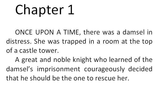
Most traditionally published books don’t indent the first paragraph of each chapter. Popular novels do indent paragraphs, but not usually the first paragraph of the chapter. Check out several popular traditionally published print books. If you understand what I mean by “not indenting the first paragraph of the chapter” (see the two pictures below) you should observe that this is very common among those books.
Examine the two examples that follow. The first example has all of the paragraphs indented. The second example doesn’t indent the first paragraph of the chapter. The second example is very common among traditionally published books. However, it can be a challenge to implement this on the Look Inside. (Many traditionally published books put the first few words in CAPS in e-books, instead of using drop caps, as drop caps can format improperly on some devices. Tip: If you write fiction where this is common, try putting the first few words of your blurb in CAPS, too. I’ve seen this done effectively in the blurbs of some popular traditionally published books.)

Even if the first paragraph appears non-indented on the Kindle device, it may still appear indented on the Look Inside. But there are ways to get this right.
Let me illustrate the wrong ways first. Definitely, don’t use the tab key to indent some paragraphs, thinking this will correctly distinguish between which paragraphs are or aren’t indented. This might seem intuitive, but it doesn’t work (there will be inconsistencies). Similarly, don’t use the spacebar to create indents; it doesn’t work either.
Here is another wrong way. Better, but still wrong. If you highlight the first paragraph, click on the funny little icon in the bottom-right corner of the paragraph group on the home tab, change Special to First Line, and set By to 0.01″, it might not work. It will work on the screen and may work on most devices, but may not work on the Look Inside.
Here’s the problem. You can see the problem firsthand by looking at the HTML. You don’t need to know anything about HTML to peek at it and learn what’s going on. If you want to see Word’s HTML, Save As a filtered webpage (you want the one called Webpage, Filtered). Click Yes to the question that pops up. Find this new file on your computer (e.g. it might be in My Documents; it will be wherever you just saved it to). Right-click this HTML file and Open With Notepad.
When I adjusted the first paragraph’s indent the wrong way, as I outlined two paragraphs ago, the paragraph tag for the first paragraph looks like this:
<p class=MsoNormal style=’text-indent:.7pt’>
Compare this with the second paragraph:
<p class=MsoNormal>
You don’t have to know HTML to see the difference. Each paragraph sets the style to Normal. The first paragraph says to indent 7 points (0.01 inches).
The style=’text-indent:7pt’ setting will tell some devices to ignore the Normal style and indent the first paragraph 7 points (very little).
But the Look Inside may not accept this override. The Look Inside sees that you’re using the Normal style, which was previously defined to indent 0.2″. There are two different sets of instructions.
The better way is to provide a single set of instructions. That leaves less to interpretation.
This time, instead of highlighting the first paragraph and changing First Line from the home tab, I’m going to define a NoIndent style. I’ll do this by creating a new style based on the Normal style, and give it the name NoIndent (the last bullet in the section above called Microsoft Word’s Styles explains how). Then I’ll modify the NoIndent style (again, look for the bullets in the previous section for instructions). While modifying the NoIndent style, click Format, choose Paragraph, and set First Line there.
Now I simply place my cursor anywhere in the first paragraph and click the NoIndent style from the home tab. Prest-o, Change-o!
This time, the paragraph tag for the first paragraph looks like this:
<p class=MsoNoIndent>
Now this paragraph only has one set of instructions. When Amazon’s Look Inside reads the Kindle e-book, the class=MsoNoIndent statement will tell it to indent the paragraph according to the previously defined NoIndent style, which says to indent just 0.01 inches.
You can improve on this. Find the style definition for the NoIndent style in the beginning of the HTML file. Change 7pt or 0.01in (whichever it says) to 0 (that’s the number zero, not the letter O). This doesn’t work in Word, but it does work in the HTML file.
Notes:
- Don’t open the HTML file in Word. Use Notepad to examine and modify the HTML.
- If you have images in your file, you want to create a compressed zipped folder as explained in Amazon’s free guide, Building Your Book for Kindle.
- Also look for span tags that include font definitions. If you remove these, be sure to remove the closing tags, too, which look like </span>. The Find tool can help you locate these.
- Search for text-indent with the Find tool to see if any paragraphs are indenting through this setting instead of through a style definition.
- Seemingly endless italics, boldface, or underline that’s not intended to be there may be caused by unclosed <i>, <b>, or <u> tags. For example, <i>italics</i> makes the word “italics” appear italicized. If the closing tag, </i> is missing (or typed incorrectly), the italics will keep going and going and going…
- Other things you might look for are images. For example, instead of specifying the width and height in pixels, for large pictures that you’d like to fill the screen, you might remove the current width and height statements and replace them with width=”100%” (don’t set both the width and height this way; just set the width; however, if you have really skinny pictures, i.e. skinnier than the Kindle Fire, you might prefer to set the height instead of the width).
Chris McMullen
Author of A Detailed Guide to Self-Publishing with Amazon and Other Online Booksellers
- Volume 1 on formatting and publishing
- Volume 2 on marketability and marketing
Follow me at WordPress, find my author page on Facebook, or connect with me through Twitter.
Comments
Click here to jump to the comments section:
https://chrismcmullen.wordpress.com/2014/05/18/formatting-the-look-inside/#comments

Aargh! Why does anyone use Word, styles or no styles? I’m assuming you mean you have to create the Look Inside text separately – but Word is notorious for inserting flaky HTML.
When I get to that point, I suppose I’ll find out.
Just recently I found out that ragged right margins are NOT the fault of the indie ebook author – that a perfectly-formatted file for Kindle can display as ragged in the Look Inside. I thought it was the mark of an amateur – but the ebook itself was fine.
I haven’t found THE answer yet, but I’m wary of using Word even though I’m good with Styles. Too much complexity, too many things to go wrong. Right now my text is a formatter’s nightmare, though I plan to clean it up when I’m finished with this revision, and start Book 2 clean.
Thanks for the info, Chris. Also note: the link from the main page worked fine – but you can name it anything you want (ie something shorter), or simply underline a word or phrase in the text (I put in a line which asks for comments), and choose that as your link NAME.
Alicia
Word is popular for its convenience, i.e. it’s readily available. Amazon has made Kindle much more Word-friendly, though. Kindly, Chris. 🙂
I feel like I have spent years of my life fixing the HTML that Word generates. I myself use a simple text editor for writing (usually iA Writer) and Sigil for structuring and formatting the EPUB. Amazon’s Kindlegen application will convert an EPUB to MOBI for upload.
One irritation I haven’t solved yet is the even justification of headings that can look awful…
Simple text editors certainly have advantages when creating e-books, and using Sigil to format an epub may be the better approach. It also has the advantage that most other e-book publishing services accept epub (and, as you say, it works for KDP, too). It’s probably easy to center headings than to force left alignment (as what seems like should be set to left can come out justified; although there is a prescription for left justified in the Word to HTML approach).
I didn’t read this whole article because I just checked out a couple of my Look Inside samples and they are perfect! Exactly as I intended them to look! I use Word, and I always upload an HTML to KDP because that’s what they tell you to do. I do the Smashwords first because they are so much pickier and the only thing I add to the Kindle is page breaks. What’s hard about that? Smashwords won’t allow block paragraphs or hanging indentions so I don’t use them in Kindle either.
It’s a wonderful feeling for the Look Inside to come out as intended. Congratulations. 🙂 Uploading the HTML offers some benefits; that’s the way I go, too. Reading the Smashwords Style Guide and formatting the e-book properly to pass the Autovetter would be a good precursor to publishing with Kindle.
KDP has automatically selected most of the first chapter of my book for the ‘Look Inside’ preview. However, I’d like to manually select parts of each chapter myself – how can I do this?
Thanks, Wendy.
Unfortunately, you can’t. You can get KDP to adjust the percentage of the book shown in the Look Inside, but it will be in order from the beginning.
How can I reset the Look Inside percentage?
You can click Contact Support at Author Central, or, for an ebook, at KDP.
Thank you for the advice! I’ve followed your directions by doing all formatting religiously via styles, and the downloadable version of the book looks great. It’s a very normally-formatted novel with chapter headings and some block quotes. Nothing wild.
However, the Look Inside has a ragged right edge and I am torn between justifying the normal (body text) style of the novel so that the LI is justified and looks more professional. Would you recommend this?
Doing a survey of popular ebook-only (no paperback) books reveals that most of these have a ragged right edge on LI! So maybe I should leave the body text left-indented, because they know what they’re doing and they know the repercussions of forcing justifications, right?
Can forcing justification on the body text style cause a problem with the actual downloadable text? It appears to preview OK.
My preference is for a justified look inside, but if the issue is common among similar books, I would be tempted to fit in.
Thank you for the advice! I’ve followed your directions by doing all formatting religiously via styles, and the downloadable version of the book looks great. It’s a very normally-formatted novel with chapter headings and some block quotes. Nothing wild.
However, the Look Inside has a ragged right edge and I am torn between justifying the normal (body text) style of the novel so that the LI is justified and looks more professional. Would you recommend this?
Doing a survey of popular ebook-only (no paperback) books reveals that most of these have a ragged right edge on LI! So maybe I should leave the body text left-indented, because they know what they’re doing and they know the repercussions of forcing justifications, right?
Can forcing justification on the body text style cause a problem with the actual downloadable text? It appears to preview just fine.
My preference is to justify body text, since my feeling is that it makes the Look Inside more marketable, in general, but if it’s common with similar books, it’s also generally okay to follow suit. (The bigger repercussions come from a third option, forcing body alignment.) In your case, I would probably leave it alone for now and see how it goes.
And by forcing alignment, you mean just highlighting in word and choosing “justify” rather than justifying via a style, correct?
I would definitely use a style. (If you’re going beyond Word, I would do it in the style definitions.) I wouldn’t highlight in Word for paragraph formatting.
Hello, I’ve read through these but am not completely clear on one issue: the page breaks.
Is there, or is there not a way to have page breaks in Look Inside the Book?
Is there someone I can hire to fix the formatting for my eBook for Kindle? Any help is appreciated, thanks!
You only see page breaks in the Look Inside when you (A) open the Look Inside for a print edition (B) open the Look Inside for a print replica book created with the Kindle Textbook Creator, designed for e-textbooks (C) open the Look Inside for an illustrated children’s e-book that was created using the Kindle Kids’ Book Creator or by someone proficient in fixed-format e-books.
Most e-books are reflowable, not fixed format. So when you open the Look Inside for a typical Kindle e-book on Amazon using a web browser, you don’t see pages at all. What you see looks like a typical website, that is the content scrolls down from the top to the bottom. So there can’t be a page break in the Look Inside. (If instead you download a free sample onto a Kindle device, then it displays the same way that the full book would appear, and that free sample will respect page breaks.)
Instead of a page break, there can be space added between paragraphs, and this feature can be translated to the Look Inside feature, if done correctly (ideally, through the paragraph styles feature, creating a special paragraph style for the paragraph where you want to add space).