Blogging Style

Checking out one another’s blogs, we see that we have unique blogging styles. Some bloggers have a very clear blogging brand. Do you recognize some bloggers just from a glimpse of the heading and picture, without having to check out the photo or name to see who posted it? These bloggers have already established a recurring theme, such that all of their posts look similar.

Have you ever visited a blog where a quick inspection of the homepage tells you precisely what the blogger does besides blogging? Sometimes, it’s obvious that a blogger has a hobby of photographing landscapes or that the blogger loves to write children’s books, yet there is no advertisement. These bloggers have developed themes that clearly match their passions.

Are there any bloggers where you know in advance what to expect from their posts? Maybe they always post poems, quotes, jokes, or essays. These bloggers have achieved a brand through consistency.

Do you know any bloggers who show variety in their posts and often surprise you? Their creativity might arouse your curiosity.

With every award nomination, bloggers post a list of other blogs that they like. I would like to thank those of you who have nominated my humble blog. Awards might not be my thing, but I was thinking, I can still share some blogs that I like. It shouldn’t take an award to get us to acknowledge some other blogs and what we like about them, right?

There are many blogs that I like, and thousands of good ones that I have yet to discover. Please allow me to highlight a few that exemplify a variety of blogging styles (since that is that theme of this post), and please don’t be offended if I didn’t mention your blog. Chances are that I really like your blog, too, even if it’s not on this list (and if I’m a follower or occasionally like your posts, that is, in fact, the case – because I only like and follow when I truly like the blog).

There are also a few blogs that look very nice, but which I don’t choose to like or follow because they primarily involve a topic, sometimes controversial or adult-oriented, which I generally don’t read. It’s not because I dislike these blogs, they just don’t happen to coincide with my interests. I hope you understand. I always check out the blog of anyone who checks out my blog.

Again, this is not a contest where I’m ranking my favorite blogs. I picked a few blogs that happen to represent varied styles. If your blog isn’t on this list, it’s not because I don’t enjoy it very much and it’s not because it’s not among my favorites.

(1) I recently discovered Ashley Bollinger’s blog. Check out the consistency in the style of headings that she uses on her homepage. One of her recent posts includes tips for better blogging.

http://ashleybollinger.wordpress.com/

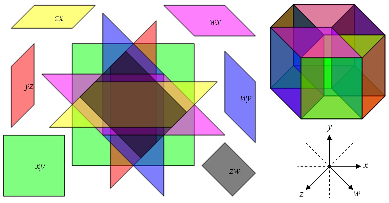
(2) Robert’s blog consistently features some cool geometric objects.

http://robertlovespi.wordpress.com/

(3) There are several poetry blogs that I follow where the artwork and poetry are both amazing (in my humble opinion). For example, look for one of the poems posted on Keli’s blog to see powerful emotions correlated between the image and the poem.

http://kelihasablog.wordpress.com/

(4) Julie Farrell has a very positive blog. The internet and world can certainly benefit from more people spreading positivity like this.

http://youaresunshine.wordpress.com/

(5) Nhan-Fiction often posts little motivational statements that can help provide some needed inspiration.

http://nhanfiction.com/

(6) Natalia Marks features nice photography. She often has a picture of the day.

http://nataliamaks.wordpress.com/

(7) Mandy Eve Barnett usually starts out with a definition, which gives her style a little signature.

http://mandyevebarnett.com/

There are many other blogs that I regularly enjoy, too. Remember, my goal was to show some variety, not to list all of my favorites.

Author Power

Mighty Author Pic

“The pen is mightier than the sword.” (Edward Bulwer-Lytton, in Richilieu, Or the Conspiracy)

Authors have power through their writing.

Writers are creators. They can create new worlds, new people, new creatures, new ideas. Some aspire to create better worlds. Diversions from reality.

Authors share experiences. Readers can imagine traveling anywhere in the world (universe, even) without ever stepping out of their homes.

Writers can convey powerful emotions. Simply through words.

Wordsmiths make the letters themselves dance on a sheet of paper. Flow gracefully through action. Or. Stop. Suddenly. The reader enjoys the text without any idea as to how much care was put into the selection of each and every word.

Authors express themselves. And they express others. And others who don’t even exist, except in print and in the minds of those who have read their writing.

Writers disguise books that help people rebel against totalitarianism. Writers instigate revolutions. Writers spread fear through propaganda. Writers market freedom.

Poets sing. It may be beautiful, but very often it’s not. Very often, they sing suffering. And they sing it loud and clear. Yet it helps.

Authors plant seeds. Little ideas. Revolutionary ideas. Ideas that get people thinking. People with young and agile minds. People who may challenge the status quo. Rebels seeking a cause. Ideas that may grow with nutrients, time, water, and nurture.

The power of writers can be dangerous. Writers have much freedom to exercise, and coming with it is a great responsibility.

We may be weak in life, yet powerful in print.

It’s not the size of the pen that matters, nor the length of the words, nor how many words are written. It’s how the pen is wielded that really matters.

“Does he really think big emotions come from big words?” (Ernest Hemingway, in response to William Faulkner’s criticism, “He has never been known to use a word that might send his reader to the dictionary.”)

Chris McMullen, self-published author of A Detailed Guide to Self-Publishing with Amazon and Other Online Booksellers (Volumes 1 and 2)

The Most Common yet Critical Publishing Mistake (?)

Perhaps the most common mistake that I see when shopping for self-published books is a target audience mismatch. Either many indie authors don’t realize how much this may deter sales or they didn’t consider how significantly this affects marketing when they were selecting the title, designing the cover, and preparing the blurb.

When authors with slow sales ask what they are doing wrong, very often their books suffer from this same marketing flaw.

In the simplest terms, the problem will seem very obvious, but knowing is only half the battle:

Imagine that you’re browsing through search results for a sci-fi novel. Are you likely to click on thumbnails that look like they might be mysteries, romances, or fantasies? If it doesn’t look like a sci-fi novel, will you click on the book? What if the title doesn’t sound like sci-fi? What if the cover looks suitable for kids, but you’re an adult?

After you click on the book, if the blurb sounds like adventure or erotica instead of sci-fi, will you look inside? What if it sounds like a blend of sci-fi, romance, and mystery? If you were in the mood for sci-fi, maybe you would prefer pure sci-fi.

(Don’t contemplate the exceptions. It’s what the majority will do that influences your sales.)

When you look inside, if it starts out like historical fiction or comedy, will that satisfy your hunger for sci-fi?

If you’re a sci-fi fan, you know what sci-fi covers usually look like, what sci-fi titles often sound like, what you expect to see in the blurb, how the novels usually begin, etc. When readers are looking for something in particular, they usually don’t settle for something else.

When a thumbnail cover looks like genre A, but the blurb sounds like genre B, then all of the potential readers who are attracted to the cover won’t be buying the book, and all of the potential readers who would be attracted to the description will never check it out.

A target audience mismatch is a huge sales killer!

Even a slight mismatch is a major problem. For example, readers should be able to distinguish between contemporary romance, historical romance, teen romance, and erotica. A contemporary romance cover with too much sex appeal might be mistaken for erotica, and vice-versa.

I understand that it’s not easy for most writers to design excellent covers. But it’s not enough to just have an appealing cover. If it doesn’t attract the right audience, the cover isn’t helping at all.

Many authors struggle with their image searches, often settling on stock photos that are in the ballpark, but really aren’t a good fit for the book. Others get a concept in their minds that either isn’t a good fit for the book or that they can’t pull off well enough for it to work. If the cover doesn’t appeal to the intended audience, this isn’t satisfactory.

If you’re in the mood for a candy bar, you won’t purchase a snack that looks like potato chips from a vending machine (and those in the mood for potato chips that wind up with chocolate will be irate customers). It’s no different and should be no less obvious for books.

If you value sales, don’t make this costly mistake.

Develop the title, cover, blurb, and Look Inside with the specific target audience in mind.

Check out other covers in the same genre to see what buyers are accustomed to seeing. Make sure that your cover appeals to the right audience. Receive feedback from readers in the target audience as you develop your cover.

You don’t need to copy the ideas of the bestsellers; in fact, copycat covers may backfire. But you do need to see what’s common.

If you absolutely loathe a very common concept, you can work around it. For example, if you write contemporary romance and find that most covers feature a romantic couple, but refuse to put people on your cover, you can find other elements common in the genre that signify romance. It is possible to make a cover without people that clearly looks like a romance (how about a red heart?). However, be sure that you do this for the right reasons. Don’t sacrifice your sales simply because you can’t find people to put on your cover; do it because it’s something you believe in so firmly that you don’t mind if it deters sales.

Do similar research for the title and blurb. Ensure that the title, cover, blurb, and Look Inside present a unified message regarding the content and genre. Have people in your target audience check these out before you publish, specifically asking them if they all sound like your book’s specific genre.

The cover and title are most important because if these send the wrong message, nothing else matters. Next, the blurb and Look Inside must reinforce the same signals.

Will the story and characters also appeal to your target audience? This is very important for reviews and the prospects for valuable word-of-mouth sales.

Chris McMullen, self-published author of A Detailed Guide to Self-Publishing with Amazon and Other Online Booksellers (Volumes 1 and 2)

Wear the Indie Badge Proudly

Badge

Authors who choose to self-publish should do so proudly.

Times have changed. Not too long ago, there were very few self-publishers. Most had a garage full of books. Some paid large sums of money to vanity presses.

Now the majority of authors are self-published. Authors no longer need to pay money to be self-published; it can be done for free. With print-on-demand and eBook technology, they no longer need to stock up on thousands of books.

Some of the companies who have made self-publishing possible are no small names. Authors can publish paperbacks with CreateSpace – an Amazon company – and eBooks with Amazon (using Kindle Direct Publishing) and Barnes and Noble (through Nook), for example.

CreateSpace

Kindle

Nook

A number of indie authors have achieved high levels of success with top-selling titles. Amazon periodically features indie success stories on their homepage. Reputable newspapers and magazines are highlighting self-publishing achievements.

Hugh Howey

Amanda Hocking

There is no reason to be embarrassed to be a self-published author:

  • Indie authors have strength in numbers.
  • Self-publishing represents freedom of creativity, content, and style.
  • Some traditionally published authors are choosing to self-publish their new titles.
  • There are many high-quality indie books out there, which show the true potential of self-publishing.

Move to Self-Publishing

Authors who choose to wear the self-publishing badge should wear it proudly.

They should also polish their badges so that they shine bright by perfecting their books and making them look as professional as possible. This improves the image of self-publishing for all indies, and also improves their own chances of success.

Chris McMullen, self-published author of A Detailed Guide to Self-Publishing with Amazon and Other Online Booksellers (Volumes 1 and 2)

Branding Distinction for Authors

What distinguishes your book from others? What makes it special? How is it unique?

You don’t just want people in your target audience to see your name and the name of your book repeatedly. You want people in your target audience to associate something with the kinds of books that you write.

Knowing the author’s name or the book’s title provides recognition when they see it. You don’t just want people to buy your book when they recognize it. You want people to search for your book.

If you brand a distinction for your writing, people in your target audience may search for your book when they’re next in the market for a book of that kind. This is better than recognition.

When people in your target audience discover your name or the title of your book while they interact with you, you’re branding your name or your book’s title. It may be more effective to brand a signature that distinguishes your writing. Give your target audience a compelling reason to search for your book.

First, you must identify your target audience. Secondly, you must market your brand effectively – e.g. through discovery or by providing valuable content (whereas self-promotion and being too frequently visible may get you tuned out).

Interact with people in your target audience and let them discover that you’re a writer and what makes your work special. The more you write or say, the less people will remember. You want the emphasis on a concise phrase (just a few words, nowhere near an entire sentence) that brands your specialty and something to go along with it – your name, your book’s title, or the name of a series, especially if it’s very short – so that they can easily find it when they’re ready to search for it.

Here are some examples of how to brand distinction:

  • Your Name, writer of clean romance
  • Series Title, featuring Brooklyn’s modern day Sherlock Holmes
  • Book Title, a dancing guide for people with two left feet
  • Author’s Name, specializing in vampire erotica
  • Workbook Series, math for children with ADHD
  • Name of Book, sick of implausibly perfect characters?

Chris McMullen, self-published author of A Detailed Guide to Self-Publishing with Amazon and Other Online Booksellers (Volume 2, on editing/marketing, is now available)

Murphy’s Laws of Writing

Writing

(1) You are more likely to be interrupted when you’re in the middle of a very deep thought. Silencing your phone, sending the kids out, and disabling the doorbell simply inspire Murphy’s creativity.

(2) Your muse will abandon you whenever you need her the most. But don’t worry: She’ll return as soon as you become too preoccupied to write.

(3) Your best ideas are most likely to come when you don’t have anything to write with or to write on. You’re also likely to be frequently interrupted between your moment of inspiration and the moment you’re able to jot it down.

(4) Whenever you correct a set of typos, you introduce some new ones.

(5) The fewer words you write, the greater the chances that there will be a glaring typo.

(6) Your worst typos are most likely to occur in the most prominent places, such as the first paragraph of the book or the book description.

(7) It’s much easier to see somebody else’s mistakes than it is to find your own.

(8) Not checking your preview or proof is like waving a large red flag with Murphy’s name on it.

(9) If you’re not sure about something that you’re writing, but don’t take the time to check, it will probably be wrong. However, if you do take the time to check, it will probably be right.

(10) The more people who read your writing, the greater the chances that there will be an embarrassing mistake in it. Presenting it to a large audience via PowerPoint improves the odds.

(11) After submitting revisions, if you quickly thumb through your book, your eye is very likely to spot a typo.

(12) The more frequently you check your sales report, the more likely you are to be disappointed.

(13) The more frequently you check your book reviews, the more likely you are to be disappointed.

(14) You’re much more unlikely to see a sale post on your report while you’re spending money.

(15) A good review is 100 times more likely to disappear than a bad review.

(16) One stupid comment that you make in the most remote corners of the internet is far more likely to generate publicity than anything else that you do.

(17) If you only have one copy of your file, this improves the chances that the file will become corrupt. The closer the book is to completion, the greater the odds.

(18) If all of the versions of your file are stored on the same computer, this improves the chances that the hard drive will crash.

(19) If you download a program to help with your book without paying attention to where the file is saved, it will be buried in the least obvious place.

(20) If you need to revise your book, but didn’t keep track of the location and name of the most recent file, you’re more likely to reintroduce old typos when you correct new ones.

Chris McMullen, self-published author of A Detailed Guide to Self-Publishing with Amazon and Other Online Booksellers (Volume 2 now available)

A Humble Little Book

Part 1

She worked from 9 to 5. It was a boring job, but it paid the bills.

From 6 to 10, she sat at her computer, typing a book. This was very fun, but just a hobby.

Several months later, her book was finished, but not yet complete. She spent a few more months reading, revising, proofreading, editing, perfecting.

Then it was time to share her work. She viewed her writing as a hobby, not as a profession. So she opted to self-publish.

Specifications. Formatting. Googling computer skills. Researching. PDF conversion. Formatting problems. Asking for help. Reformatting. Not the fun part of her hobby, but at the same time, she was growing anxious. So thrilling and nervous at the same time!

She thought about hiring an editor to help revise and format her book. She considered hiring a cover designer. But as this was just a hobby, should would settle for a humble little book. However, she did proofread it carefully again, and even sought help from friends.

The description was the hardest part to write. All in all, she wrote a dozen descriptions, and the last didn’t remotely resemble the first. It wasn’t a killer blurb, but she researched descriptions of similar books and sought advice from friends. It would suffice.

The biography was a stumper, too. Qualifications? Experience? Skills? Background? Then she realized that she wasn’t writing a resume. Writing was her hobby, not her profession. Readers might be interested in her life experience, not her writing career.

Author photo… (she was a little shy). But her writing was very personal, and she was sharing that. So she would share her photo, too. Not glamorous, but much better than the DMV.

Approve Proof. Click! Ta-da! Celebration coming on!

There it is on Amazon. Check that out. She showed her friends and family. Some pats on the back. A show of support. A little unexpected criticism.

Way down the search results. No reviews. Occasional sales. Well, she wasn’t a bestselling author; not bad for a hobby. Wrote and published a book: Quite an accomplishment!

Part 2

He saw the thumbnail. Not a Picasso. Not eye-popping. But there was something about it. So he clicked the link.

Didn’t sound like the popular books. But it was intriguing. So he looked inside.

Wasn’t fancy. But it was nice enough. And the story caught his interest. So he bought it.

Wasn’t flawless. A few typos. An occasional formatting mistake. But not enough to detract from the story. So he read it.

Wasn’t a nail-biter. Not a page-turner. Yet he enjoyed the story. So he finished it.

He even left a review and told a few friends.

Part 3

It wasn’t a bestseller. But it sold occasionally.

She didn’t market avidly. Yet many (to her) people read her book and truly enjoyed the story. She touched their minds. They shared experiences and emotions that she created. And they appreciated this.

She continued her hobby.

It was a humble little book. Yet it was a success.

Chris McMullen, self-published author of A Detailed Guide to Self-Publishing with Amazon and Other Online Booksellers (Volume 2 now available)

Professional Touches that Make Books Stand out

Design Marks

Small professional touches on the cover, title page, copyright page, and first pages can make a big difference. They may be little design marks, but they help to create a favorable impression.

Self-published books are competing against traditionally published books. Some books appear very much self-published at a glance, others are obviously traditionally published, and there are also many in between – those that use an imprint and look very nice, but not quite.

When we’re buying books, we prefer to find those that look professional. For this reason, all publishers – self or traditional – want their books to look professional.

One way to tell is to carefully examine the cover and Look Inside. Don’t just read the first chapter: If you’re looking for a professional book, look for visual clues before investing time on Chapter 1.

Following are a few examples. I’m not affiliated with any of these authors in any way. I’ve never met or interacted with any of these authors. I haven’t even read these books (well, not yet): I chose them for the professional touches that they illustrate, not because I wanted to recommend the content.

(1) Enchantment by Guy Kawasaki:

http://amzn.com/1591845831

See the gold starburst on the paperback cover. Such a starburst doesn’t need to be an award; it can be any note worth highlighting, although in fiction it’s usually an award. (By the way, although this book was published with Penguin, this author has recently self-published a book with CreateSpace.)

Starburst

Look at the pictures in the Look Inside of the Kindle edition. These are not just the front cover repeated inside, but are sending a unified message with the front cover by using the same butterfly.

Interestingly, the Look Inside for the paperback brings up the “Kindle edition” (or so it says), but when you click on the Kindle edition and then Look Inside, it’s different. The actual Kindle’s Look Inside includes a logo, for example. The logo is another professional touch.

Study the copyright page. Every traditionally published book has a very detailed, professional-looking copyright page. Virtually every self-published book has a minimal (if any) copyright page.

Why? Because self-publishers are thinking (A) customers don’t care about the copyright page and (B) they want to get to Chapter 1 as soon as possible, hoping to hook the reader who begins reading. Think about why traditional publishers don’t similarly minimize their copyright pages. Their copyright pages look very professional.

Customers don’t stop and stare at the traditionally published copyright pages. They pass right over them. It’s not going to be a delay on the potential customer’s route to Chapter 1. However, customers will catch a glimpse of the copyright page as they skip past it.

When customers see the minimal copyright page, it creates the impression that the book is self-published. Not much effort was put into this page (perhaps like the rest of the book?). When they catch a glimpse of the long, detailed, professional-looking copyright pages of traditional publishers, it makes the impression that a professional staff has combed through and prepared the book.

(2) The New Rules of Marketing & PR by David Meerman Scott:

http://amzn.com/1118026985

You’ll find another starburst here; this cover also has matching top and bottom borders. (Note that this book is geared toward businesses.)

Check out the customer images and you’ll find an Amazon Video – a video from the author. There are many ways to use AuthorCentral to help make the book’s Amazon detail page look professional, too.

In the Look Inside, of course the copyright page is again very professional (since it’s published by Wiley). The page numbering, horizontal lines after section headings, and matching gray boxes outlining some short paragraphs are design touches that help the book appear more professional. Note that traditionally published books often have such design marks – which come in a wide variety of styles – but that they don’t overuse them.

(3) The Millionaire Next Door by Thomas J. Stanley and William D. Danko:

http://amzn.com/1563523302

This cover has a corner stripe with text instead of a starburst (but when you Look Inside, there’s a similar cover with a starburst instead of a corner stripe).

It also features a logo on the copyright page.

Topher

(4) Love Medicine by Louise Erdrich:

http://amzn.com/0061787426

Most fictional books that include a starburst do so to indicate an award of some type (whereas a nonfiction book that doesn’t have an award or bestseller rank to advertise might use a starburst just to say something like, “Includes answers”).

If you publish a fictional work and don’t have an award, note a couple of other design marks on this cover: part of a green circle on the bottom right and a quote between brackets at the bottom center. Harper chose to clearly advertise that this was a “newly revised edition” right on the cover.

Notice the logo/picture at the bottom of the title page, which also appears at the top of the copyright page.

Find the flowery artwork border at the top of the family tree pictures. Such artwork can also be used as section breaks (provided that it matches the theme of the book). If so, it should be short – just taking up about one line of text (and often isn’t nearly as wide as the artwork I’m referring to here). For eBooks, a glyph section break should be in gif (not jpeg) format, and should look good against white, sepia, or black backgrounds (it’s very important to check the preview in each format with each background).

(5) Wool by Hugh Howey:

http://amzn.com/1476733953

When you Look Inside, first you find the logo, then you see a cool picture on the next two pages that looks like the “page” is torn. Although this is now published by Simon & Schuster, this author had been featured at CreateSpace.

Banner

Look closely at a variety of traditionally published paperbacks (and, where available, compare with their eBooks). You will sometimes see a couple of lines or other marks on the cover, copyright page, and other pages, or special marks used in a page header or footer, for example. This sample will help you see what’s possible and help to inspire a professional looking design of your own.

Check out traditionally published books in your own genre to see what kinds of design features are common. Some kinds of designs are more popular in some genres and much less common in others. You don’t want your book to seem out of place.

Don’t go overboard and overuse design marks. Don’t make the cover too busy with too many design details. Notice that traditional publishers tend to add occasional touches. An occasional design touch stands out very well – you notice it better this way.

Make sure that no design marks or pictures seem out of place. Any glyphs or images should match the theme of the book.

Chris McMullen, self-published author of A Detailed Guide to Self-Publishing with Amazon and Other Online Booksellers (Volume 2 coming in mid-April)

Fighting Word’s Picture Compression

Microsoft Word has a tendency to compress pictures down to as little as 96 dots per inch (DPI), even when the box is checked telling Word not to do this. That’s great when there is a priority on saving memory, but not desirable when printing for quality.

The first step is to disable automatic picture compression, while realizing that this step – all by itself – is not sufficient. In Word 2010, for example, click the File tab, scroll down below Help to find Options (at first hidden toward the bottom of the list), select Advanced, scroll down to Image Size and Quality, and check the box that says, “Do not compress images in file.” Do this before inserting any images into the file.

Don’t copy and paste pictures into the Word document. Instead, click Insert and then Picture.

Don’t resize or otherwise manipulate the pictures in Word. Instead, edit the images with photo-editing software that doesn’t compress them prior to inserting them into the Word document.

Don’t use Save As to convert the Word document to PDF. Instead, print the file to PDF using a Word-to-PDF converter. For self-publishing, find a PDF converter that allows fonts to be embedded in the file and transparency to be flattened.

Also, check the DPI of the pictures at the source – i.e. the software (e.g. PhotoShop) or device (e.g. camera or scanner) that created the pictures. Using 300 DPI or more produces sufficient print quality images for most applications.

F8

As long as we’re talking about pictures, I may as well include one with a tesseract and a half-dozen planes intersecting in four-dimensional space. If anything else, it may help to make Word’s picture compression seem somewhat less complicated. 🙂

Authors of eBooks have the opposite problem. With eBooks, what counts is the number of pixels along the width and height. In this case, there is a premium on compressing the images in order to minimize the file size of the eBook. To compress the pictures in Word 2010, right-click a picture, go to the Format tab (that appears when a picture is selected), click Compress Pictures, choose 96 DPI (KDP’s recommendation for most eBooks), and uncheck the box that says, “Only to this picture.”

For eBooks, after inserting an image into Word, right-click the image, choose Size and Position, go to the Size tab (in the pop-up window), and set both the width and height to 100% scaling (Word automatically scales images down to a lower percentage when they would otherwise exceed the margin width).

May your pictures come out picture-perfect! 🙂

Copyright (c) Chris McMullen, Author of the Improve Your Math Fluency series of workbooks and self-publishing guides

An Effective Blurb: The Challenge of Writing Just a Few Words

Authors love to write. If you love to jog, running a marathon is easy. If you love to sew, knitting a blanket is fun. If you love to write, completing a novel is a breeze.

Typing tens of thousands of words comes very naturally to writers.

Writing very many words is easy. Writing just a few words is the real challenge.

That is, if you want a small number of words to be effective.

The greatest condensation challenge comes when the self-published author completes the book and must prepare the blurb. Most writers incorrectly view this as having to summarize tens of thousands of words with just a hundred words or so.

But the blurb shouldn’t be a synopsis. The function of the blurb is to entice readers to read the book.

The blurb has the best chance of persuading readers to look inside when it accomplishes the following:

  • Immediately captures the interest of the reader; it has to have a great start.
  • Engages the interest of the reader throughout; every sentence – phrase even – must intrigue the reader.
  • Sends the same message about the genre and content as the title and cover. Buyers want to know exactly what they’re getting; when they see mixed messages, they search for a different book. A target audience mismatch is a related problem: If the title and cover sound like adult romance, but the blurb sounds like teen romance, for example, the readers who are attracted to the book probably won’t buy it.
  • Arouses the reader’s curiosity. Don’t give too much information away; leave questions (implied or explicit) that require the reader to buy the book in order to find the answers.
  • Is well-written. If a hundred words or so have spelling, punctuation, grammar, and other writing mistakes, it doesn’t bode well for tens of thousands of words being well-written. Any mistakes in this short writing sample are deal-breakers.
  • Presents the information concisely. Longer blurbs are less likely to hold the reader’s interest. Bored readers don’t buy books. The longer the reader has to decide about the book, the more likely the reader will find a reason not to look inside. This is especially true in fiction. In nonfiction, there may be some books that have valuable content or features where a longer blurb may help sell the book. However, even in nonfiction, the general rule is that a shorter blurb is better.
  • Provides a clear description. Confused shoppers don’t buy books. Too many characters appearing out of the blue, information that seems ambiguous, words or phrases that don’t make sense to the readers, or anything that isn’t crystal clear to the vast majority of the target audience – these things are likely to blow the sale.
  • Creates an accurate expectation. Readers who are successfully enticed to make the purchase will return the book or provide a bad review if the book fails to live up to unrealistic expectations.
  • Looks appealing. Use block style with linespaces between paragraphs. Nonfiction blurbs that have multiple points to make can use bullets. Such formatting can be done through AuthorCentral.

That’s a tall order! A blurb, which must be short to be effective, has so much to accomplish. It’s quite a challenge to make a small number of words achieve so much.

Yet writing an effective blurb is very important. It can make the difference between very few or very many prospective customers looking inside.

There are three more challenges that fiction authors face when writing the blurb:

  • They tend to write summaries instead of blurbs.
  • They know the story, but often have trouble reading their description from the perspective of a reader who hasn’t read the book.
  • They are often partial to some information in the book which really doesn’t belong in the blurb (for a similar reason, there is often an extra out-of-place object on the cover).

Authors should place their focus elsewhere:

  • What are the main aspects of the book that make it very interesting? Stuff that doesn’t make it sound interesting shouldn’t be in the blurb.
  • What do members of the target audience who haven’t read the book think of the blurb? Feedback is very important. The most effective blurbs often undergo several major revisions.

Look back at the top of this blog article and you’ll see that it started with a few short paragraphs with space between them. When you first see the article, you only see the beginning of it, which – like a blurb – must catch and hold your attention. Evidently, it worked for you, since you reached the end. 🙂

Chris McMullen, self-published author of A Detailed Guide to Self-Publishing with Amazon and Other Online Booksellers (Volume 2 coming in mid-April)