How to Make 3D Text (and the old Preset Gradients) with new Versions of Microsoft Word


HOW TO USE WORD 2003 WORDART WITH WORD 2007, 2010, 2013, 2016

In Microsoft Word 2007 and onward, the WordArt and textbox options changed substantially from Word 2003.

Although for the most part I prefer the newer versions of Word’s drawing tools, there are a few features from 2003 that I rather like:

  • I prefer the original 3D text effects (and shape effects) options.
  • I like some of the old preset gradients, such as Fire and Sapphire.

There is a way to use these old drawing tools. Click File > Save As and adjust Save As Type from Word Document to Word 97-2003 Document. This changes the extension from .DOCX to .DOC.

Unfortunately, you won’t be able to use any of the newer features in your Word file if you do that.

But there is a way to enjoy the best of both worlds. Follow these steps:

  • Open a new document.
  • Click File > Options > Advanced and check the box Do Not Compress Images In File (for most recent versions of Microsoft Word for Windows), unless you don’t higher quality for your purposes.
  • Click File > Save As and adjust Save As Type to Word 97-2003 Document.
  • When you finish your picture, convert the file to JPEG format. You get the best results with professional image-editing software like Adobe Photoshop or Gimp. If the program is too primitive (like the basic version of Paint), you might get a significantly pixilated or blurry image. Here is a tip: Make the page size 20″ x 20″ in Word (with zero margins), change the View to Page Width, set the margins to zero, and make very large text and drawings. This way, if you use the snipping tool, you can compensate for the lower resolution snip (which used to be 72 dpi or 96 dpi, but on some new computers with large monitors it is 192 dpi). In the image program, set the dpi to 300 and resize the image to what you really need (probably 8″ or less), and the resulting picture will effectively be much sharper than it would have been had you started with 8″ (or less) in Word. (You want to go 20″ x 20″ in the beginning when you’re making the picture, otherwise you may run into alignment issues or problems with your border being too thin. You’ll want to work with a huge font size, etc.)
  • Now open your actual Word file, which may be .DOCX format. Insert > Picture, find your JPEG picture, and insert it into your Word file. A nice thing about JPEG’s is that they help to keep your Word file from growing too complex and becoming corrupt. I convert most of my pictures and tables into JPEG’s (and save each chapter of my books in separate files) to help deal with memory and complexity (and conversion) issues. It also helps when you can set the Text Wrap to In Line With Text (though occasionally I need one to float In Front of Text).

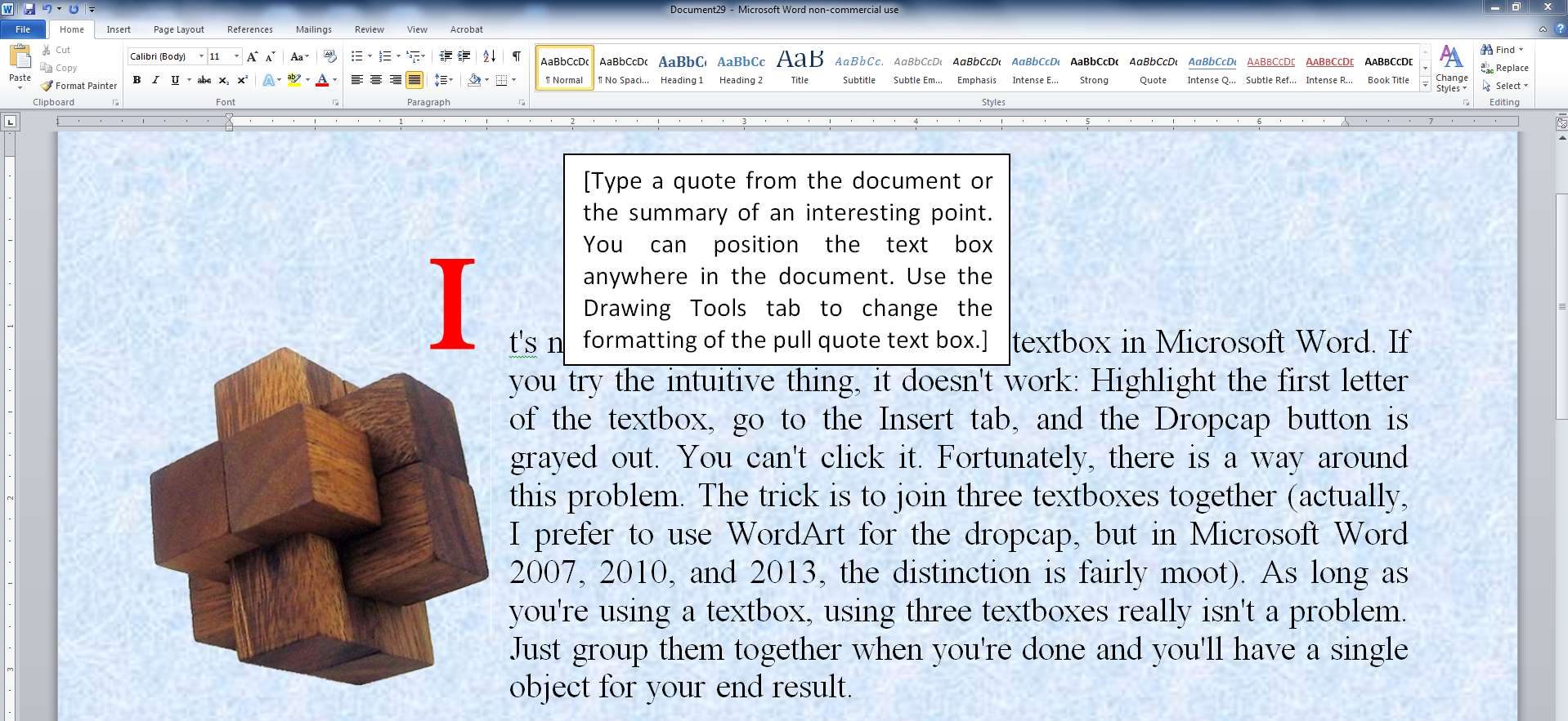
The newer versions of Microsoft Word do have a few cool WordArt features, like bevels. The following picture was created with a recent version of Word in .DOCX format.

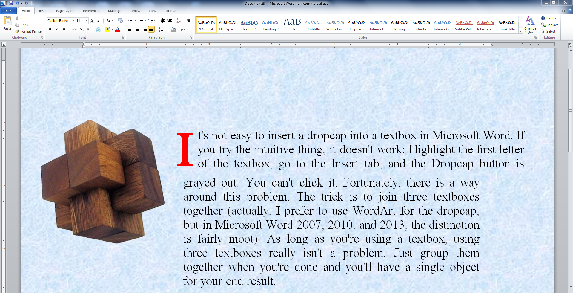
The following picture was created in .DOC format (the Word 97-2003 setting) with a recent version of Word. The picture at the beginning of this article was also created that way.

Creating WordArt in .DOC format (the Word 97-2003 setting) with recent versions of Word for Windows:

  • WordArt and Textboxes are different in this format (whereas they are the same in the newer format).
  • Look on the Insert menu. On the text panel, choose the A button in the middle. Choose one of the presets to serve as a handy starting point.
  • Select the WordArt and go to the Format ribbon.
  • One of the buttons worth noting is the Change Shape option. Play with these options.
  • For 3D effects, click the 3-D Effects button. Play with the Color, Depth, Direction, and Lighting in addition to exploring the options above.
  • The default font, Arial, works quite well with WordArt. If you wish to change the font (right-click the WordArt and choose Edit Text), pick a TrueType font for better results.
  • In .DOC format, resizing the textbox and even changing the aspect ratio can quickly help you find the right look. You don’t have to change the font size.
  • Click Shape Fill > Gradients > More Gradients. Select the Preset option to explore preset gradients like Fire, Gold, Rainbow, and Sapphire (four of my favorites). Note that you can adjust the direction of the gradient, and that some directions look much better than others (it can change the look drastically from what you would expect).
  • Beware the distinction between Shape Effects and Text Effects. If you’re not paying attention, it’s easy to do the wrong one.

Creating WordArt in .DOCX format:

  • Look on the Insert menu. It won’t matter if you begin with a Textbox or if you click the A button in the center of the Text panel and choose one of the options as a starting point.
  • Select the Textbox and go to the Format ribbon.
  • Look at the WordArt styles panel. There are three A buttons in a column. The bottom A button gives you options like Bevel or 3-D Rotation. Under any of these options, at the bottom of the list will be an option with ellipsis (…). Click this and you’ll discover a new option, 3-D Format.
  • If you want to make a 3D rotation, the best thing is to first choose one of the presets, and then try experimenting with the x, y, and z rotation angles. The presets help you get started.
  • Click the top A and select Gradients for the (limited) gradient options.
  • Beware the distinction between Shape Effects and Text Effects. If you’re not paying attention, it’s easy to do the wrong one.

Write Happy, Be Happy

Chris McMullen

Author of the Improve Your Math Fluency series of math workbooks and self-publishing guides

Word Is Good Enough

Good Word

MICROSOFT WORD

If you’re self-publishing, Microsoft Word is good enough.

Whether you’re publishing a print-on-demand paperback through CreateSpace or an e-book through Kindle Direct Publishing, for example, it’s possible to create a well-formatted book using Microsoft Word.

Of course, it’s also possible to create a document that looks rather unprofessional, but that’s possible with any software. Word can produce excellent results, but it’s necessary to first learn how to make Word do this.

Some ‘experts’ like to advertise that Word isn’t good enough. There are a few simple explanations for this:

  • They may not be aware of all the little tricks that are possible in Word (like kerning and tracking, or how to prevent Word from compressing your images). Once somebody prefers different software over Word, there is no longer any incentive to master Word. So why should people who prefer other software become and remain up-to-date on all the little tricks that Word can do?
  • They may not be aware that each version of Microsoft Word has become more compatible with Kindle and CreateSpace, for example (partly from improvements in Word and partly from improvements from the publishing platforms). When Word 2007 first came out, .docx files led to formatting issues compared to .doc, but now .docx files from 2010 or 2013 in many cases work better than .doc files. Those who learned to prefer .doc in the early days may have not continued to test .docx over the years.
  • They may have an ulterior motive. Somebody who earns a living formatting books might want to advertise that Word is unsatisfactory. Some people may have a financial interest in another software program.
  • Authors or publishers who don’t use Word may wish to sell the brand that their books are better. A professional looking book does have better formatting, but all that matters is how it looks to the customer, not the process by which it was created. The truth is that if you master Word formatting, you can produce excellent formatting with it.
  • A couple of features are more convenient in other software programs, like creating different headers or page numbers in different sections. There is a straightforward way to do this in Word, but it just doesn’t seem straightforward until you learn how to do it. On the other hand, sometimes other tools that should be easy to use in other software programs don’t seem intuitive.
  • There are a couple of subtle improvements that can be made by using other software programs. For example, you can gain better control of images and you can work with em’s or percentages instead of pts in an e-book by working with HTML. If these subtleties are important to you, it doesn’t mean that you must work with different software. For example, you can save a Word file as a filtered webpage and then make these subtle improvements directly. Similarly, if you need a PDF file for your print-on-demand paperback, you can find a Word to PDF converter and print to PDF (using the convenient Save As PDF option leads to images with less than 200 DPI—but this is just one of several steps needed to avoid images with less than 300 DPI).

Microsoft Word doesn’t make formatting foolproof. For example, if you use tabs, your e-book could be a disaster (but if you simply learn how to use First Line Indent instead, and research other ways to produce good formatting—or avoid poor formatting—this won’t be a problem).

But it does provide a convenient method of formatting self-published books, and it can lead to good formatting for those who learn how to use it well.

There are many points in its favor:

  • fairly economical
  • very accessible
  • easy to get help (free tutorials from Microsoft, numerous online tutorials on Google, knowledgeable Word users on author community forums, etc.)
  • excellent formatting is possible (doesn’t matter that it was really designed as a word processor, it has grown to include the features needed to format a book quite well)
  • most features are very intuitive (and it’s easy to find helpful tutorials for anything that isn’t)
  • flexible for self-publishing as it serves as a great starting point for both print and e-book publishing
  • use of the built-in styles on the top of the Home ribbon make it easy to convert from print to e-book or vice-versa (those styles are also imperative if you want to achieve reliable e-book formatting from Word)

There are good alternatives to Word for those who prefer something else.

For print publishing, Adobe InDesign is considered by most to be top of the line. It’s not nearly as intuitive as Microsoft Word, but if you take the time to learn it, this will only be an issue for your first book. Serif Page Plus and Scribus are two other publishing software programs. Open Office is a free open-source alternative to Word.

There are a variety of alternatives for e-books, such as Jutoh, Atlantis, Calibre, and Sigil. Many of the alternatives are actually begun in Word using the styles and then improved with other software programs, even by some experts who are in the habit of faulting Word.

Read Tuesday

Imagine a Black Friday type of event just for book lovers.

You don’t have to imagine it. It’s called Read Tuesday, and it’s free: www.readtuesday.com.

Chris McMullen

Copyright © 2014 Chris McMullen, Author of A Detailed Guide to Self-Publishing with Amazon and Other Online Booksellers

  • Volume 1 on formatting and publishing
  • Volume 2 on marketability and marketing
  • Boxed set (of 4 books for the price of 2) now available for both Kindle and paperback

Follow me at WordPress, find my author page on Facebook, or connect with me through Twitter.

Comments

Click here to jump to the comments section:

https://chrismcmullen.wordpress.com/2014/11/29/word-is-good-enough/#comments

Styles: The Secret for Word to Kindle

Word to Kindle

Microsoft Word’s Styles

There are five simple rules to follow to achieve very good Kindle formatting from Microsoft Word:

  1. Don’t use the tab key for anything.
  2. Don’t use two or more consecutive spaces (not even after a period).
  3. Don’t press the Enter key three or more times in a row.
  4. Use Word’s styles for any and all formatting that can be done through the styles (including indents—yes, it is possible).
  5. Avoid special characters and formatting that may not be supported on all devices.

The first three rules are really easy to follow. If you didn’t, you can use Word’s search and replace feature to easily remove tabs, extra spaces, or extra Enters. (Tab removal: Make a tab, cut it and paste it into the find field and leave the replace field blank. Double-space removal: Type two spaces and replace with one space, then repeat this find until no matches are found. Triple Enter removal: Click More > Special > Paragraph Mark three times to create three Enters in the find field and replace with two enters; repeat as needed.)

Rule 4 is critical toward achieving consistent Kindle formatting from Word. How to do this is the focus of this article.

The last rule just requires a little research. Beware that some fancy features, like dropcaps, are supported on many devices, but don’t format properly on all devices. When in doubt, simple works better.

Using Word’s Styles

The secret to good Kindle formatting is to apply any and all formatting through Microsoft Word’s styles.

Don’t apply formatting directly to highlighted text or paragraphs—not even for first line indents.

Instead, set the formatting in a style and apply the style to the paragraphs (or text).

You can find Microsoft Word’s styles on the right-half of the Home ribbon at the top of the screen. (These instructions are specifically for Microsoft Word 2010, which is similar to 2007 and 2013, for Windows.)

Styles Location

Note: Some styles (e.g. Normal) apply to entire paragraphs, other styles (like Emphasis) apply to text, and yet others can apply to either. The distinction is important because if you highlight just some text and apply a paragraph style, it will modify the entire paragraph rather than just the selected text. You can tell what a style applies to by clicking the little arrow-like icon below where it says Change Styles. Then look next to the style name to see if it has a paragraph symbol, an ‘a,’ or both.

Styles MenuStyles Options

Modify Word’s Styles

Right-click a style on the Home ribbon in order to modify it.

For Kindle e-book formatting, leave the color set to Automatic in the Normal style (because a customer might choose to read in night or sepia mode, for example). You needn’t set a font, as the customer will choose the font from his/her device, though if you do pick a font, using a very common font like Georgia is apt to work best (but, again, the customer gets to control the font from his/her device).

Apply the font style, font size, linespacing, indents, and all other formatting through Word’s styles.

Don’t highlight text or paragraphs and apply formatting directly to the text.

Instead, modify a style to suit your needs and apply that style to selected paragraphs (or, when applicable, highlighted text).


Style Modify


All styles other than Normal allow you to check a box to Automatically Update after right-clicking and choosing Modify. This is convenient to apply changes to that style throughout your document.

How to Indent Paragraphs for Kindle

Not with the tab key!

Not using the spacebar!

Not by going into the paragraph menu and using first line indent. Close, but no cigar!

Instead, right-click the Normal style, then:

  1. Choose Modify > Format > Paragraph.
  2. Change Special to First Line.
  3. Set the value to 0.2″ or so (definitely, not 0.5″ as that’s huge on a small screen).
  4. Apply the style to paragraphs you want formatted this way.

How to not Indent

Not indenting is even trickier.

Kindle automatically indents non-indented paragraphs.

So the trick is to copy the Normal style and give it a different name, like NoSpacing (don’t put a space in the name). This new style will be modified and used for non-indented paragraphs.

To copy a style, click the little arrow-like icon below Change Styles at the right of the Home ribbon to pull up the styles menu. Find the three buttons at the bottom of this menu (this menu pops up at the right side of your screen). Click the left button (of these three buttons) to add a new style. Choose the style you want this based on (pick Normal). Name the style (e.g. NoSpacing). Modify the style as needed.

Modify this new style as follows: Click Format > Paragraph, change Special to First Line and set the indent to 0.01″ (not smaller).

Note: Setting this to zero will backfire!

As always, modify the style and apply the style to the paragraphs. Don’t apply First Line Indent directly to paragraphs.

The first paragraph of the chapter is typically not indented. This is typical of most traditionally published books.

Stand-alone, non-centered lines like subheadings or lines from your table of contents also need to be non-indented. There are typically many such lines throughout the book. Remember, if they appear non-indented in Word, they’ll be automatically indented on Kindle.

Unless you apply the NoSpacing style to those paragraphs.

Indenting isn’t an issue with centered text, e.g. using styles like Heading 1 that center text.

Page Breaks

You can even use Word’s styles to create page breaks.

You should be using Heading 1 to create your chapter headings.

If you want each chapter to automatically start on a new page, and if you only apply Heading 1 where you want to begin a new page, you can remove all of your current page breaks and instead implement them through Word’s styles.

Right-click on Heading 1 to modify it. Choose Format > Paragraph > Line and Page Breaks and check the box for Page Break Before.

Why Do You Need to Use Styles?

When you upload your file to KDP, it gets converted to a .mobi file.

In this conversion, KDP reads your Word file as an HTML file (yes, even if you upload a Word document).

The top of your Word’s HTML (even if you don’t upload an HTML file, this still applies to you) defines all of Word’s styles.

If you highlight selected text or paragraphs and apply formatting directly to them, you introduce formatting contradictions: The styles say one thing, while the specific paragraphs or text says another. This confusion can lead to inconsistent formatting in the all-important Look Inside or on specific devices.

If you only apply formatting through the styles, then you won’t have contradictions, which leads to more consistent formatting.

Chris McMullen

Copyright © Chris McMullen, Author of Kindle Formatting Magic (now available)

How to Insert a Dropcap in a Textbox in Microsoft Word

Drop 8

Drop Cap in Textbox in Word

It’s not easy to insert a drop cap into a textbox in Microsoft Word. (Inserting a drop cap at the beginning of a chapter is easy; doing it in a textbox is another matter.)

If you try the intuitive thing, it doesn’t work: Highlight the first letter of the textbox, go to the Insert tab, and the Dropcap button is grayed out. You can’t click it.

Fortunately, there is a way around this problem.

The trick is to join three textboxes together (actually, I prefer to use WordArt for the drop cap, but in Microsoft Word 2007, 2010, and 2013, the distinction is fairly moot).

As long as you’re using a textbox, using three textboxes really isn’t a problem. Just group them together when you’re done and you’ll have a single object for your end result.

Here are the step-by-step directions, then following these you can find some screenshots that illustrate key steps:

  1. Put the first letter in its own textbox. You may prefer WordArt for the single letter. Use Insert > Text Box or Insert > WordArt.
  2. Put the first lines of the paragraph in one textbox. For example, if the drop cap will have a height of three lines, put the first three lines of the paragraph in one textbox.
  3. If the paragraph needs to be justified full, place your cursor at the end of the paragraph and press Shift+Enter to make the last line justified.
  4. Place the remaining lines of the paragraph in another textbox.
  5. Select each textbox and go to Format to set the Shape Fill and Shape Outline to No Fill and No Outline, respectively.
  6. Select each textbox and go to Format > Wrap Text > In Front of Text. (They need to be free-floating so you can position them. Once they are joined, you can change the text wrap to something else.)
  7. You will need to adjust the widths of your textboxes. That is, the lower textbox needs to be longer than the higher textbox.
  8. Position the textboxes to form your paragraph. Align the boxes precisely. You want even line spacing between the two parts of your paragraph, alignment at the right edge of your paragraph, and alignment between the left edge of the dropped cap and the left edge of the lower textbox.
  9. You may need to transfer words from one textbox to the other as you adjust their widths. The last line of the upper textbox can have really wide gaps, for example, if there is room for more words on that line and you used Shift+Enter. If so, transfer the first words of the lower textbox onto that line.
  10. If you used WordArt, you’ll need to format it. If you want to remove the automatic shadow effect, for example, click on the WordArt and go to Format > Text Effects > Shadow > No Shadow. You can manually format the font style instead of choosing a default effect.
  11. Ensure that the formatting of the upper and lower textboxes are identical.
  12. To make a single object, select the three textboxes and go to Format > Group > Group. To select multiple objects, grab one, then press and hold down Ctrl while selecting the others.


Drop 1


Drop 2

Drop 3

Drop 4

Drop 5

Drop 6

Drop 7

Drop 8

Chris McMullen

Copyright © Chris McMullen, Author of A Detailed Guide to Self-Publishing with Amazon and Other Online Booksellers

  • Volume 1 on formatting and publishing
  • Volume 2 on marketability and marketing

Microsoft Word Tutorials

Find more free Microsoft Word tutorials here: https://chrismcmullen.wordpress.com/word-tutorials.

Comments

Click here to jump to the comments section:

https://chrismcmullen.wordpress.com/2014/07/24/how-to-insert-a-dropcap-in-a-textbox-in-microsoft-word/#comments

Master Page Numbers in Microsoft Word 2010

Page Numbers


Introduction

There are several problems that one must solve when numbering pages in Word, and this can be the source of much frustration:

  • You change the page number on one page, and it changes the style or numbering on one or more other pages.
  • You insert a page number on a page, but the formatting doesn’t match that of the other pages.
  • You try to make the front matter have Roman numerals, but all the page numbers switch from Arabic to Roman.
  • You discover that the same page number appears twice in a row.
  • You add page numbers and the file freezes on you. Worse, it won’t open back up.

WHY doesn’t it work? WHY can’t it just be easy?

Calm down. Take a deep breath.

It is possible to number the pages exactly how you want them. The problem is that the way to do it isn’t intuitive. You have to use section breaks, and you have to implement the page numbering a certain way.

If you follow the procedure that Word is looking for, you can master pagination in Microsoft Word.


Before We Begin

Microsoft Word is somewhat more prone to file freezing or corruption when making changes to page numbering.

What does this mean to you?

It means you should back up your file before you edit Word’s pagination.

Save your file with a new filename (like Book v2.docx) and save it in two different places (like jump drive and email). If you’ve already spent months typing hundreds of thousands of words for a book, the worst that can happen is that you have to start over… unless you wisely back up your file in multiple places.


Procedures

Follow these steps in Microsoft Word. This outline is specifically for the 2010 version, but 2007 and 2013 are nearly identical and 2003 follows the same ideas (but the toolbars are different).

A picture is worth a thousand words, right? At the end of the procedures you can find some screenshots of the key steps.

  1. Insert a section break anywhere you want the style of page numbering to change. For example, if you want to number your first page on the fifth page of your manuscript, you need a Next Page section break at the end of the fourth page. If you’d like to switch from Roman numerals (v, vi, vii, viii, ix, x) to Arabic numbers (11, 12, 13) on the eleventh page, insert a Next Page section break at the end of the tenth page. Remove the ordinary page break (if that’s what you have presently) and instead go to Page Layout > Breaks > Next Page to insert a section break instead of an ordinary page break. This section break tells Microsoft Word that you wish to change the header or footer style (your page numbers are either part of the header or footer, depending on where you place them).
  2. Press the Show/Hide button (it looks like ) on the Home toolbar. This will help you identify page breaks, section breaks, and blank lines, for example. (If your page numbers aren’t lining up between different sections, this will help you see if you accidentally pressed the Enter key while formatting the page numbers in one of the sections, for example.)
  3. Start at the very beginning of your Word document and work your way forward one section at a time. Very often, sections link to previous sections (though you can choose to unlink them), so if you make changes to one section, it often affects every section that follows (sometimes it also affects previous sections). Problems are best minimized by starting at the beginning and working forward one section at a time. After you make any change, immediately review all the previous sections to double-check that none of the previous page numbers have changed. You can save a great deal of frustration by nipping problems in the bud. It’s worth checking. It might seem like it’s a lot of extra work, but in the long run it might be much less work.
  4. If you don’t already have page numbers, go to the page where you’d like to add them and find Page Numbers on the Insert toolbar. Choose one of the options (it’s possible to customize it after inserting them); the simpler options are less likely to result in freezing or file corruption, but nothing is foolproof. Return to the same place and click Format Page Numbers. This gives you the option to change the starting number, continue from the previous section, or change the style from Roman numerals to Arabic numbers, for example. You can highlight the page number and change the font size or style. You can also place your cursor just before or after the page number and type characters (such as ~ to make your page numbers look like ~17~).
  5. You can remove page numbers the same way as you add them. Just go to Insert > Page Numbers > Remove Page Numbers.
  6. Remember to check the previous sections each time you add, remove, otherwise make changes to page numbers. You don’t want previous sections to change. It’s okay if following sections get changed; you’ll be able to correct that once you get to those later sections. If previous sections do change, hit the Undo button at the top of the screen (what a handy button!). Then you need to unlink the current section from the previous section before trying to make these changes. See the next step.
  7. The magic button is called Link to Previous. It’s actually a checkbox. Simply place your cursor in the page number area to open the Design toolbar for page numbers. Uncheck the box to remove the Same As Previous flag and that will allow you to modify the current page numbers without affecting previous page numbers. (Changes you make might affect page numbers in following sections, but that’s okay—you’ll be able to fix those when you get there. It’s the previous sections that you need to check on repeatedly. You don’t want previous sections to change.) Sometimes you do want the current section to follow the same style and numbering as the previous section. In these cases, you want the Link to Previous checkbox to be checked.
  8. When you want a new section to have different page number formatting from the previous section, remember to uncheck the Link to Previous box and verify that the Same As Previous flag disappears before making the changes. Otherwise, previous sections will change, too. It’s easy to forget. Remember also to go back and check all the previous sections anytime you make changes. Once in a while, a previous section (sometimes, it’s way back) changes even though the Link to Previous box is unchecked. So it pays to check. Also, remember to insert a Next Page section break (see Step 1) instead of an ordinary page break anywhere you’d like to make changes to the page numbering style. Not sure if you have a section break where you need it? See Step 2.
  9. Place your cursor in the page number area on a given page to open the Design toolbar. Two of these options can be quite useful. One is the option to have different page number styles on odd and even pages. For example, this helps you place page numbers near the outside edges, which would be the right side for odd-numbered pages and the left side for even-numbered pages. Another option is to have a different style on the first page of each chapter. Many books don’t number the first page of the chapter, so this option allows you to remove the page number from the first page of each section without disturbing the other pages. Well, if you suddenly remove the page number from the first page of the chapter, you may need to go in and reinsert the page numbering on subsequent pages of the same chapter (in addition to just checking the box for a different first page).
  10. Note that the two-page view in Word does NOT show you an actual book view. In a real book, such as one you self-publish at Amazon using CreateSpace, odd-numbered pages appear on the right-hand side and even-numbered pages show up on the left-hand side. Word shows it backwards. Just ignore the way that Word shows it; don’t try to adjust your page numbering based on Word’s incorrect two-page view. If you would like to see how your book will really look, save your file as a PDF file and open it with Adobe Acrobat Reader (you can get the Reader for free from Adobe’s website). Then go to View > Page Display > Show Cover Page in Two Page View, then View > Page Display > Two Page View.
  11. If you’re having trouble getting two different sections to display page numbers the same way, try clicking the Show/Hide Codes button (see Step 2) and comparing the formatting marks in both sections. Also check the settings in the Page Setup Dialog Box (click the funny-looking, arrow-like icon in the bottom right of the Page Setup group on the Page Layout toolbar to open this dialog box); check all three tabs there—Margins, Paper, and Layout. Especially, check the From Edge values in the Layout tab (which should be the same for every section if it’s applied to the Whole Document).
  12. You can change the position of page numbers relative to the body text using the From Edge values (see Step 11). The right combination of margins and From Edge values should allow you to get the body text and page numbers to look exactly how you want them to appear.
  13. Note that headers and footers are set differently. For example, if you unlink one section’s header from the previous section, the footer may still be linked to the previous section. So, for example, if you have both page headers at the top and page numbers in the footer below, unlinking the page numbers won’t unlink the page headers. This is important to keep in mind when you’re trying to format both headers and footers in the same document.
  14. If at first you don’t succeed, vent some of your frustration, get some rest and relaxation, and try again. See the suggestion in Step 15.
  15. Unfortunately, once in a while Word seems to go haywire. That is, you’re sure did everything right, but it doesn’t seem to be working. Sometimes, it helps to undo the last change, remove the section break, reinsert the section break, and then try again. It’s also possible for a Word file to become corrupt, in which case it’s best to start over with your back-up file. Didn’t back it up like I recommended? Ouch!
  16. If you just can’t hammer the square peg through the round hole, there is an alternate solution, which can really come in handy for self-published authors formatting books for print-on-demand services like Amazon’s CreateSpace. You can break your file up into smaller files. Before you do this, see if you can find a Word to PDF converter that allows you to join multiple PDF files together (e.g. Adobe Acrobat XI Pro offers a free trial period, and also offers a monthly subscription; Nuance PDF Converter Professional offers this feature; and there are also many free converters available on the internet). When you publish with CreateSpace or Ingram Spark, it’s best to submit a PDF anyway. If you’re able to join PDF files together, then you can break all the separate sections of your Word document into separate files. The trick is to ensure that all the page sizes, layout, and formatting is consistent across all of your files. Then you just need to get the page numbering right in each individual file, which is easier than getting it right in several different sections of a large file.
  17. If you’re also self-publishing an e-book, remember to remove page numbers (and all headers and footers) from the e-book version of your file.


Breaks

20140703_222956

Link to Previous

Show Codes Arrow

Page Setup Location

Page Setup

Page Headers, too

Headers and footers in general work the same way as pagination.

For example, if you would like to have even-page headers show chapter names and odd-page headers show the book title, you can do this by formatting the page headers the same way as page numbers are formatted. It’s also common to exclude the page header from some pages, such as some of the front matter and the first page of each chapter. It would be wise to see what header and page numbering styles are common for the type of book you’re publishing before you decide on the formatting.

Chris McMullen

Copyright © Chris McMullen, Author of A Detailed Guide to Self-Publishing with Amazon and Other Online Booksellers

  • Volume 1 on formatting and publishing
  • Volume 2 on marketability and marketing

Pros & Cons of Publishing with Adobe

Creative Cloud

Publishing Software

Microsoft Word is easy to recommend as publishing software for a few good reasons:

  • It’s accessible. Many writers already have Word. If not, it’s fairly inexpensive and easy to find. If price is a factor, Open Office is an alternative.
  • It’s convenient. Most writers already have familiarity with how to use some of Word’s functions. It’s also fairly intuitive. When it’s not, a Google search or a question in the CreateSpace or Kindle community forum will usually help out.
  • It’s functional. It’s possible to make a very nicely formatted print book. You can set the leading, inside and outside margins, add different styles of headers and page numbers, adjust the kerning, and even deal with widows. Not everything is easy, like using section breaks to change the header style or preventing Word from compressing images, but the potential is there and it’s relatively painless once you master the tricks.
  • It’s Kindle-friendly. Using Word’s style functions, it’s possible to make a Word document that converts very well to Kindle format. KDP continues to improve this.

Adobe is considered to be more professional for publishing print books, formatting images, and converting to PDF (note that PDF isn’t very e-book friendly, while Word is, although Adobe does have software features oriented toward making e-books). It’s not that you can’t learn how to format a Word document that looks professional, but more that once you master Adobe’s features, some of the formatting features become easier to perfect in Adobe InDesign. Most book designers who are equally fluent in both Word and InDesign prefer InDesign.

Here are some of the advantages of using Adobe:

  • Acrobat XI provides many options for conversion to PDF, such as flattening transparency, selecting output resolution, and embedding fonts. Most free or low-cost Word-to-PDF converters don’t have as many options to choose from. Very often, the free and low-cost converters provide a quality conversion, but when it doesn’t work, there isn’t much you can do but look for an alternative. Sometimes, you settle for PDF output that’s not quite what you desire because you didn’t have the options you needed.
  • Acrobat XI allows you to do some editing of your PDF, which is sometimes more convenient than returning to the original source file.
  • InDesign includes many professional book formatting features, namely page layout and typography. Many of these features are more convenient in InDesign once you master how to implement them.
  • PhotoShop is professional image-editing software, great for using photos to design covers or make illustrations. Word likes to compress images unless you take pains to avoid this, while Adobe’s products make it easy to achieve high resolution.
  • Illustrator is great for drawing, illustrating, and formatting text and images together.

Adobe does come with some drawbacks:

  • There is a steep learning curve. Many of the basic features aren’t as intuitive as Word, and most writers have no experience with Adobe until they purchase it. You can get help with Adobe software, though it’s probably somewhat easier to get help with Microsoft Word simply because more people use it.
  • Some of Adobe’s software is fairly expensive compared to Microsoft Word and especially compared to Open Office. However, there is now a monthly payment option that provides instant access to just about everything.
  • You must decide among your options. Do you need PhotoShop or Illustrator for your images? Do you just need Acrobat XI to convert to PDF and edit that, or do you need InDesign to prepare your books? But if you go with the Creative Cloud, then you don’t have to decide—you get all of this and more.

There are other software programs besides Word, Open Office, and Adobe. For example, Serif Page Plus is a fairly affordable alternative.

Creative Cloud

For years, I had considered purchasing InDesign, Acrobat XI, PhotoShop, or Illustrator. But the cost was more than I wanted to invest up front, I didn’t like having to choose between programs, and until you try it out, you’re not confident that it will be worth the investment. So I continued to postpone my purchase. In the meantime, Microsoft Word was fulfilling all of my needs.

I didn’t realize that you can download a free trial of Adobe’s products. If you’re thinking about using one of these programs, you can actually try it out for a limited time and see if you like it.

A new purchasing option came about that drew my interest. You no longer need to buy the program up front. An alternative is to buy a monthly subscription. For about $20 per month with a one-year commitment, you can purchase a subscription to use one of these programs. Or for about $50 per month, you can opt for the Creative Cloud, which gives you access to all of the software programs that I’ve described, plus more. This also allows you to keep your software constantly up-to-date.

In the long run, i.e. after a few years, it may cost more than buying just the programs you need (or maybe not, since you otherwise may have invested money in updates). But what attracted me was that I didn’t need a large upfront investment to get started. For $50, I was immediately able to start using Acrobat XI, InDesign, PhotoShop, Illustrator, TypeKit, and more. And I downloaded all of these on the first day and started exploring them avidly.

For me, this made very expensive software quite accessible. It starts to add up after several months (it’s like paying an extra cable t.v. bill), but for me it was worth it.

I wish I’d seen this option a few years ago. There were times where I would only have needed these software programs for a couple of months. I could have bought a temporary subscription (the price is higher if you don’t commit to a full year), and then not renewed it for a year or so until I next needed them.

But that’s not the case now. I’m using all of these programs avidly and will continue to do so.

That’s the big factor:

  • What are your needs? If you’ll be using these programs regularly, then it’s probably worth it. If you might just use them occasionally, the commitment may not be a good value. In that case, you might try the free download to better assess the value, or you might take the higher-priced short-term subscription to fill your temporary needs and then stop using it.
  • If you’re publishing multiple books a year, you’ll probably be using the software more. If you reach a point where you earn $1000 or more per month from net royalties, then investing 5% into professional software may be a reasonable expense. If instead you’re making like $100 per month, half your earnings are going into the software (then factor in the IRS and not much is left, although you will have substantial expenses to deduct).

One thing I like is how the Creative Cloud makes professional publishing software accessible to the self-publisher without a large upfront cost.

I was surprised when I was shopping for guides on Amazon for how to best utilize the software. I had purchased the Creative Cloud directly from Adobe. When I was shopping for guides, I discovered that I could have supported Amazon with my purchase (it was the same price at the time).

What was shocking was that Creative Cloud had 35 reviews with an average of two stars (**). The top four most helpful reviews on the product page were all one-star (*) reviews.

Wait a minute. Adobe is the best publishing software, right? So why does it have all these one-star reviews?

This became apparent when I started reading the reviews. There was a great pricing debate going on. Many people who had purchased the products at full price in the past were displeased that they hadn’t been grandfathered into the Creative Cloud. Maybe I would have been upset, too.

But still. As an author, I know it’s no fun to receive low-star reviews, let alone a string of reviews that don’t say anything at all about the content of the book.

Adobe is a large company, not an indie author, but still. People, like you and I, worked on Adobe’s software. Imagine how they feel to see all those one- and two-star reviews of their hard work. Reviews that don’t describe how well the software works, but mostly focus on the pricing model. Again, I understand those reviewers’ frustration. But those reviews didn’t seem fair, and they didn’t help me as a customer to decide whether or not to make the purchase.

Fortunately, I had already made the purchase from Adobe, so those reviews didn’t have the opportunity to scare me away. Personally, the Creative Cloud is a good fit for my needs, as I’m making extensive use of it, and I’m very pleased with my purchase.

Is it the right choice for you? Maybe, maybe not. If you have Word and already have some experience with it, that’s a convenient option, too. Would you use the Adobe software often enough to get your money’s worth, and would it make a difference for you compared to Word? Those may be the questions to consider.

About Me

Chris McMullen, author of A Detailed Guide to Self-Publishing with Amazon and Other Online Booksellers

  • Volume 1 on formatting and publishing
  • Volume 2 on marketability and marketing

Follow me at WordPress, find my author page on Facebook, or connect with me through Twitter.

How to Use the Chapter Names as Even-Page Headers in Microsoft Word

Headers

Most traditionally published books have page headers running along the top of every page (don’t confuse headers with headings; at the beginning of every section is a heading, while at the top of each page is a header).

When the author is famous, the author’s name is likely to appear on the page header. For the rest of us, it’s probably more useful to put other information here.

Many books put the chapter name on the even-numbered pages and the book title on the odd-numbered pages.

Before you get started, save your file (in two or more places, like on your jump drive and email, in case one file becomes corrupt), then save it again with a different filename. This way, you’ll have a backup of the original, just in case. A file can be messy without you realizing it and become corrupt when working with the page headers, so having a backup of the original may turn out to be valuable.

There is a trick to using different header text in each chapter of the book. It’s the same trick that’s needed to use Roman numerals and Arabic page numbers in the same file. You can find a thorough, step-by-step tutorial with screenshots by clicking here.

The main idea is to use a Next Page section break for each section or chapter where you would like the header to be different. Don’t insert an ordinary page break; going to Insert and selecting Page Break or going to Page Layout and choosing Page won’t work.

Instead, go to Page Layout and select Next Page to make the page break in a way that will tell Word that a new section is beginning.

(In Word 2003 and earlier, the menu options are somewhat different, but the main ideas are still the same. I’ll describe how to use Word 2010 for Windows, specifically, which is similar to Word 2007 and onward.)

Remove ordinary page breaks and recreate them using Next Page anywhere a new chapter is starting (or anywhere else you wish to have different header text, including no header at all, such as front and back matter).

Start at the beginning of the document and edit the headers from the first page onward. If you don’t have page headers yet, add them from the Insert menu.

Place your cursor in the header area. Check the box for different first page if you wish to have a different header in the first page of the section. It’s common, for example, for the first page of each chapter and some pages of the front matter to have no header at all.

Check the box for different odd and even pages to allow the header text of odd-numbered and even-numbered pages to be different. It’s common to have the book title on odd-numbered pages and the chapter name on even-numbered pages.

The first section should be fairly easy, especially if you didn’t already have headers in place to begin with.

When you get to the second section, where you want the headers to be different, place your cursor in the header area and look for the ‘magic’ Link to Previous button. When you click this, the Same As Previous flag will disappear. This allows you to create a new header in this section (instead of copying the header from the previous section; more precisely, to avoid having the previous section change as you type the new header).

You needed those Next Page section breaks (instead of ordinary page breaks) to tell Word where each new section begins.

Remember to start at the beginning and work your way forward one section at a time. After you adjust a new section to your satisfaction, go back and ensure that the previous sections are still correct. If not, be thankful for that handy Undo button.

If your file is messy (it won’t look messy to you on the screen if it is), sometimes Word seems to be a little fussy about the page headers. If Word seems uncooperative, try undoing everything you did in the new section. Then remove the section break at the beginning of the new section, and reinsert it. See if that helps.

Sometimes you can play with it and persistence will pay off.

If you have a richly formatted book, or if the file is otherwise messy (again, without your knowledge), occasionally persistence makes the file even messier or it can become corrupt. (If you saved all of the section breaks and headers until your file was otherwise complete and went section by section systematically through the book, it may help to avoid these troubles.)

One solution to a corrupt file is reverting back to the original you saved as a backup prior to adjusting the headers.

A messy file can be cleaned up by stripping out the formatting. For example, copy and paste everything into Notepad and then copy and paste it into a new Word document. This is not a good option for a file that has numerous pictures, equations, bullets, instances of italics, or other formatting. And if the file mostly contained plain text, it was less likely to get so messy in the first place.

Opening the backup and trying the headers again may be worth the hassle (and far less hassle than stripping out the formatting for a richly formatted book), and it may work out better the second time.

In the worst-case scenario that you just can’t get the headers to cooperate, the simple way around this when your ultimate goal is to create a PDF file is to break your Word document up into smaller files (e.g. one file for each chapter, provided that the chapter count is reasonable). Then it will be easy to make different headers for each chapter.

In this case, you’ll have to manually start the page numbering from the previous chapter by inspection. If you make any revisions to your book, you’ll have to update the page numbering.

If you split the Word file into separate files, you’ll need a Word to PDF converter that allows you to compile separate PDF files together. With the number of free PDF converters available online, there is a good chance you can find one that fits your needs that has this option (but beware of possible viruses or spyware anytime you download programs from the internet).

Many books have been prepared in Word as a single file that have different headers for each chapter. Chances are that you’ll be able to do this in Word with your book, too, without having to resort to any drastic measures.

Publishing Resources

I started this blog to provide free help with writing, publishing, and marketing. You can find many free articles on publishing and marketing by clicking one of the following links:

Chris McMullen, Author of A Detailed Guide to Self-Publishing with Amazon and Other Online Booksellers

Follow me at WordPress, find my author page on Facebook, or connect with me through Twitter.