KINDLE FORMATTING EXAMPLE
I just published a new Kindle e-book and it occurred to me that it might be helpful to show on my blog how I formatted it.
This way, you can see an actual example of the formatting in action. You can also check out the free sample if you have a Kindle to see how it turned out. (Or the whole book, free if you have Kindle Unlimited; just 99 cents to buy.)
It’s a fun little book (by fun, I mean it involves puzzles—word scrambles, but not the usual variety: these have a Romance theme). But even if you don’t like the book, you can still check out the free sample to explore the features and how they were made. After all, this article isn’t about word scrambles; it’s about formatting Kindle e-books.
Formatting a puzzle book or a workbook for Kindle poses several formatting challenges. We’ll explore some of these in this article.
If you’re self-publishing a novel or nonfiction book, even though it’s somewhat different from a word scramble book, it involves many of the same formatting features. So this article and the book itself serving as an example can help you see firsthand how to implement those features on Kindle.
It’s 2015 and publishing is dynamic. What worked well for Kindle in 2009 or 2012, for example, may not be quite the same in 2015. Some things have stayed the same, but much has changed.
Plus, the more books you design for Kindle, the more your eye for the design of digital books changes.
This book has a different look and style compared to my other e-books. It has some features that I feel are better. I’ll describe a few design choices along the way, and a few features of Kindle design that I’ve come to regard as ‘better.’ But remember, when it comes to style, ‘better’ is just an opinion. One designer’s ‘better’ is another designer’s ‘worse.’ 🙂
CONTENTS
I’ll begin with some basic Word formatting for Kindle. If you already know how to format a Word document for Kindle, you can skip the first sections below (though you never know when you may learn something you didn’t know before).
Then I’ll introduce a book to serve as an example of my Kindle formatting, and I’ll discuss a few design issues. I’ll also describe a few improvements that can be made rather quickly beyond Word to Kindle formatting, showing my recent book as an example.
You’ll find specific directions for how to quickly implement some formatting tricks toward the end.
MICROSOFT WORD KINDLE PREP
I began the Kindle formatting with a simple plain text version of the book. (It’s also available in paperback, so ultimately I needed one file for Kindle and a totally different file for print. Yet at the same time, it’s important to have identical content for both.)
I used the Replace tool in Word to remove:
- two consecutive spaces. I put two spaces in the Find field and one space in the Replace field. I continued to hit Replace until there were no matches found.
- blank lines. I typed ^p in the Find field and deleted everything from the Replace field. There isn’t a single blank line in the book, yet there is space between some lines which creates the same effect. More on this later. You may also want to put ^l (lowercase L) in the Find field in case you have another kind of line break.
- tabs. Type ^t in the Find field and make sure that the Replace field is empty. (There were none to be found, of course, as I know not to use the tab key in the first place.)
- page breaks. Put ^m in the Find field to remove ordinary page breaks. (If you have section breaks that are also page breaks, you want to remove those, too.) My book does have page breaks, but I make them a different way in the Kindle edition.
I don’t have headers, page numbers, or other print-only formatting features in my original Word file for Kindle.
You also have to be careful not to use any unsupported symbols.
What about the formatting? Don’t worry; we’ll get to that.
IMAGES IN WORD
I even removed all of the images from the Word file. You can leave them in Word, but I like to apply a simple trick to improve the way that pictures are displayed (revealed later in this article), and as long as I’m doing that, I just save all the pictures for later. I just write things like “Pic1” or “Pic5” on their own lines where I want the pictures to go later. Well, I did put one figure in, just so that Word would recognize the file as containing images, which I replaced later. (If my trick is new to you, things will be simpler if you leave the images in Word.)
If you prefer to leave the images in Word, or if you intend to upload a Word document to KDP, here are a few things that you may wish to know:
- Word may reduce the size of your image when you insert it. Word wants your picture to fit in the margins shown on the screen, so if necessary, it will reduce the width. Right-click on the image, choose Size and Position, find the Size tab, and enter 100 for the width (and height). This may cause your image to appear larger than the page in Word, but don’t worry about that, as that isn’t how it will look on a Kindle.
- Setting the width to 100% in Word does NOT make the image appear full-screen on Kindle devices.
- Right-click the image and change Wrap Text to In Line With Text. Place the image on its own line.
- Use Insert > Picture to insert your images; don’t use copy/paste from outside of Word.
- Crop, size, and format the picture with image-specific software before inserting into Word. If you do these things within Word, note that these features won’t be saved and propagated through to Kindle with Word’s default settings.
- If you upload a Word file, sometimes a drop shadow appears along the edge of one or more images. If so, the simple solution is to upload a compressed zipped folder instead (described later in this article). If you opt to do this, it also gives you the flexibility to make your images display better.
WORD FORMATTING FOR KINDLE
The key to predictable and consistent formatting from Word is religious use of the paragraph styles.
In Word 2010 (and 2007 and 2013) for Windows, these appear on the top right half of the Home ribbon at the top of the screen.
It’s a mistake to highlight a paragraph and apply formatting directly to what’s highlighted. If you’ve already done that, you can find a Clear Formatting button on the Home tab.
The way to format a paragraph is to create a style, format the style just the way you want, and simply associate that style with the desired paragraph(s). Place your cursor within the paragraph and simply click the style button to apply that paragraph style to the paragraph.
You can highlight a word, phrase, or sentence that’s part of a paragraph and apply formatting, like italics or boldface, to that. But don’t do this for an entire paragraph. To format an entire paragraph (or a chapter heading, like Chapter 1, which is a paragraph), instead format a style and apply the style to the paragraph.
The Normal style is the default for body text. Once you’re typing body text with the Normal style, simply pressing the Enter key will let you type another paragraph with that same Normal style.
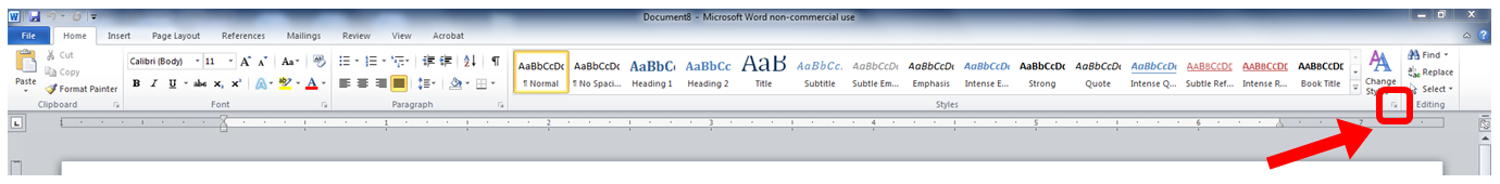
Right-click a style to modify it. Click the funny-looking little arrow-like icon in the bottom-right corner of the group of styles on the Home ribbon. This opens up a window of styles at the right side of the screen.


Find the three buttons at the bottom of this new window. The left button lets you create a new style. When you create the new style, give the style a name that will help you remember which style is which. Choose which current style the new style will be based on.
MICROSOFT WORD’S STYLES
The Normal style is designed for the majority of your body text paragraphs, though you’ll want to modify the settings of this style before using it. You may need one or more variations of the Normal style, for example a similar style for the first paragraph of each chapter (e.g. if you don’t want to indent the first paragraph of each chapter, as is common among most traditionally published books).
Use Heading 1, Heading 2, Heading 3, etc. styles to format headings that you’d like to be used in navigation. Kindle tends to automatically use your heading styles for built-in navigation (though it may take some time after publishing before this is done). You may want to use the Heading styles for chapter headings (like Chapter 1, Chapter 2, etc.) and some front or back matter sections (e.g. Introduction, Appendix), for example.
Think about other kinds of paragraphs that you may want to be formatted differently. For example, you might want a block of text for quotes that is indented from both the left or the right. Or you might want a centered line for figures or for text that you don’t want to be used in navigation.
Modify the Normal, Heading 1, and Heading 2 styles, and then create new styles—as described in the previous section. Once you have all the styles for the variety of paragraphs that are used in your book (including “paragraphs” that only consist of a few words or an image on one line, or lines from your table of contents, for example), then you just need to apply the appropriate style to each paragraph.
Except for the Normal style, you can check a box so that any changes you make to that style automatically apply to every paragraph of that style when you modify the style. Otherwise, and for the Normal style, if you want to update every paragraph of that style, open the style box on the right of the screen (see the instructions in the previous section), place your cursor on a paragraph of the style you want to modify and update, right-click the style in the box at the right (not the top), choose Select All, click Modify, and then update the style and the changes should propagate throughout.
FORMATTING WORD’S STYLES
For each style (Normal, Heading 1, Heading 2, and variations of these that you use), you need to modify the style to adjust the font and paragraph settings.
Leave the color set to automatic, except where you need to create text a different color. For example, if you want a heading to appear in red or blue, you can change the color for that heading style. Don’t set the color to black for body text; leave it set to automatic. (Note that colored text may not appear as nice on black and white devices; for example, red stands out in color, but appears gray on black and white devices).
The default Word font style (Times New Roman or Calibri) is simplest. This will allow the user to choose a font to his or her liking. There is a better way to treat the fonts, as I’ll describe later.
Font size is something that you must set in Word if you intend to upload a Word doc, but which the user will ultimately take control over. So font size is relative. The points don’t translate perfectly from Word to Kindle. Kindle doesn’t discriminate between some close font sizes. If you use 12 pts for body text and want a heading to appear twice as large, you might try 24 pts, for example. Some trial and error is wise. If the font for a heading is too large, for example, a long word (like INTRODUCTION) might not fit on a single line on some devices (though when a user chooses a very large font on a cell phone, that’s virtually unavoidable), so it pays to test it out. There is a better way to set font size than by doing so within Word, as I’ll explain later.
To adjust the font in Word, don’t highlight an entire paragraph and change the font for that paragraph. Instead, right-click a style to modify it, click Format, choose Font, and modify the font for that style. Then simply associate that style with the desired paragraph(s).
You must similarly adjust the paragraph settings. Right-click a style, click Modify, choose Format, and select Paragraph.
This is where you can set Space Before (or After, but I prefer to use Before only), if you would like headings or the first paragraph of a chapter (only if you create a separate style for it) to have space above it. This is better than inserting blank lines with the Enter key. Why? Because it looks funny when a blank line happens to appear at the bottom or the top of a page, or a blank line that you’d like to serve as a section break may not be visible in such a case. (Using asterisks, * * *, centered on a line by themselves, or a glyph, provides a section break that won’t get lost. Pad your glyph with space on the sides so it doesn’t zoom to full-width on old devices, perhaps a clear background with a .gif, with black or sepia user options in mind.)
Instead of inserting manual page-breaks, you can include this in a style, too. You also find this in Modify > Format > Paragraph for a style, then choose the Line and Page Breaks tab, and check the box for Page Break Before (but note that most of the other options on that tab don’t propagate through to the Kindle; page-break works, though).
The paragraph setting is also what you need to use, within the style itself, to treat indents in a way that will work predictably and reliably.
HOW TO INDENT FOR KINDLE E-BOOKS
The wrong ways to indent lead to inconsistent indents in Kindle e-books:
- Don’t use the tab key at all.
- Don’t use the spacebar to create indents.
- Don’t rely on automatic indentation.
- Don’t go to the paragraph dialog box and set First Line for a particular paragraph. Close, but no cigar. You need to do this for a style instead to achieve the most reliable and predictable indents across all devices and the challenging, yet all-important, Look Inside.
Right-click a style to modify it, click Format, Select Paragraph, change Special to First Line, and enter a value for the indent there.
- Do this for all non-centered styles, including justified and left-aligned (ragged right) styles.
- Do this for Normal and variations of Normal that will be justified or left-aligned.
- Set the indent to 0.2″ or 0.3″ for indented paragraphs. The default value of 0.5″ appears too large, especially on small devices like a cell phone. (There is a better way, which I’ll describe later.)
- Don’t choose (None) for paragraphs that you want non-indented (like the first paragraph of a chapter, if you have a special style just for those paragraphs, or the lines of your table of contents page). This won’t work. Instead, set First Line to 0.01″ to create non-indented paragraphs.
- For centered paragraphs, do set First Line to (None). This only works for centered styles. (You don’t want centered styles, like Heading 1, to include indents, otherwise they’ll appear off-center.)
OTHER FEATURES FROM WORD
There are two different ways to format a table of contents in Word for Kindle. There is a table of contents tool, or you can create bookmark hyperlinks. There is yet a third way to do it if you wind up exporting Word’s HTML to create an epub or mobi file. On top of this, Kindle may build in navigation (after a lengthy delay once your book is published) based on h1, h2, etc. tags (Heading 1, Heading 2 in Word).
You can also create other bookmarks for built-in navigation. For example, if you type “See Section 4,” you can use bookmark hyperlinks so that when the reader clicks Section 4, it takes the reader directly to that section. If you have external hyperlinks, e.g. the url to a website, you can similarly activate these.
Footnotes and endnotes in Word also propagate to Kindle.
MY KINDLE EXAMPLE
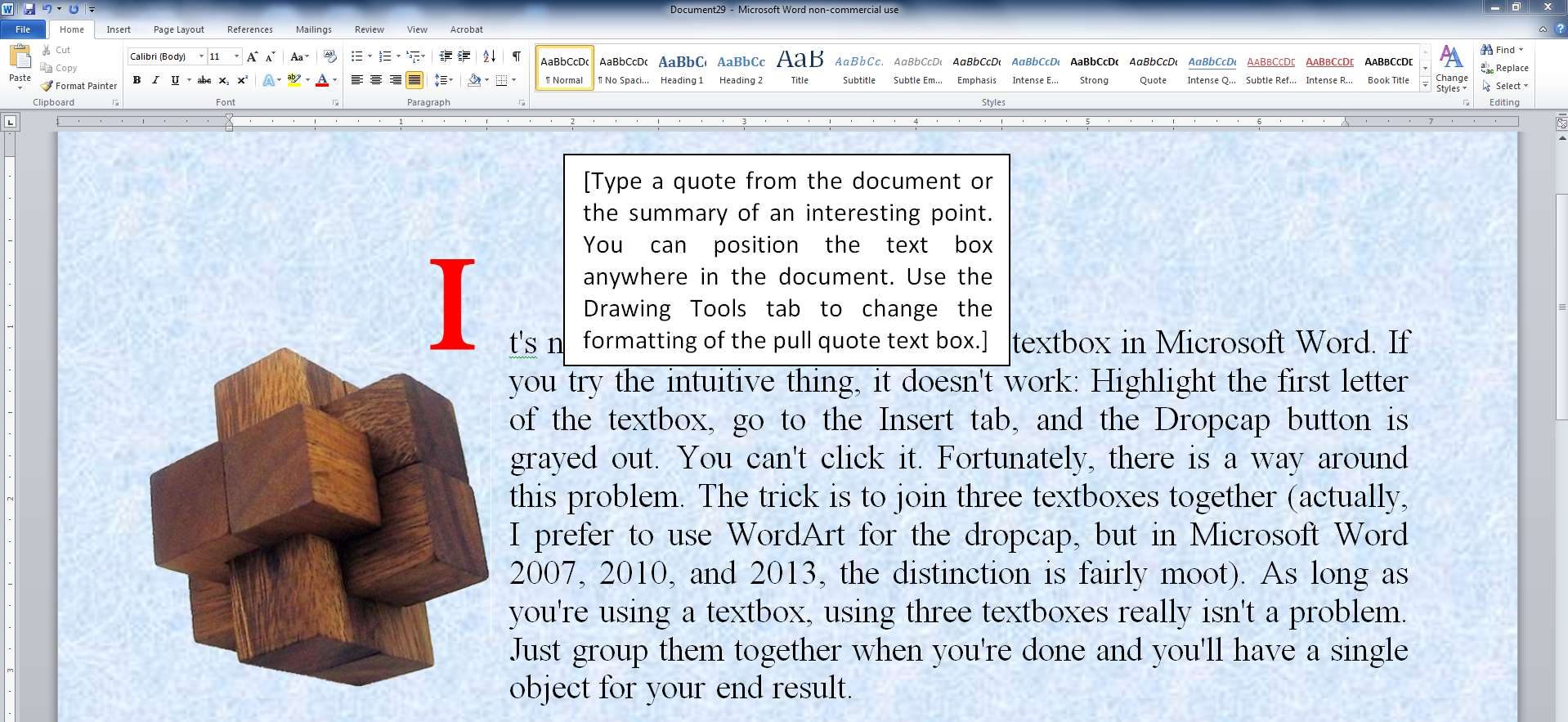
Below is a picture of how a portion of my sample e-book appears in Microsoft Word. If you look above Contents, you can see “pic 2” on a line by itself. Later, I turned that line into a picture. Remember, it’s not how the book appears in Word that matters, it’s how it appears in Kindle that counts. Later in this article, I’ll describe a few ways to improve the formatting from how it appears in Word.

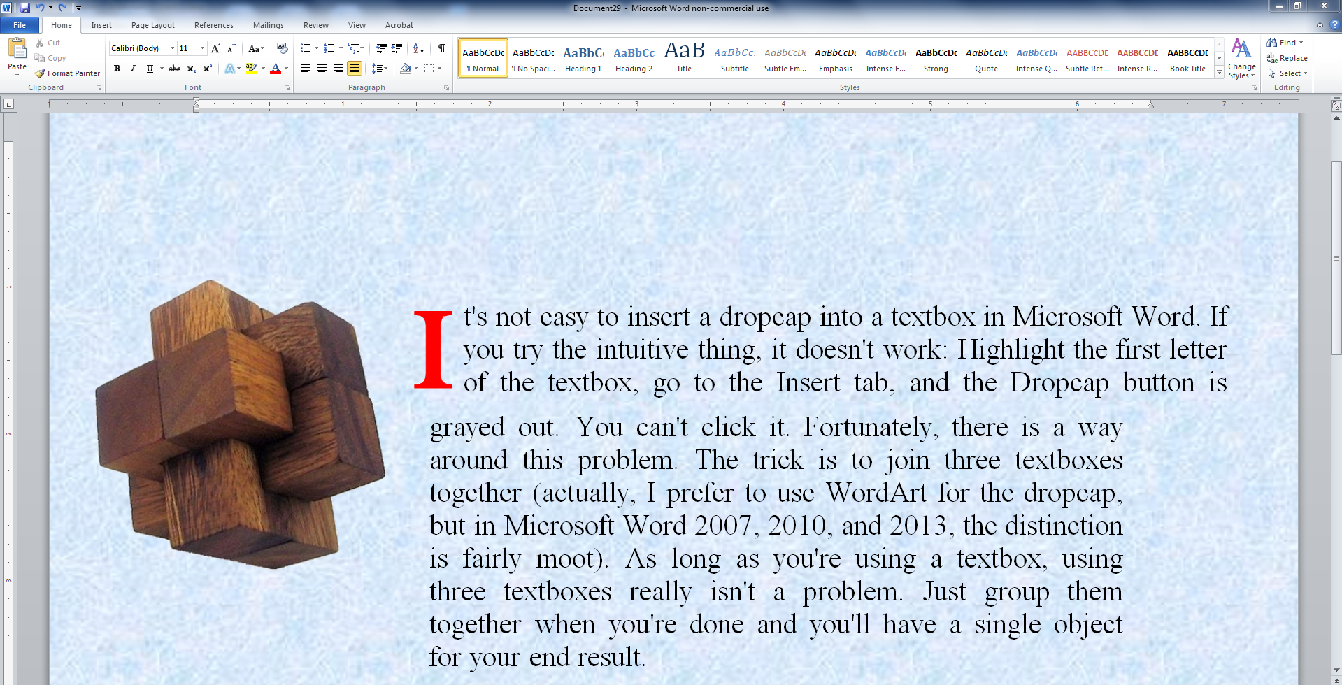
Here is how the beginning and introduction look in the actual Kindle e-book:

I’ll discuss some design choices and a simple way to make further improvements. In case you may want to check out the free sample to see the example firsthand, click the image below:

Click the image to view at Amazon.
DESIGN ISSUES
DECORATIVE IMAGES
There are four decorative images in the front matter. The paperback edition includes some visual elements, so the hope was to incorporate a taste of that visual impression into the Kindle edition.
However, square images (like a heart), full-page images, or tall images take a great deal of room on a screen, which can impact the readability. For one, it serves as a long gap between the text that comes before and after the image. Also, you have limited control over where the paragraphs of text preceding and following the picture will appear. You can wind up with a lot of white space on the screen prior to the image, or you can have one line of text above or below the image, etc. When an image is a crucial part of the book, you do your best to work with it. But for decorative touches, I didn’t want to use an image that may cause such issues.
So I went with wide, short images. These don’t take up much space vertically. You can see one of these pictures in the previous section. (An alternative would be a glyph, padded on the sides so it doesn’t blow up to full-width on certain devices.)
FRONT MATTER CHOICES
Another design choice is which sections to include in the front matter. Some people move the copyright notice and table of contents to the back matter in order to maximize the potential of the Look Inside. A few cram extra stuff into the Look Inside, hoping to make it easier for customers to reach that 10% mark, so crucial for Kindle Unlimited. Neither of these reasons appealed to me.
I included a short, basic copyright notice in the front. I feel that customers generally expect to see this; it’s a standard part of a book; I didn’t want its absence to stand out, and I believe its inclusion, if done well, can help signify that professional touch. Virtually nobody will read the copyright page, but everyone will notice it briefly while passing by (except when they first open the book in a Kindle, where Amazon starts the book after this position; but I’m more worried about the customer on Amazon’s website, checking out the Look Inside).
I also opted to include the table of contents in the front. This book has 88 pages of puzzles. I didn’t want to include 88 entries in the table of contents. So I divided the table of contents up into Puzzles 1-8, 9-16, 17-24, etc.
FRONT MATTER ALIGNMENT
Both the copyright notice and table of contents in this book are centered. For a multi-level table of contents, I would format it left aligned (ragged right) instead, and use indents (through styles) for the various levels. I might use left alignment for most tables of contents, in general, but if you look at this puzzle book, very much of it is centered (including the puzzles), so this kind of fits.
Many traditionally published books center the copyright page, while others are justified and yet others are left aligned (ragged right). In the past, I’ve often used justified or left alignment for the copyright page, and I’ve often noted formatting issues on one or more devices. For example, the last word (like the line with the title or subtitle) might wind up on a line all by itself, or when justified, there can be some large gaps (or one line might not even justify, in the extreme cases). These problems tend to occur more with many copyright pages, and if you include it in the Look Inside, you want this section to look good. Some of these issues can be avoided with proper centering. (Don’t center each sentence of your notice; put it all in one centered paragraph; but the title lines and copyright date lines need to be on their own lines.)
HEADING & SUBHEADING ALIGNMENT
If you have any lengthy chapter titles, headings, or subheadings (for large fonts on small screens, it doesn’t have to really seem ‘lengthy’), you can run into similar issues, deciding between centered or left aligned. (Definitely, don’t justify the headings.) (Another thing to note is that left alignment, i.e. ragged right, can sometimes be a little tricky to pull off if you upload a Word document; it’s more reliable if you just go a quick step beyond Word, as shown later in this article.)
FORCED LINE BREAKS
Sometimes, it pays to force a break to avoid a bad break. For example, the authors are listed as Carolyn Kivett & Chris McMullen. I spread this onto three lines (with the & on its own line). Why? Because on a smaller screen or with a larger font size selected by the user, we could wind up with Carolyn Kivett & Chris showing on one line and McMullen on the next line, which would look unnatural. Separated on three lines avoids that possibility. You can’t do such things with body text, but everywhere else you can keep such things in mind.
But be careful. If you take something too long and break it in half, you might get bad breaks in between. For example, suppose you have two short sentences and decide to place each on its own line. This sounds good until you see the last word of the first sentence wind up on the second line all by its lonesome on a smaller screen or with a larger font.
Remember, don’t try to force breaks in body text paragraphs. It will surely backfire on some devices.
PARAGRAPH ALIGNMENT
Novels and most nonfiction should have indents, but no spaces between paragraphs, in the body text. (But the first chapter of each paragraph is ordinarily not indented.)
My example is a puzzle book. The puzzles themselves are centered, as is much of the front matter. I formatted the Introduction with block paragraphs, i.e. it has space between paragraphs, but no indents. This isn’t your standard nonfiction book, so these block paragraphs fit in with the design.
Definitely, don’t use indents and block paragraphs, or your book will stand out, probably not in a positive way; readers just aren’t accustomed to that.
Readers expect novels and most nonfiction to have indents, but no space between paragraphs. A few kinds of technical books, for example, tend to have block paragraphs (space between, but no indents). If you have a nonfiction book, see what’s common among very similar books.
DESIGN CHALLENGES
One of the challenges in designing a puzzle book or a workbook is that in print, answers are usually collected in the back. That’s just incredibly inconvenient in an e-book.
It’s more convenient to use footnotes for the answers. Unfortunately, if you publish a workbook or puzzle book with answers in both print and digital editions, this would entail much restructuring. (But if you’re really handy with programming, you might be able to restructure your book efficiently that way. I actually went into Excel and efficiently restructured the book there to move the hints and answers from the back of the book into their respective puzzles, but let me warn you, it’s much more straightforward to restructure this with programming than to do it with Excel.)
Another challenge with puzzles and workbooks is that you can’t write in an e-book (well, maybe you could create an ‘app’ instead of a ‘book’). A crossword puzzle, word search, or Sudoku puzzle can’t be ‘read’ as a ‘book,’ for example. But you can do a word scramble in your head.
My biggest struggle with this book was that each puzzle contains 6 word scrambles plus a theme (also scrambled). Since all 7 words go together, it really makes sense for all 7 words to lie on a single page. That’s the way it looks in print (the print edition also includes nice visual decoration). But it’s a big problem for Kindle.
The only way to guarantee that all 7 word scrambles for each puzzle would appear on a single ‘screen’ in Kindle is to format the entire page as an image, but then it wouldn’t likely be readable on a great many devices. Unfortunately, one or more words for a puzzle will go onto the following screen on smaller devices, or any device with a large enough font size selected.
I could have tightened the space between puzzles, but I preferred to add space between the lines of each puzzle (using Space Before, in the styles, not with the Enter key), as readability is important to help focus on one word scramble at a time.
I made a draft without using page-breaks at all, and I rather liked how that looked and read, but in the final product, I included page-breaks. Since each puzzle has a theme, a page-break seemed the natural way to collect the themes together.
IMPROVEMENTS
I took a few quick and simple steps to improve the Kindle formatting.
Below, I show you exactly what I did and how I did it.
You can follow the same steps. Really, there is nothing to learn. You just have to follow directions. 🙂
It will improve the formatting.
FILTERED WEBPAGE
In Word, Save As a filtered webpage (don’t choose single-file webpage), then open the file in Notepad. (An alternative is Sigil, which can help you create an epub, but there is a learning curve for using Sigil.) I’ll describe minimal changes to look for in Notepad. Don’t open the filtered webpage in Word.
If your file has images, there is another step to take before you open the file in Notepad. Find the file on your computer (in My Documents, or wherever you saved the filtered webpage). Right-click on the file, click Send To > Compressed (zipped) folder. This creates two folders: one with images and one zipped folder. Find the image folder (you may have scroll to the top) and drag it into the zipped folder (both folders have the same name as the filtered webpage file).
When you want to edit the file in Notepad, open the filtered webpage, and after saving the filtered webpage, find it and drag it into the zipped folder to replace the old file.
STYLES
When you open the filtered webpage in Notepad, you find the styles at the top.
I delete the font definitions: Everything beginning with /* Font Definitions */ and just before /* Style Definitions */.
I next improve the styles that you find under /* Style Definitions */.
Be careful to type everything exactly (or use copy/paste, as typos here can create havoc). Don’t forget the semi-colon (;) at the end of each line.
The top of each style (Normal, Heading 1, etc.) should include:
margin-top:0in;
margin-right:0in;
margin-bottom:0in;
margin-left:0in;
Exceptions: (1) When you want to include space before a paragraph, change margin-top from 0in to 2em, for example, where an ’em’ is a helpful unit in typography. (2) When you want to a create a block indent, e.g. for quotes, change margin-left and/or margin-right to 2em. This indents every line from the left (or right, or both), not just the first line.
For styles where you want a page-break before (perhaps a chapter heading style), include this line in the style definition:
page-break-before:always;
Control paragraph alignment and indents with lines like these in the styles:
text-align:justify;
text-indent:0;
The word justify could also be left or center, depending on how you want that style to be aligned. Heading styles are often centered. Most body text is usually justified.
Set text-indent to 0 for any paragraph that you don’t want to be indented. While zero doesn’t work in Word, it does work here.
For the Normal style or any other styles that you do want indented, I recommend 2em (two em’s), as in
text-indent:2em;
This way, your indent size will depend on the font size that the user selects. While a percentage seems like it would better match the screen size, it comes out way too big in the Look Inside, which is your main selling feature.
However, you should control the font size with a percentage, such as
font-size:100%;
Regular body text should be 100%. I used 150% for headings.
I remove all mention of font families by changing these lines to:
font-family:;}
You should only have the closing brace } if this is the last line of the style’s definition.
There are other changes that I make, and other things I do to clean up my file; I’m taking a minimalist approach here to keep things simple.
IMAGES
Find the paragraphs that call your images. One way to format them better is like this:
<img style=”width: 100%; height: auto;” width=”2048″ height=”342″ alt=”” src=”Filename/Picname.jpg”>
Only include the “width: 100%; height: auto;” if you want the image to fill the width of the screen. (Note that older Kindles automatically fill the width anyway, so if you don’t want an image to zoom full screen, you should pad it instead.)
Don’t use 2048 and 342. Use whatever size the image is (most likely, if you have multiple images, they will differ in size; find the sizes of your images).
It may seem redundant to also include the width and height size if also setting the width to 100%, but this may speed things up on some devices.
Word can resize your images on you, so you should check the point values in the HTML and also in your compressed image folder. If it was resized, you can delete an image from the compressed image folder within the compressed zipped folder and copy/paste it back in (based on your original).
If the src= part at the end doesn’t specify your file location correctly, the image won’t display in the Kindle e-book. (So you should check every picture when you preview it.)
The img style should be part of a paragraph, like:

You’ll probably have a p class instead of a div class. I use the Replace tool in Notepad to change every <p into <div and every </p into </div throughout the file.
OTHER
There are more things you can change, but again I’m trying to keep the changes to a minimum for simplicity.
If you want to see how clean your Word file is, try using the Find tool and looking for span, font, color, <br, clear all, and things like that. If you have a lot of spans (other than endnotes), it probably means you had a habit of highlighting text or paragraphs and applying formatting to what’s highlighted. The more you get in the habit of using styles for paragraph formatting, the more that will reduce those spans. Those breaks (br) and clear all’s can arise from manual page breaks, Enters, etc.; these come out cleaner when you build the page-break into the header style and when you use Space Before in the paragraph style instead of using the Enter key (don’t add these features to every style; just figure our which kinds of paragraphs should have space before and add it to paragraphs of those styles). If you find the word font (other than in your style definitions), it probably means that you highlighted text or paragraphs and selected a font style, size, or color. Try to break that habit (except when you need a portion of a paragraph, rather than the entire paragraph, to format differently).
CONSISTENCY AND PREDICTABILITY
It’s worth browsing through your p-tags. They begin <p class=, such as <p class=MsoNormal>, unless you changed all the p tags to div tags like I do, then you’ll have things like <div class=MsoNormal> or whatever you called the style.
Your HTML will tend to produce more consistent and predictable results if you don’t have overrides in your paragraph tags. Examples of overrides in your paragraph tags include <p class=MsoNormal align=center> or <p class=MsoNormal style=’text-indent:.3in’>. These are contradictions. The Normal style says to justify, while your p tag says to align center. Unfortunately, when you have contradictions like this, the Look Inside doesn’t always choose the way you’d like.
These contradictions come about when you don’t use the styles religiously. If you highlighted a paragraph and changed the alignment to center, you create a p tag like <p class=MsoNormal align=center>. What you should have done is create a centered style and simply associate that style with the paragraph to create a p tag like <p class=Center>. Similarly, don’t highlight a paragraph and change First Line for the highlighted text, as that creates a p tag like <p class=MsoNormal style=’text-indent:.3in’>. The better thing is to create a new style with the indent you need, then simply associate that style with the paragraph. If you see overrides in your paragraph tags, you want to change your habit of formatting highlighted paragraphs and use the styles instead. That will give you the most reliable formatting.
Chris McMullen
Copyright © Chris McMullen, Author of A Detailed Guide to Self-Publishing with Amazon and Other Online Booksellers
- Volume 1 on formatting and publishing
- Volume 2 on marketability and marketing
- 4-in-1 Boxed set includes both volumes and more