Formatting the Look Inside

Look Inside

Amazon’s Look Inside

Kindle Direct Publishing (KDP) offers previews for how your e-book may look on the Kindle, Kindle Fire, Kindle Fire HD, Paperwhite, iPad, iPhone… but not the Look Inside.

Yet prospective customers checking out your book on Amazon see your book’s Look Inside before making the purchase.

The Look Inside can significantly impact sales.

At the same time, Kindle authors tend to experience more formatting issues with the Look Inside than on the Kindle, Kindle Fire, and most other devices.

In fact, it’s not uncommon for a book to look great on a Kindle device, but format incorrectly in the Look Inside.

This problem plagues indie authors self-publishing their books on Kindle. Once they finally master Kindle formatting, the Look Inside is the last big hurdle.

In this article, we’ll explore how to format for the Look Inside. One example we’ll examine in detail is how to create non-indented paragraphs that don’t indent in the Look Inside.

Why Doesn’t the Look Inside Format Right?

Well, the technical answer involves a discussion about what is “right.” The Look inside is ultimately generated by a program following instructions. In the end, the Look Inside is “right.”

It often seems like the formatting is wrong when the author compares the original Word file with the Look Inside.

Some of the formatting that may look right in Word can get lost in translation on the way to the Look Inside.

The Look Inside sees a set of HTML instructions generated from the Word file.

Note: Even though you may submit a Word document to KDP, what the device reads is a set of HTML instructions that tell it what to display—ultimately, your submitted file is converted into a mobi file, which essentially contains a set of HTML instructions based on the Word file that you submit.

Often, what the Look Inside displays from reading those instructions differs from what Word displays on the screen.

What a Kindle, Kindle Fire, iPhone, iPad, Kindle for PC, and the Look Inside display on the screen can vary from the same set of HTML instructions generated from a Word file.

The Look Inside interprets the HTML more strictly, which is why the formatting is hardest to get right for the Look Inside.

From Word to Kindle

Kindle doesn’t see the Word document the way you do. It sees a set of HTML instructions.

The beginning of the HTML defines a set of styles used in your Word file. For example, there is a style for heading, subheading, titles, and a Normal style for the paragraphs of your body text.

Kindle (or iPad, or whatever device is being used) displays the different parts of your book according to these different styles.

If you highlight all or part of a paragraph and change the formatting of that text in Word, this carries over into the HTML.

Then the HTML says something to the effect, “Use the normal style, but change the indent size and add italics.”

This is where the Look Inside problems can begin. The Look Inside may format according to the style, and disregard some of those exceptions created by highlighting selected paragraphs. Other issues can arise from unclosed HTML tags.

The HTML generated from a Word file can get pretty messy, with all sorts of style exceptions built into the HTML, with <span> tags dispersed throughout, and with font settings redefined within the paragraph blocks. (You don’t want the file to define font size or style within the paragraph blocks. Not only can this cause formatting problems, but the device user expects to have control over these settings.)

Microsoft Word’s Styles

Much of the problem can be resolved by using Microsoft Word’s built-in style functions religiously. Modify the heading, subheading, title, and Normal styles to suit your needs.

Then make a new style that’s essentially a copy of the Normal style for paragraphs that need to be non-indented. I’m going to call this the NoIndent style just to give it a name.

When you’re modifying the styles, click on the Format button and adjust the Paragraph settings, too. Set the First Line indent for the Normal Style. It might be something like 0.2″ (since the common 0.5″ would be really large on a device with a small screen, especially an iPhone or the basic Kindle). Don’t use the tab key at all (and don’t use the spacebar to create indents). For the NoIndent style, set First Line to 0.01″.

Notes:

  • I specifically have Microsoft Word 2010 for Windows in mind. (Other versions may function similarly, though they can lead to important differences.)
  • If you set First Line to “none” or zero, it won’t work. Use 0.01″. (If you try to make it too small, it won’t take.)
  • Go to Special in the paragraph menu to find First Line, then set the By value next to it.
  • You see all the styles at the top of the screen, on the right side of the toolbar, in the home tab.
  • Right-click a style to modify it. When modifying the style, click the Format button to find the font and paragraph menus.
  • You can even build pagebreaks into the styles. Click Format, select Paragraph, then click the Line and Page Breaks tab. There is an option to pagebreak before. If you have pagebreaks that aren’t respected, try this (but realize that a Look Inside displayed as a single, scrolling page isn’t going to implement this).
  • To create a new style (for NoIndent, for example), click on the funny icon in the bottom-right corner of the styles menu on the home tab (the little icon is below the A’s where it says “Change Styles”). This will pull up a new window on the right side of the screen. Find the three buttons at the bottom of this window. Click the left button.

Apply the styles to sections of your document one by one. You can highlight a section and click the style, or you can place your cursor in a paragraph and click a paragraph style from the menu.

You want every block of text in your file to be associated with a particular style.

Except when you have to have different styles in the same paragraph (e.g. you wish to italicize, boldface, or underline specific text, or create subscripts or superscripts), you want the style to dictate the formatting. Go into the Font and Paragraph menus when modifying each style to create the formatting you want there. Don’t use the font and paragraph tools on the menu at the top of the screen to make these adjustments (except to adjust specific text, with something like italics, within the paragraph).

For example, set the linespacing in the paragraph menu by adjusting the style itself and applying the style to the text. Don’t do it by highlighting text and setting the linespacing.

Be sure to check the font menu when modifying each style (from the Format button). If you go into Advanced, you may find that Word’s defaults have adjusted the kerning for selected styles (you may or may not agree with these settings, so you should check them out). The font color should be automatic except when you need to apply a specific color to selected text.

You want to have a larger font size for headings and subheadings than the normal text, but you want to achieve this by setting the font size within each style. If you select text and apply a font size or style to the selected text, this causes problems when an e-reader interprets the HTML instructions for your file.

Check the “Automatically Update” box when modifying each style if you want changes to that style to be applied to text that has already been set to that style.

Word’s styles can get mixed up. What you want to do is start with a document as clean as possible (in the worst-case scenario, this can be achieved by cutting and pasting your document into Notepad and then back into Word). Then apply one style to every section to avoid any mix-ups.

Don’t select text and set specific font styles (e.g. Georgia). Don’t select whole paragraphs and set linespacing, indents, or other paragraph options. Instead, apply a specific style to those paragraphs. Make the paragraph adjustments in the style (for every paragraph of that style in your document), and apply the style to the paragraphs rather than modifying the paragraphs through the toolbar at the top of the screen (except by clicking the styles, like Title or Normal, found on that toolbar).

How to Create Non-Indented Paragraphs

Let’s work through a concrete example that plagues the Look Insides of many Kindle e-books.

Most traditionally published books don’t indent the first paragraph of each chapter. Popular novels do indent paragraphs, but not usually the first paragraph of the chapter. Check out several popular traditionally published print books. If you understand what I mean by “not indenting the first paragraph of the chapter” (see the two pictures below) you should observe that this is very common among those books.

Examine the two examples that follow. The first example has all of the paragraphs indented. The second example doesn’t indent the first paragraph of the chapter. The second example is very common among traditionally published books. However, it can be a challenge to implement this on the Look Inside. (Many traditionally published books put the first few words in CAPS in e-books, instead of using drop caps, as drop caps can format improperly on some devices. Tip: If you write fiction where this is common, try putting the first few words of your blurb in CAPS, too. I’ve seen this done effectively in the blurbs of some popular traditionally published books.)
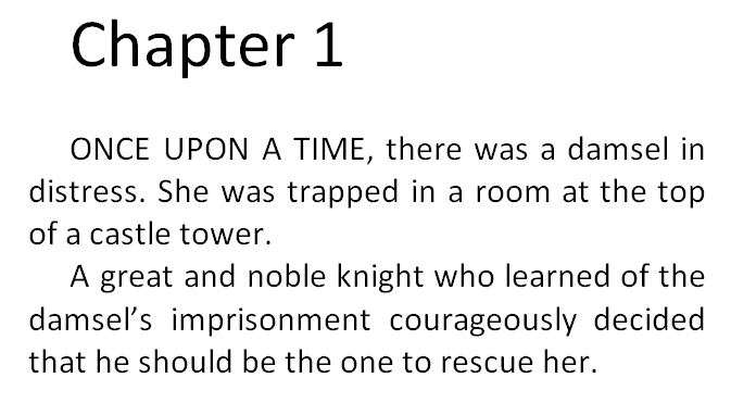
IndentedNot Indented

Even if the first paragraph appears non-indented on the Kindle device, it may still appear indented on the Look Inside. But there are ways to get this right.

Let me illustrate the wrong ways first. Definitely, don’t use the tab key to indent some paragraphs, thinking this will correctly distinguish between which paragraphs are or aren’t indented. This might seem intuitive, but it doesn’t work (there will be inconsistencies). Similarly, don’t use the spacebar to create indents; it doesn’t work either.

Here is another wrong way. Better, but still wrong. If you highlight the first paragraph, click on the funny little icon in the bottom-right corner of the paragraph group on the home tab, change Special to First Line, and set By to 0.01″, it might not work. It will work on the screen and may work on most devices, but may not work on the Look Inside.

Here’s the problem. You can see the problem firsthand by looking at the HTML. You don’t need to know anything about HTML to peek at it and learn what’s going on. If you want to see Word’s HTML, Save As a filtered webpage (you want the one called Webpage, Filtered). Click Yes to the question that pops up. Find this new file on your computer (e.g. it might be in My Documents; it will be wherever you just saved it to). Right-click this HTML file and Open With Notepad.

When I adjusted the first paragraph’s indent the wrong way, as I outlined two paragraphs ago, the paragraph tag for the first paragraph looks like this:

<p class=MsoNormal style=’text-indent:.7pt’>

Compare this with the second paragraph:

<p class=MsoNormal>

You don’t have to know HTML to see the difference. Each paragraph sets the style to Normal. The first paragraph says to indent 7 points (0.01 inches).

The style=’text-indent:7pt’ setting will tell some devices to ignore the Normal style and indent the first paragraph 7 points (very little).

But the Look Inside may not accept this override. The Look Inside sees that you’re using the Normal style, which was previously defined to indent 0.2″. There are two different sets of instructions.

The better way is to provide a single set of instructions. That leaves less to interpretation.

This time, instead of highlighting the first paragraph and changing First Line from the home tab, I’m going to define a NoIndent style. I’ll do this by creating a new style based on the Normal style, and give it the name NoIndent (the last bullet in the section above called Microsoft Word’s Styles explains how). Then I’ll modify the NoIndent style (again, look for the bullets in the previous section for instructions). While modifying the NoIndent style, click Format, choose Paragraph, and set First Line there.

Now I simply place my cursor anywhere in the first paragraph and click the NoIndent style from the home tab. Prest-o, Change-o!

This time, the paragraph tag for the first paragraph looks like this:

<p class=MsoNoIndent>

Now this paragraph only has one set of instructions. When Amazon’s Look Inside reads the Kindle e-book, the class=MsoNoIndent statement will tell it to indent the paragraph according to the previously defined NoIndent style, which says to indent just 0.01 inches.

You can improve on this. Find the style definition for the NoIndent style in the beginning of the HTML file. Change 7pt or 0.01in (whichever it says) to 0 (that’s the number zero, not the letter O). This doesn’t work in Word, but it does work in the HTML file.

Notes:

  • Don’t open the HTML file in Word. Use Notepad to examine and modify the HTML.
  • If you have images in your file, you want to create a compressed zipped folder as explained in Amazon’s free guide, Building Your Book for Kindle.
  • Also look for span tags that include font definitions. If you remove these, be sure to remove the closing tags, too, which look like </span>. The Find tool can help you locate these.
  • Search for text-indent with the Find tool to see if any paragraphs are indenting through this setting instead of through a style definition.
  • Seemingly endless italics, boldface, or underline that’s not intended to be there may be caused by unclosed <i>, <b>, or <u> tags. For example, <i>italics</i> makes the word “italics” appear italicized. If the closing tag, </i> is missing (or typed incorrectly), the italics will keep going and going and going…
  • Other things you might look for are images. For example, instead of specifying the width and height in pixels, for large pictures that you’d like to fill the screen, you might remove the current width and height statements and replace them with width=”100%” (don’t set both the width and height this way; just set the width; however, if you have really skinny pictures, i.e. skinnier than the Kindle Fire, you might prefer to set the height instead of the width).

Chris McMullen

Author of A Detailed Guide to Self-Publishing with Amazon and Other Online Booksellers

  • Volume 1 on formatting and publishing
  • Volume 2 on marketability and marketing

Follow me at WordPress, find my author page on Facebook, or connect with me through Twitter.

Comments

Click here to jump to the comments section:

https://chrismcmullen.wordpress.com/2014/05/18/formatting-the-look-inside/#comments

Models of Good Books: What to Look for

Models

Model Books

Indie authors must go way beyond writing the book. There is also editing, formatting, cover design, and marketing.

But self-publishers don’t need to invent the wheel. When it comes to formatting and cover design, there are many effective models available to help serve as guides.

Look at books as models for what can be done.

It’s important to realize that different books serve different purposes. Don’t take your favorite book and use it as a model for everything.

  • Paperback formatting: Look at books similar to yours by the big publishers. Money-saver: Visit your local library.
  • Cover design: Browse through top-selling indie books in your genre. (Note: Big publishers and popular authors can get away with lesser covers. When you see a popular book with a blah cover, it doesn’t mean that covers aren’t important.)
  • E-book formatting: Try to find professional e-book conversion services with a strong reputation or e-book formatters who appear very knowledgeable. Browse through books they’ve formatted. For example, KDP has a list of conversion services: https://kdp.amazon.com/help?topicId=A3RRQXI478DDG7. One of these is Book Nook Biz, which has a gallery of books: http://www.booknook.biz/bk_books.
  • Blurb: Best-selling indie books often have great blurbs. Look for popular indie books in your genre. (Note: Big publishers and popular authors don’t need the best blurbs to sell books.)
  • Price: Look for books that are very similar to yours to see what price range is common.
  • Categories: Search for popular books similar to your book on Amazon. See which categories they are listed under.
  • Marketing: Find successful indie authors in your genre and see what kinds of marketing strategies they are employing. Their social media pages may give you some clues. Many top indie authors have Author Central pages at Amazon, and very often their blogs or tweets feed into Author Central. Click on a blog post or tweet to find these authors online.

For any single aspect, such as formatting, don’t limit yourself to just one book. Look at a variety of books in your genre.

Your goal isn’t to copy what someone else has done, but to sample a variety of quality books that show you what some of your options are. You can also develop a feel for design by studying well-designed books. The more you study, the better (provided that they were designed well).

What to Look for

Here is a sample of specific things to look for when studying models.

Paperback formatting:

  • Are the books justified or ragged right? Are all the pages like this, or are there exceptions in the front or back matter?
  • What size font is used? What style font is used? Research suitable fonts for your genre that are available for free for commercial use. Print out a sample paragraph in a few different font sizes and compare your sample paragraph to what you see printed by the big publishers. You can learn a lot about book design by trying to recreate a page that you see. (Recreate the page only as a test. You don’t want to copy the design of any book, but want to develop your own style from studying these models.)
  • Measure the linespacing. Chances are it’s close to single spacing, but not quite. Google how to measure font leading. You can set the linespacing to Exactly a pt measure (font sizes being measured in terms of pts).
  • Measure the page margins. Also measure the distance between any headers and footers to the body text.
  • Do the lines of text line up at the top and bottom of all the pages? Are there exceptions, like the first or last page of each chapter?
  • Which pages have page numbers? Which pages have Roman numerals?
  • Which pages have page headers at the top? Study the style of the page headers. What text appears on different page headers? Note that the publisher name or author name are less relevant for indie books.
  • Study the chapter heading and subheading styles, including the font size, font style (e.g. bold), numbering, and space before and after the headings. Do the first-page chapter headings drop down from the top of the page?
  • Does the book use hyphenation? How frequent are the hyphens? If the book is justified, are the gaps between words ever noticeable?
  • Do you find any widows (a single line of a paragraph that appears on a page by itself)? Do you see orphans (a word or short phrase all by itself on the last line of a paragraph)?
  • Is there a single space after a period and before the next sentence starts instead of two spaces? Look closely.
  • Look for bullet points, footnotes, citations, and any other kinds of formatting that you plan to use in your book and study the formatting.
  • Does the book have a drop cap at the beginning of each chapter? Is the first paragraph of each chapter non-indented?
  • How are the front and back matter organized? Which sections are included?
  • Examine the copyright page closely. Formatting is important. You need to prepare a professional copyright statement and, if you write fiction, a fictional works disclaimer. Your print-on-demand book won’t have a Library of Congress number or printing numbers like traditionally published books do.
  • Study the formatting of other front and back matter sections, like the table of contents, references, index, glossary, and about the author section.
  • Look for little design marks that improve the feel of the book. Are they small? How do they look? Where are they used?

E-book formatting:

  • Most of the bullet points listed above for paperback formatting apply here, too, except that you may prefer to look at indie e-books converted by professional e-book formatters. If so, it’s also worth comparing these to traditionally published e-books.
  • Look for differences between e-book and paperback formatting.
  • Do e-books tend to give you the freedom of font size, font style, linespacing, and other user options?
  • Do the images fill the width of the screen when reading on a pc? Would you be able to make out the detail in the images on a cell phone? How do they look on a black or sephia background? Are there some images, like glyphs, that don’t appear full-width? Do the images look nice? If they are in color, how do they look in black and white? (Obviously, if you have the chance to sample some of these things on a few different devices, that will help.)
  • Does it seem like some front matter sections are missing? Is the table of contents in the front or back?
  • Study the way the e-book begins, especially the formatting and order of the title page, copyright page, contents, introduction, and how the book starts.
  • Does the end of the book include a short sample from one of the author’s other books?
  • Examine the chapter headings closely. Study the formatting. Do they appear as text or as images? Do they come with images, or are they text only?
  • Is the first paragraph of each chapter non-indented? Are there any lines from the table of contents or copyright page that appear indented?
  • How large is the indent? Does the indent look the same size if you change the font size or view the book on a different device? (You can save a Word document as a filtered webpage, open the e-book in Notepad, and change the size of the indent to something like 2 em instead of a value in inches. That way, the size of the indent depends on the font size.)
  • Is the book justified or ragged right? Which text is centered (copyright page, chapter headings, etc.)? If the book is justified, do you see any large gaps between words?
  • Does any of the text appear in color?
  • Is the e-book reflowable, fixed layout, or comic book format?
  • Are there any or many long paragraphs? Or does it seem like the e-book has mostly short paragraphs to prevent a single paragraph from easily filling up a screen?
  • Does the Look Inside get into the action quickly or build slowly?
  • It’s worth skimming all the way through a well-designed e-book shortly before viewing your own e-book on the previewer. That will help you notice possible issues.

Cover design:

  • See how everything (i.e. the central image, background, and text) seems to fit together on the best book covers. You don’t want your cover to look like separate pieces slapped together.
  • Can you immediately guess what the book is about by glancing at the cover? Compare the thumbnail image to the full cover.
  • What are readers in your genre accustomed to seeing on covers?
  • How many images do you see on the best covers?
  • Do the people on the covers have blank stares, bored looks, or appropriate expressions? Do you see the same stock images on many of the top sellers?
  • How many main colors are there? What kinds of colors are common in your genre? Which color combinations seem to work well together?
  • Do the fonts fit the genre? Are the fonts plain, fancy, or somewhere in between? Are the fonts easy to read? Is the title easily read on the thumbnail? Is the text horizontal? Do you recognize popular fonts like Times New Roman, Arial, and Comic Sans, or did the designer spend time browsing font sites like Font Squirrel (http://www.fontsquirrel.com) and FontSpace (http://www.fontspace.com) to find the one that works best?
  • Although you should study top-selling indie book covers, traditionally published books reveal an important point: They don’t mention the cover designer on the front cover, but instead mention the designer in small print on the back cover and on the copyright page.

Blurb:

  • Is it short or long? If it’s long, is there space between paragraphs? Does it have bullet points? Does it use italics or boldface? (You can do these things from Author Central: https://authorcentral.amazon.com.)
  • Does it grab your attention right away? Does it hold your attention throughout?
  • Can you tell right away what the book is about?
  • How does the text flow? Is it easy to read? Does sentence structure and length vary? Is the writing simple or complex? How strong or plain is the vocabulary?
  • Is it written in the third person or something else? What tense is used?
  • Are there review quotes in the description? If so, what are the sources?
  • Also study author pages, including biographies and author photos.

About Me

Chris McMullen, Author of A Detailed Guide to Self-Publishing with Amazon and Other Online Booksellers

Follow me at WordPress, find my author page on Facebook, or connect with me through Twitter.

Authors, You Are Amazon

Me yes you

Why You

Because your book is available for sale at Amazon.

Amazon does sell many other products, but most customers think of books when they think of Amazon.

Millions of customers will buy other books besides yours, but some will (hopefully) buy your book.

When those customers read your book, your book—for that period of time—represents Amazon.

If the customer enjoys the shopping and reading experience that your book provides, the customer doesn’t just think highly of your book and you, but Amazon, too.

A poor buying or reading experience produces the opposite effect.

Of course, you have your own reasons for wanting to create a positive reading experience: You want the customer to recommend your book to others and to look for more of your books.

You want other authors’ books to create positive reading experiences. The more customers who enjoy shopping for books at Amazon and reading those books, the more likely those customers are to buy more books from Amazon and recommend Amazon to their friends, which improves the sales potential of your own books.

So it’s in your interest to support your fellow authors when they need and ask for help. (Offering unsolicited advice isn’t always received well, though.)

It’s also in your own best interest to help brand a positive image for Amazon, Kindle, and CreateSpace. The more customers who shop on Amazon, the better for all authors.

It’s even in your best interest to have good things to say about books similar to yours because those books are likely to appear on your customers-also-bought lists, and even if they don’t, most customers buy multiple books that are similar, not just one of them. Similar books can thrive together (or they can sink together).

When you hear negative things about Amazon, Kindle, or CreateSpace, take a moment to calmly and concisely say something good—and then let it be. Don’t get into a confrontation. Brand a positive image for yourself, too.

If you ask a customer what Amazon is, he or she will probably mention that it’s a huge website with an enormous selection of well-priced books.

But that’s not how the customer feels about Amazon. How the customer feels depends on shopping experiences and reading experiences. Each sale of your book contributes to a customer’s perception of Amazon.

You are Amazon.

We are Amazon.

Even the customer is Amazon. Anyone who enjoys the great selection, convenience, and prices benefits from helping to brand a positive image for Amazon.

Of course, indie authors must be thankful for the opportunities that Amazon has created.

Indie authors account for a significant share of Amazon’s book sales.

Indies are Amazon, too.

And the best indie books have shown that they can create wonderful reading experiences.

Beyond Amazon

You’re more than Amazon.

If you sell books on Nook, Kobo, Sony, Smashwords, etc., you’re all of these.

Wherever your book is sold, your book represents that retailer.

You want to brand a positive image for all of these outlets, and for whatever publishing service you use.

Chris McMullen, Author of A Detailed Guide to Self-Publishing with Amazon and Other Online Booksellers

Follow me at WordPress, find my author page on Facebook, or connect with me through Twitter.

Can You Be too Professional?

Pro Am

Amateurish!

There are many ways that a book or author may be perceived as amateurish.

Many of these correspond to doing what seems intuitive or convenient:

  • Commenting on reviews.
  • Not realizing that the cover is a visual representation of what quality to expect.
  • Including the word “by” before your name.
  • Using the default settings in Microsoft Word.
  • Creating indents with the spacebar or using the Enter key to pagebreak.

Others are more subtle:

  • Not seeking editorial reviews to earn buyer confidence.
  • Typing two spaces after a period.
  • Poor font selection.
  • Not using Word’s style functions and First Line Indent from the Paragraph menu.
  • Getting a free .wordpress.com site instead of buying a domain or using .org.

Add to this at least 90% of the things done in the name of “marketing.”

Too Far?

If it’s not professional, does that make it amateurish?

Unfortunately, I see comments about other books and authors of the sort:

  • “That’s so amateurish!”
  • “You need to enroll in Publishing 101.”
  • “What a newbie!”
  • “Nothing says ‘amateur’ like Times New Roman.”
  • “Didn’t you preview your book first?”
  • “That book is in bad need of editing help.”

In a moment, I will come to an alternative to professional and amateurish.

First, let’s consider some of these points:

  • If there is something reasonable that you can do to improve the formatting of your book, you should do it. A better-formatted book makes a better impression. It’s certainly harder for readers who enjoy a story to recommend a poorly formatted book. A better-looking Look Inside is more likely to close the sale. However, once the book looks pretty good, for most buyers who support indie publishing, there will come a point where the formatting is good enough to earn the sale.
  • Some of the people who are avidly complaining about grammar, spelling, and writing style, and who are pointing out editing issues, are themselves editors. They want to advertise the importance of editing to drum up business. If they love editing books, naturally editing will be quite important to them. But it’s also important to readers. Frequent mistakes will lose reader interest. Not just in spelling and grammar, but using a vocabulary and style that suits the audience, having the book flow well, even improving the storyline and characterization. There are many different kinds of editors, and all editing is important. However, like formatting, customers who support indie books have some degree of tolerance. The important thing is to be on the safe side of where this line is drawn for the majority of your target audience.
  • A lousy cover suggests a lack of effort. Who wants to read a book where little effort was put into it? If the cover reflects much effort, the cover should, too. The cover is also a valuable visual tool. Customers searching on Amazon see the thumbnail among many others before deciding which books to check out. Most of the thumbnails don’t receive any attention. The cover is also a valuable branding tool. An effective cover makes the genre and content immediately clear to strangers in the target audience and appeals to the target audience. In nonfiction, sometimes large keywords can be effective with little imagery. If you interact with people personally, this can offset not having a great cover. But a fantastic cover opens many doors, and is a must for selling fiction through discovery online.

Option 3

If not professional nor amateurish, what else?

Stephen King is a professional author. Sold millions of books, traditionally published, famous.

You don’t expect to see Stephen King use his children’s school artwork for his cover. You don’t expect to see him commenting on many of his reviews. You expect his books to be professionally edited and formatted. You probably have really high expectations for the quality of his stories. Stephen King can easily get a ton of editorial reviews, famous authors to write forewords, professional book reviews, etc. His author site is stephenking.com, which looks very professional.

You’re not Stephen King. (If you were, why on earth would you be reading this blog?)

But you don’t need to be.

In fact, you can do some things that you wouldn’t expect Stephen King to do. (I’m not saying he doesn’t do them, just thinking what average expectations are.)

Personalization.

It’s your asset. You can interact with your fans, your target audience. Stephen King can interact personally with fans, too, and probably does. You can easily interact personally with a much larger percentage of your fan base. By the sheer numbers, Stephen King is pretty limited percentage-wise.

The Personal Touch

I see some authors with an AuthorName.com website without a blog. I’ve even see a few authors switch from the free WordPress .com site to .org, and I’ve seen the Likes and Follows disappear to be replaced by Facebook and Twitter options only.

I perceive this as an attempt to appear more professional (and .org may also offer more flexibility, although .com has everything I feel that I need). Also, displaying a tally of views, likes, and follows might show that a website isn’t too popular, so perhaps some aim to hide this data.

But it seems less personal.

In addition to personalization, humility may be another factor.

We like to discover the small guy, with a humble book that tells a great story, that we can support.

By the way, WordPress.com is huge and may help, rather than hurt, with search engine traffic compared to .org. See here: http://onecoolsitebloggingtips.com/2014/05/05/no-metadata-required-for-good-seo/. There is a lot of helpful info there; for this point, look at the end of the first paragraph under “Keyword Use in Branding.” I have .com (with the WordPress extension in it) and draw in over 100 views per day from search engines, so .com seems to work well for me.

Readers who want a professional, impersonal reading experience can already find that with traditional publishing. One of the advantages of self-publishing is the opportunity to provide a more personal experience to a larger percentage of readers. There are disadvantages, too, so it’s important to take advantage of the benefits.

Readers can also choose a personal experience, with a perhaps more humble book and author. I’m not saying to not worry about being professional. Get the formatting, editing, and cover to look as good as you can. Marketing-wise, think personal. That’s your advantage.

An interactive blog, where it’s easy to interact and follow however the fan prefers (WordPress, Facebook, Twitter, Google, Pinterest, email, etc.), with the convenient option of commenting from WordPress without having to sign into Facebook or Twitter, encourages participation. A simple Like while logged into WordPress offers a quick and easy show of support.

Think of ways to find and interact with your target audience. Readers who personally interact with an author, online or in person, and who enjoy the experience are more likely to buy the book, and to recommend the book to others if they enjoy it.

Many of the ways that books are bought are inaccessible to new authors: bestseller lists, showing up high in a category, professional reviews, name recognition, etc. But one of the big ways that books are purchased is following personal interaction with the author. Every indie author has this opportunity.

How about editorial reviews and advance review copies? This is very common among traditionally published books. Should indie authors be copying what traditional publishers do? I know, there are some incentives to reviews, as some sites that promote indie books set a bar to reach.

Some customers don’t like to see numerous reviews show up shortly after a book is published: It can create buyer suspicion. Some disregard all those quotes of how wonderful a book is. At the same time, customers want to see an assortment of neutral opinions. Ah, what is neutral? Are all those glowing remarks inside a top-selling book really “neutral”?

Is it possible for a humble book with a personal touch, along with a possible personal experience, to have more appeal than a book that seems “too” professional? Food for thought, perhaps.

Chris McMullen, Author of A Detailed Guide to Self-Publishing with Amazon and Other Online Booksellers

Follow me at WordPress, find my author page on Facebook, or connect with me through Twitter.

Pros & Cons of Publishing with Adobe

Creative Cloud

Publishing Software

Microsoft Word is easy to recommend as publishing software for a few good reasons:

  • It’s accessible. Many writers already have Word. If not, it’s fairly inexpensive and easy to find. If price is a factor, Open Office is an alternative.
  • It’s convenient. Most writers already have familiarity with how to use some of Word’s functions. It’s also fairly intuitive. When it’s not, a Google search or a question in the CreateSpace or Kindle community forum will usually help out.
  • It’s functional. It’s possible to make a very nicely formatted print book. You can set the leading, inside and outside margins, add different styles of headers and page numbers, adjust the kerning, and even deal with widows. Not everything is easy, like using section breaks to change the header style or preventing Word from compressing images, but the potential is there and it’s relatively painless once you master the tricks.
  • It’s Kindle-friendly. Using Word’s style functions, it’s possible to make a Word document that converts very well to Kindle format. KDP continues to improve this.

Adobe is considered to be more professional for publishing print books, formatting images, and converting to PDF (note that PDF isn’t very e-book friendly, while Word is, although Adobe does have software features oriented toward making e-books). It’s not that you can’t learn how to format a Word document that looks professional, but more that once you master Adobe’s features, some of the formatting features become easier to perfect in Adobe InDesign. Most book designers who are equally fluent in both Word and InDesign prefer InDesign.

Here are some of the advantages of using Adobe:

  • Acrobat XI provides many options for conversion to PDF, such as flattening transparency, selecting output resolution, and embedding fonts. Most free or low-cost Word-to-PDF converters don’t have as many options to choose from. Very often, the free and low-cost converters provide a quality conversion, but when it doesn’t work, there isn’t much you can do but look for an alternative. Sometimes, you settle for PDF output that’s not quite what you desire because you didn’t have the options you needed.
  • Acrobat XI allows you to do some editing of your PDF, which is sometimes more convenient than returning to the original source file.
  • InDesign includes many professional book formatting features, namely page layout and typography. Many of these features are more convenient in InDesign once you master how to implement them.
  • PhotoShop is professional image-editing software, great for using photos to design covers or make illustrations. Word likes to compress images unless you take pains to avoid this, while Adobe’s products make it easy to achieve high resolution.
  • Illustrator is great for drawing, illustrating, and formatting text and images together.

Adobe does come with some drawbacks:

  • There is a steep learning curve. Many of the basic features aren’t as intuitive as Word, and most writers have no experience with Adobe until they purchase it. You can get help with Adobe software, though it’s probably somewhat easier to get help with Microsoft Word simply because more people use it.
  • Some of Adobe’s software is fairly expensive compared to Microsoft Word and especially compared to Open Office. However, there is now a monthly payment option that provides instant access to just about everything.
  • You must decide among your options. Do you need PhotoShop or Illustrator for your images? Do you just need Acrobat XI to convert to PDF and edit that, or do you need InDesign to prepare your books? But if you go with the Creative Cloud, then you don’t have to decide—you get all of this and more.

There are other software programs besides Word, Open Office, and Adobe. For example, Serif Page Plus is a fairly affordable alternative.

Creative Cloud

For years, I had considered purchasing InDesign, Acrobat XI, PhotoShop, or Illustrator. But the cost was more than I wanted to invest up front, I didn’t like having to choose between programs, and until you try it out, you’re not confident that it will be worth the investment. So I continued to postpone my purchase. In the meantime, Microsoft Word was fulfilling all of my needs.

I didn’t realize that you can download a free trial of Adobe’s products. If you’re thinking about using one of these programs, you can actually try it out for a limited time and see if you like it.

A new purchasing option came about that drew my interest. You no longer need to buy the program up front. An alternative is to buy a monthly subscription. For about $20 per month with a one-year commitment, you can purchase a subscription to use one of these programs. Or for about $50 per month, you can opt for the Creative Cloud, which gives you access to all of the software programs that I’ve described, plus more. This also allows you to keep your software constantly up-to-date.

In the long run, i.e. after a few years, it may cost more than buying just the programs you need (or maybe not, since you otherwise may have invested money in updates). But what attracted me was that I didn’t need a large upfront investment to get started. For $50, I was immediately able to start using Acrobat XI, InDesign, PhotoShop, Illustrator, TypeKit, and more. And I downloaded all of these on the first day and started exploring them avidly.

For me, this made very expensive software quite accessible. It starts to add up after several months (it’s like paying an extra cable t.v. bill), but for me it was worth it.

I wish I’d seen this option a few years ago. There were times where I would only have needed these software programs for a couple of months. I could have bought a temporary subscription (the price is higher if you don’t commit to a full year), and then not renewed it for a year or so until I next needed them.

But that’s not the case now. I’m using all of these programs avidly and will continue to do so.

That’s the big factor:

  • What are your needs? If you’ll be using these programs regularly, then it’s probably worth it. If you might just use them occasionally, the commitment may not be a good value. In that case, you might try the free download to better assess the value, or you might take the higher-priced short-term subscription to fill your temporary needs and then stop using it.
  • If you’re publishing multiple books a year, you’ll probably be using the software more. If you reach a point where you earn $1000 or more per month from net royalties, then investing 5% into professional software may be a reasonable expense. If instead you’re making like $100 per month, half your earnings are going into the software (then factor in the IRS and not much is left, although you will have substantial expenses to deduct).

One thing I like is how the Creative Cloud makes professional publishing software accessible to the self-publisher without a large upfront cost.

I was surprised when I was shopping for guides on Amazon for how to best utilize the software. I had purchased the Creative Cloud directly from Adobe. When I was shopping for guides, I discovered that I could have supported Amazon with my purchase (it was the same price at the time).

What was shocking was that Creative Cloud had 35 reviews with an average of two stars (**). The top four most helpful reviews on the product page were all one-star (*) reviews.

Wait a minute. Adobe is the best publishing software, right? So why does it have all these one-star reviews?

This became apparent when I started reading the reviews. There was a great pricing debate going on. Many people who had purchased the products at full price in the past were displeased that they hadn’t been grandfathered into the Creative Cloud. Maybe I would have been upset, too.

But still. As an author, I know it’s no fun to receive low-star reviews, let alone a string of reviews that don’t say anything at all about the content of the book.

Adobe is a large company, not an indie author, but still. People, like you and I, worked on Adobe’s software. Imagine how they feel to see all those one- and two-star reviews of their hard work. Reviews that don’t describe how well the software works, but mostly focus on the pricing model. Again, I understand those reviewers’ frustration. But those reviews didn’t seem fair, and they didn’t help me as a customer to decide whether or not to make the purchase.

Fortunately, I had already made the purchase from Adobe, so those reviews didn’t have the opportunity to scare me away. Personally, the Creative Cloud is a good fit for my needs, as I’m making extensive use of it, and I’m very pleased with my purchase.

Is it the right choice for you? Maybe, maybe not. If you have Word and already have some experience with it, that’s a convenient option, too. Would you use the Adobe software often enough to get your money’s worth, and would it make a difference for you compared to Word? Those may be the questions to consider.

About Me

Chris McMullen, author of A Detailed Guide to Self-Publishing with Amazon and Other Online Booksellers

  • Volume 1 on formatting and publishing
  • Volume 2 on marketability and marketing

Follow me at WordPress, find my author page on Facebook, or connect with me through Twitter.

Better

Better

The Good and the Bad

Better can be a great concept:

  • Trying to do better leads to improvement.
  • Not satisfied with how things are, it can be a great motivator.

Yet the concept of better does have drawbacks:

  • Other people may feel jealous of someone who seems to be better.
  • A feeling of superiority can lead to a variety of social consequences.

A Better Balance

The trick is to try to derive the benefits of the idea of doing better while avoiding the drawbacks.

I will apply this specifically to books and authors so that we have a concrete example in mind.

Striving to write a better book, focus on these positives:

  • Use this goal to motivate your writing.
  • Do research that will help with your book.
  • Seek feedback that may help you improve.
  • Think of how your book may benefit readers.
  • When dealing with criticism, remind yourself of the extra efforts that you made.

but avoid these negatives:

  • Feeling that your book is better than others. It probably is in some ways, but can’t be better in every way; so in some ways, it will be worse. Not every author has the same priorities: Maybe richer, more in-depth characterization appeals to you, and this makes your book better to readers who appreciate this, but it doesn’t make your book better to all readers. Maybe realism appeals to you, which makes your book better for readers who want that, but for those who want a fantastic world different from reality, it’s not better. Maybe your story is better, but the way the words are strung together isn’t. Different books are better for different readers. No book is best. Find one book that thousands love, and you’ll find that hundreds hate it.
  • Claiming that your book is better than another book. It may seem tempting to say, “If you liked ___, you’ll love ___,” but this can cause problems. First, this creates unrealistic expectations. Second, you don’t want to insult another book’s loyal fan base. It can be helpful to mention another book to give an idea of what to expect, but if you do this, do it in such a way that it in no conceivable way makes your book sound better than the other book.
  • Feeling that you’re a better author. Maybe you spent more time studying the craft of writing, but others may make up for this through life experience or imagination. Maybe you have done years of research, while others have a gift for knowing how to please an audience. You may be better in some ways, but you can’t be better in every way.

It is definitely worth trying to do better. This pursuit leads to better books, which creates more enjoyable reading experiences.

Trying to write a book that is better, in various ways, than other books you’ve read is good. Other readers are likely to appreciate this. But not all readers will agree.

Trying to improve over what you’ve seen other authors do, in various ways, is good. But you won’t be better in every way.

Comparing yourself to others can lead to jealousy, if other books seem to be selling better or receiving better reviews. Comparing yourself to others can lead to an air of superiority if your book seems to be above average. Either way, thee comparisons can create big problems.

There is one person you should compare yourself to. That’s you. Try to improve over your former self. That’s a noble ambition, it will make the world a better place, and you have no reason to feel jealous or superior when you’re comparing yourself to yourself.

About Me

I started this blog to provide free help with writing, publishing, and marketing. You can find many free articles on publishing and marketing by clicking one of the following links:

Chris McMullen, Author of A Detailed Guide to Self-Publishing with Amazon and Other Online Booksellers

How to Kill Your Book Sales

Kill Sales

The Problem

Sales are going along steadily. Then you get a sudden urge to limit your income.

  • Maybe your spouse is spending too much money, and this will provide a valuable lesson.
  • Perhaps you’re worried about paying too much in taxes.
  • It might be that you want to eliminate the headache of what to do with all that extra cash.

Whatever the reason—and I bet it’s a good one—you want to kill your sales.

If you’re an author or publisher, you came to the right place to learn how to do it.

Following are several possible solutions.

(1) Naked Cover

No, not naked people, a naked cover. (Though if you wrote a book on conservative Christian values, naked people on your cover might work, too.)

What’s a naked cover? It’s a plain white cover with the title and author name written on a tiny font so that you can barely see them—like the one below.

Thirty years from now naked covers will become the new trend, and you’ll be complaining, “Hey! That was my idea!”

Naked Cover

(2) Toga Party

Edit your book so that customers think, “That’s Greek to me.” Literally: Pay a translation service to rewrite your book in Greek, then upload the Greek file in place of the English one.

However, if a large portion of your target audience actually speaks Greek, maybe you should try Egyptian hieroglyphics instead.

(3) Pure Jibberish

Change your blurb so that it’s completely unintelligible. For example, you might rewrite it in Morse code, using burps and hiccups in place of dits and dahs. For example, it might start out something like this:

Burp hiccup hiccup. Burp burp burp burp. Hiccup burp hiccup hiccup.

Hiccup burp burp. Burp burp. Hiccup burp burp.

Hiccup burp hiccup hiccup. Hiccup hiccup hiccup. Burp burp hiccup.

Hiccup burp burp burp. Hiccup hiccup hiccup. Hiccup! Burp burp burp burp. Burp! Burp hiccup burp?

On the downside, your blurb might make perfect sense to drunk or buzzed shoppers. But there is always the hope that they will return their books after they recover from their hangovers.

(4) Insult to Injury

Insult your reviewers. Of course, you have to sign on with an account where you use your real name so that everyone knows that you are, indeed, the author.

Unfortunately, you can’t just drop F-bombs in the comments. Otherwise, Amazon may remove your comments and this will lose its effectiveness.

No, you must be clever. Insult your customers in such a way that they feel, “Why, I never!” But do it in such a way that your comments don’t appear to violate the review guidelines.

Perhaps something like, “Thank you for taking the time to leave that glowing, five-star review. I’m surprised that someone with a pea-sized brain was able to comprehend my literary genius.”

Some people don’t read the comments, so you have to go all out. Comment on every review, from one to five stars. Leave 300 or so comments after each review. When customers see that each review has hundreds of comments, that may draw their interest.

Go to every customer discussion forum you can, make it crystal clear who you are and how to find your book, and insult the daylights out of everybody there. That will attract more interest in your reviews, and, hopefully, add hundreds of one-star reviews to your product page.

Though some customers may feel pity for you and buy your book anyway.

(5) Haywire

Create a formatting nightmare as follows:

  • Place your cursor in the middle of a paragraph and encourage your toddler to play with the keyboard for a few minutes.
  • Indent your paragraphs from the right side.
  • Align your text so that it’s ragged left. (See the image below.)
  • Rotate an occasional page 90 degrees. Don’t worry if part of the text gets cut off.
  • Double space every other page.
  • Use italics, boldface, underline, and strikethrough (all four at once) on an entire chapter. Preferably Chapter 1, so it shows on the Look Inside.
  • Add dialog tags to every word of dialog. For example: John said, “Good,” then said, “morning,” and added, “Jane.” Then John said, “How,” to which he added, “are,” and finally, “you?” Jane began her reply, “I’m,” and ended it with, “miserable.”
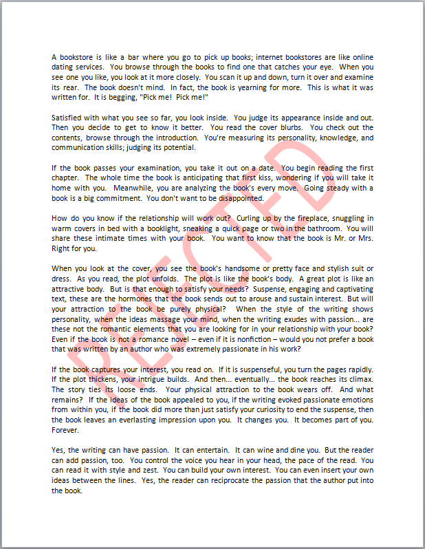
  • Insert a random watermark, like the word REJECTED, onto every page of the book. (Find an example below.)
  • Hold down the Shift key and press Enter after every heading so it expands to fill the margins.
  • Cut your pictures in half horizontally. Paste the top half on one page and the bottom half on the following page.
  • Vomit on the floor, take a high-resolution picture of it, scan the image, and insert it in your book immediately following the copyright page. (If you receive an invitation to post that page of your book on the wall of an art museum… well, then, maybe your book was just destined to sell after all. Stop fighting fate.)

Kill Sales 2

Rejected


Good Luck!

Sorry, satisfaction is not guaranteed. You should have read the fine print before you initiated action.

(Of course, if you want to be boring, you could just hit the button to unpublish your book, but that would be like cheating. Show some ingenuity!)

Copyright © 2014 Chris McMullen

Authors, What Are You Selling?

Selling

The Question

Aren’t you selling more than just a book? much more?

If all you’re selling is a book, that’s a big problem for you: It’s easy to find books. The library has thousands. You can find thousands in bookstores, millions on Amazon, and hundreds at yard sales.

It takes more—much more—than just a book to make it worth reading.

  • What more are you offering than just a book?
  • Who is likely to benefit from what your book offers?

You want to identify the benefits your book offers, the people most likely to appreciate those benefits, and figure out how to match those people (your target audience) with your book.

Well, duh!

But many authors either aren’t doing this, or aren’t taking full advantage of this seemingly simple logic.

Features vs. Benefits

People don’t buy anything.

People don’t buy features.

People may buy benefits (if those benefits are a good fit for them and they perceive the benefits as a good value).

Example: Someone asks you, “Was self-publishing your book easy to do?”

  • Nothing special: “The writing was fun, but the editing and formatting were nightmares.” You missed a golden opportunity here to introduce a benefit.
  • Features: “It was because I really enjoyed the writing, which took two years, and I hired an editor for the tedious part.” This highlights two features: Ample time spent on the writing and having your book edited.
  • Benefits: “I really enjoyed the months that I spent studying swordsmanship and how to describe it in fiction, and I hired an editor to make sure it reads very well.” First, if you’re really into swords and sorcery, this sounds authentic. Second, people don’t care for the editor (that’s a feature), but they may appreciate that it will read well (that’s the benefit).

You might be thinking, “Well, if you mentioned the editor, it should be obvious that the book should read well.” But not necessarily. For one, there are different types of editors. Some customers might interpret mention of the editor to mean that there are no spelling mistakes, but that doesn’t mean that it will read well.

And not everyone will make the connection. Sales people have better success when they describe benefits than when they list features, especially when they describe specific ways that a product will benefit each individual.

Example:

  • Nothing special: “This television measures 27 inches diagonally.” Everyone is thinking, “So do many other televisions.”
  • Feature: “This television comes with picture-in-picture.” Many customers are thinking, “Well, I don’t need that. I’d rather save money.”
  • Benefit: “With picture-in-picture built-in, your husband won’t have to change the channel during your soap opera to check the score of the game every few minutes.” Now if this applies to you, you may be starting to consider the benefit that this feature offers. You might not have considered this benefit just from the feature itself. You might have interpreted the feature to mean you could watch two shows at once, which you didn’t intend to do.

Just-a-Book Marketing

If all you have to offer is a book, then it should be satisfactory to just:

  • Tell people that you have a book. That should do it, right? Maybe tell the genre, too. But a romance novel is still one of thousands. What makes it special?
  • Keep mentioning the title so that people can remember it. But if they do remember, why should they read it?
  • Show people the cover so they can see it. But if they do see it, why should they care to find out what’s inside it?
  • Advertise that it’s on sale. But people don’t buy prices. They need a reason to want the book before price helps to create value.

Branding is important, and branding does involve getting your target audience to see your cover, your title, and your name multiple times over a long period so that they recognize it.

But branding is more effective when they associate some benefit with your book.

When you hear Sony, do you think high quality? When you hear Costco, do you think large quantities and good savings? When you hear Disneyland, do you think your kids would be happy to go there? When you hear McDonald’s, do you expect fast service and low prices? When you hear Bounty, do you think absorbent?

You want to associate some benefit with your brand. Then, when your target audience is shopping for a book in your genre and remembers your book, they will have some positive quality to associate with it.

They might not buy your book just because they recognize it. But if they recognize it and a benefit comes to mind, this greatly improves your chances for a sale.

But it’s not just about the book. It’s about you, too.

More-than-a-Book Marketing

There are two ways to offer more than just a book:

  • Mention a specific benefit that your book offers.
  • Remember that the author is an important part of the book and marketing.

This second point can make a big impact on marketing effectiveness. We’ll get to this in the next section.

Your product description is a valuable marketing tool. Think about the important benefits that your book offers your target audience. These benefits should be clear from reading your blurb, but fiction is a little tricky because the benefits generally must be implicit.

The author’s biography provides a chance to show how the author is qualified to write the book. For nonfiction, this is often a relevant degree or experience. For fiction, if you have a writing degree, you should play your card, but if not, you may still have relevant experience. Have you traveled to the place where part of your book is set? Have you spent a significant amount of time learning or studying a relevant skill, like forensics for a crime novel?

Instead of trying to brand just your book’s title, you might develop a concise phrase to serve as a hook. Use this to create interest in your book and to associate your book with a positive quality. Anywhere you mention your book’s title, you could include the hook next to it, such as at the end of blog posts, emails, or on business cards. You can even mention it in person, at readings, signings, or anytime you get the opportunity to interact with your target audience and the subject of your book comes up.

Example: Instead of just mentioning the title, A See-Through Relationship, you could also include the hook, “What if you fell in love with a ghost?”

It’s not easy to come up with a clever, appropriate, effective, very short hook, but it can really be worth it if you pull it off. It’s definitely worth spending time thinking about this.

I bet you recognize some company slogans. The hook works for authors much the same way.

When you have the chance to describe your book, online or in person, you want to make the benefits of your book clear. The better you know your target audience’s interests, the better you can show them how your book may benefit each individual.

The Author

It’s challenging to get people interested in your book.

Imagine you’re at a cocktail party, but it’s not an ordinary cocktail party. 90% of the people in attendance are sci-fi enthusiasts, and you have a science fiction book.

Suppose you set your book on a table in the center of the room and leave. I bet a few people will pick up the book, if the cover has good appeal, and check it out. But it’s just a book, and people didn’t attend a cocktail party looking for a book. They went to the party to meet people.

If instead you leave your book at home, but this time you stay at the party, there is a good chance that you will meet many people and get people interested in you.

You have a pulse. You move around. You talk. You interact. Unlike your book.

It’s easier to get people interested in you, the author, than it is to get people interested in your book.

Once people become interested in you, let them naturally discover that you’re an author, and their interest in you may translate into interest in your book.

By discover, I mean waiting for, “So what have you done lately?” instead of volunteering, “I just published a new book.” Wait for the prompt.

Use this to your advantage: Interact with your target audience, both in person and online.

You have a personality; your book doesn’t. You can interact with people; your book just sits there.

People in the target audience who personally interact with an author are more likely to check out a book, buy it, and leave a review than some random stranger who happens across it.

Online, a large number of people can come across your book. But to most of them, it’s just a book they see while passing through.

On your product page, your description may help to show the benefits, but first you need them to find your product page.

In person, your interactions can help to get people interested in your book through their interest in you, and then you can show them the benefits personally. Now you’re selling more than just a book.

You can also provide the personal touch online. You can also let people see that you’re more than just a name; you can help them discover the person behind the book.

More Than Just an Author

Chris McMullen, more than just the author of A Detailed Guide to Self-Publishing with Amazon and Other Online Booksellers

Follow me at WordPress, find my author page on Facebook, or connect with me through Twitter.

Even Indie Authors Get Rejected

Rejection

One great benefit of self-publishing is that it’s a sure thing.

You don’t need to send out query letters or book proposals.

You won’t be rejected by agents or editors.

But that doesn’t mean you won’t feel rejected.

Formatting Rejection

Once your manuscript is complete, you spend several days hammering that square peg of a book into a round hole, trying to reshape it into acceptable formatting.

You might be rejected by Microsoft Word, refusing to number pages, format headers, or keep the layout the way you would like it.

The publishing service might reject your file because it didn’t meet the technical guidelines.

Kindle might show you a preview that doesn’t look anything like your Word file.

Smashwords might not accept your e-book into the premium catalog.

Editing Rejection

People may point out spelling and grammar mistakes in your writing.

They might suggest that you really need an editor.

You might receive some constructive criticism on your writing, which, even when it has merit, can be hard to swallow.

Even worse, when you seek to hire an editor, the editor can choose to turn down the job.

Technical Rejection

When you order printed books, there is a chance of receiving defective copies.

A customer can receive a defective copy. No manufacturing service is perfect.

Even an e-book customer can experience technical hiccups while downloading or reading a book.

When one of your few customers encounters a problem that’s beyond your control, it can be frustrating.

Content Rejection

You can’t publish anything.

Amazon has content guidelines.

CreateSpace has content guidelines.

Kindle, Nook, and Kobo have content guidelines.

If you probe the limits of your writing freedom, your work could get rejected.

Sometimes there isn’t a clear line between what is or isn’t acceptable, but a murky gray area.

Legal Rejection

If you quote a line from a song, you could receive legal notice to take your book down.

If your writing infringes upon the rights of others, your book could lead to a lawsuit against you.

Legal action could cause a retailer to stop selling your book, or the publishing service to stop distributing your book.

Article Rejection

With the hope of gaining more exposure among your target audience, you may submit an article for publication.

Just like submitting a book proposal, your article may be rejected.

Contest Rejection

If you enter your book into a contest, you might not win.

You might not even make the first cut.

Review Rejection

Critics can leave bad reviews.

They can post one-star reviews right on the product page, where every shopper can see it.

Where your family and friends can see it.

Where you can see it.

Those comments can cut deep.

Sales Rejection

There is no guarantee that you will sell a single copy of your book.

Many books never sell 100 copies.

Not 100 per month. Not 100 per year. Not ever.

There are books that have been on the market for over a year that have no sales rank.

To not sell any books must hurt worse than receiving thirty rejection letters.

Public Rejection

People you know can complain about your book.

Or about how you’re wasting your time pretending to be an author.

While you strive to build positive publicity for yourself, once you enter the public eye’s scrutiny, one false step can lead to negative publicity.

Bully Rejection

Cyberbullies can target you.

Family Rejection

Your own family might not appreciate your writing.

They might wish you did something more “meaningful” with your time.

Self Rejection

You could be your own worst critic.

You might regret your prior writing.

You might delete your work and start over before you ever finish.

You might not even find the courage to publish in the first place.

Approved!

You write, therefore you are an author: See “Intimidation is nine-tenths of the writer’s law,” by Ionia Martin.

You don’t need permission to share your passion. You are approved!

Don’t focus on the worst that can happen. Focus on readers who can benefit from your writing. Those are the people worth writing for.

Writing and publishing a book is a huge accomplishment, no matter how you do it. Give yourself a round of applause. Congratulations!

Grow a thick skin. Find a support system. Don’t let ’em bring you down.

When you feel rejected, turn it around. Use it as a motivator. Let it boost you up.

Support

Offer support to other authors.

Read. When the writing is good, leave positive reviews. Spread the word about good books.

Share your wisdom and experience with authors who seek help from you.

Provide emotional support where it’s needed. Oh, yes, it’s needed.

Applaud authors everywhere for working hard to create wonderful reading experiences.

Listen.

It’s faint, but listen.

Do you hear it?

Sounds like a clap.

More clapping.

It’s growing louder.

Applause.

Take a bow. That applause is for you.

Publishing Resources

I started this blog to provide free help with writing, publishing, and marketing. You can find many free articles on publishing and marketing by clicking one of the following links:

Chris McMullen, Author of A Detailed Guide to Self-Publishing with Amazon and Other Online Booksellers

Follow me at WordPress, find my author page on Facebook, or connect with me through Twitter.

Why You Want Fellow Authors to Succeed

Compliments

You want your fellow authors to be successful.

You even want books similar to yours to do well.

And it’s not just about creating good karma.

It makes good business sense, too.

Some would have you believe that the way to thrive in the competitive publishing business is to play the cutthroat game and slam the competition. Unfortunately, you can find stories of a few big authors and publishers slamming one another, not just recently, but even going way back. You can also find gossip about more underhanded activities.

But that’s just foolish.

And again, it’s not just because it’s not nice. Economically, it doesn’t make sense if you take a moment to look a few moves ahead.

Highly similar books usually sell together. Some customers buy them all at once. Some buy one today, another in a month, and another a few months from now.

Similar books help one another out through customers-also-bought associations. They also help one another out through word-of-mouth referrals because they share a common target audience and people within that audience do discuss books they enjoy.

When you buy a book online, Amazon recommends similar books. When you visit your homepage, again Amazon recommends similar books.

Foolish authors look at similar books and think, “Oh no! That book looks good. It might take all my sales.” The immature reaction is to slam the competition.

And shoot yourself in the foot in the process.

Most likely, that book won’t take your sales. Most likely, that book will either (A) help your sales or (B) not affect your sales.

When customers really like a book, they want to find more books similar to that.

But there is one way that similar books can take your sales. That’s when you succeed in hurting that book’s sales.

Then, instead of that book’s sales helping your book out through customers-also-bought associations, it’s hurting your sales by not sending traffic your way.

When authors slam one another and a lot of the competition, it creates a bad vibe for the whole set of similar books. It hurts sales for everybody.

Similar books are free marketing for you. Other authors’ great content and effective marketing helps you through customers-also-bought marketing. You don’t need to do anything to benefit from this except continue writing your own books, developing your own author platform, and marketing your own books.

Applaud your fellow authors and watch them help you without even trying.

Act on your jealousy and watch you hurt yourself.

First of all, your efforts to hurt the competition may actually help the competition because you’re giving those other books more publicity, even if it’s negative. And you have to credit people, who can often smell a rat.

Second of all, you don’t want to hurt the sales of similar books that can only help you out.

And what about those amazing authors who break through and make it big time?

Does that make you feel all jealous inside? Do you look at those books critically and think how childish the storyline is, how poorly edited the book is, and completely miss the big picture?

Applaud those authors. If you self-publish, applaud the indie authors who succeed. They’re helping to make a great name for indie authors. They’re reaching hundreds of thousands of readers and showing them that indie books can be amazing.

If you self-publish, you want other indie authors to be successful. Their success builds a large audience of readers who are willing to take a chance on indie books. That helps you.

It’s not just indie author success. It’s any author success. Any author who makes readers love the reading experience creates future sales for many other authors.

There is no indie versus traditional battle. What’s most ridiculous about that is the increasing number of authors who publish both ways. Should they punch themselves in the face?

There is just one battle. That’s you wrestling against yourself, your emotions, and your irrational instincts.

What’s good for readers is good for all authors.

And if there are readers who enjoy a book, that book is pleasing readers and therefore good for all authors, including you, whether or not you approve of that book.

Way to go, Amanda Hocking! You made a huge name for yourself. You made a huge name for indie authors.

Way to go, Hugh Howey! Way to go, E.L. James!

Way to go, Stephen King! Your great works have hooked millions of readers not just on your books, but on the love of reading.

Way to go, J.K. Rowling! Way to go, Anne Rice!

Way to go, all authors, big and small, whose books have pleased readers.

Chris McMullen, Author of A Detailed Guide to Self-Publishing with Amazon and Other Online Booksellers

Follow me at WordPress, find my author page on Facebook, or connect with me through Twitter.