Tracking Views at Amazon—Finally..?

Image from ShutterStock.

Image from ShutterStock.

TRACKING VIEWS AT AMAZON

Don’t you wish that you could see how many people are viewing your book’s product page at Amazon?

Then you’d be able to see how good your blurb and Look Inside are at closing the deal, or how well a promotion is working.

Well, now you can get tracking data at Amazon.

Amazon marketing services is now available for books enrolled in KDP Select.

For as little as a $100 budget and bids of 2 cents, you can advertise your book on Amazon.

Visit your Bookshelf and click the link under the KDP Select column called Promote and Advertise.

When I did created an advertisement this morning, I received an approval email that said:

  • “Please allow 1 day for clicks/impressions to appear…”
  • “…and 2-3 days for detail page views to appear.”

IMPRESSIONS AT AMAZON

This will show how many impressions are made all together. That’s the number of times that your ad is shown to potential customers.

You don’t pay for impressions that don’t result in clicks. You only pay when someone clicks on your ad.

But every impression helps with branding and discovery.

CLICKS TO YOUR BOOK

Divide your budget by your bid. That’s the minimum number of clicks that you’ll get if your entire budget is used up. (If it’s not used up and you’d like it to be next time, either increase the duration or try a higher bid.)

For example, a $100 budget and 2-cent bid will give you 5000 clicks if the entire budget is used up. (First convert 2 cents to $0.02. Then divide.)

But you’ll get even more impressions. You might get tens of thousands of impressions or more for your $100.

AMAZON CLICK-THROUGH RATE

Compare your clicks to impressions to compute your click-through rate. That is, what percentage of the time do people who see your ad click on it to view your product page?

click-through rate = ( clicks / impressions ) x 100%

The smaller your click-through rate, the less effective your cover is at attracting the audience who is seeing your ad. The problem is either that the cover doesn’t appeal to your audience, or you’re not targeting your ad to your specific audience effectively.

VIEWS AND CLOSING RATE

Amazon will evidently also show how many people are viewing your detail page. This is valuable info that many authors have requested in the past, but never had access to. Now there is a way to get this data.

Compare your sales to views to compute your closing rate. This shows how good your blurb and Look Inside are at sealing the deal once traffic arrives at your product page.

closing rate = ( sales / views ) x 100%

The smaller your closing rate, the less effective your blurb and Look Inside are at selling your book.

TARGETING CUSTOMERS

Amazon Marketing Services offers two ways to target traffic:

  • target by product
  • target by interest

When you choose interest, select the category that’s the best fit for your book. The choices are fairly broad, so unfortunately you’ll also catch some people in the category who aren’t in your subcategory, but the targeting does help to deliver your ad to a narrower audience.

When you choose product, you can find similar books (or relevant products) and target your ad to customers who view those products (or perhaps who have used those products in the past). You can choose multiple products.

BOOK DATA AT AMAZON

KDP Select authors can place an advertisement and, in addition to any benefits of the ad itself, receive valuable sales information regarding their books.

It may be helpful for planning your next book.

It might help establish whether something you’ve changed recently is helping or hurting.

It might help you see how well a promotion is doing.

It’s valuable data that we didn’t have before.

Once you run more than one ad at different times, you have some basis for comparison.

However, this tool may be more effective in the beginning, while it’s still new to customers and other authors.

AMAZON MARKETING SERVICES

Advertising isn’t a band-aid for a book that doesn’t sell on its own.

Advertising isn’t a substitute for learning how to market a book effectively.

Advertising is more helpful for authors who have multiple books out and already have some positive marketing experience.

Advertising is better when you supplement it with free marketing strategies.

Advertising is more effective when it’s targeted well.

Advertising is more effective when your cover is visually attractive to your specific target audience, and when it reveals the genre or subject very clearly.

Advertising may riskier when you have few reviews.

Advertising directly on Amazon.com is potentially much more effective than marketing on Facebook, Twitter, or Goodreads. Instead of asking people to stop whatever they’re doing with their social media and hop on over to Amazon, now you’re showing your ad to people who are already shopping at Amazon.

Advertising can help you brand a name.

Advertising does carry a risk. Weigh the benefits and risks carefully. The worst-case scenario is that you’re out $100 with little to show for it. Can you afford that risk? What are you doing to supplement the advertising to help minimize this risk?

Chris McMullen

Copyright © 2015

Chris McMullen, Author of A Detailed Guide to Self-Publishing with Amazon and Other Online Booksellers

  • Volume 1 on formatting and publishing
  • Volume 2 on marketability and marketing
  • 4-in-1 Boxed set includes both volumes and more

Follow me at WordPress, find my author page on Facebook, or connect with me through Twitter.

Comments

Click here to jump to the comments section:

https://chrismcmullen.wordpress.com/2015/01/29/tracking-views-at-amazon-finally/#comments

Advertise Your Book on Amazon—New Opportunity

Background image from ShutterStock.

Background image from ShutterStock.

ADVERTISE ON AMAZON

There is a new opportunity available to advertise your book on Amazon.

https://kdp.amazon.com/help?topicId=A2DJUTY13KIH2C

How would you like to advertise your book directly on Amazon.com?

That would be cool, huh?

What if you could do this on a modest budget?

Even better!

Well, now you can:

  • minimum campaign budget is $100
  • minimum bid is 2 cents
  • pay per click

But there’s a catch:

It’s only open to KDP Select authors.

I think it’s a nice benefit for enrolling in KDP Select, on top of current benefits like Kindle Unlimited.

So if you bid 2 cents, a campaign budget of $100 can net you 5000 clicks.

Higher bids are more likely to result in advertisements being shown and result in clicks. But then you get fewer clicks for your money, also.

I like that the charge is per click. You’re not charged when people see your ad, but don’t click on it.

This helps with branding. However many clicks you get, even more people who didn’t click on your ad saw it, which helps you brand your image.

Another nice feature:

targeting

Amazon will let you target your advertisement to a specific genre, for example. This helps your ad reach a specific target audience.

Compared to advertising on Goodreads, Twitter, or Facebook, advertising on Amazon doesn’t drive traffic to leave one site and visit another. These customers are already on Amazon. That’s cool!

BOOK ADVERTISING

Advertising expenses often don’t produce immediate results for book sales. Unlike paper towels, there are millions of other books to choose from.

Some of the most effective book marketing you can do is free. If you make the most of your free marketing potential, advertising will supplement this.

The more books you have out, the more potential paid advertising has. Then someone who clicks on your ad might buy several of your books instead of just one.

But with a minimum bid of 2 cents and campaign budget of $100, advertising on Amazon isn’t too expensive of a risk. Nobody wants to throw $100 away though. (If you do, feel free to borrow my trash can.)

It’s even more important to have a compelling cover that conveys your genre clearly. This will help you get clicks with your ad.

And it’s even more important to have a great blurb and Look Inside. This will help you close the deal once you get the traffic.

And it’s even more important to have a great book, as good as you can make it. This will give you your best chances when it comes to reviews and recommendations.

Another thing that might be worth doing is waiting until you have several reviews before you advertise. You’d hate for one of your first reviews to be a real stinker shortly after paying for an advertisement.

Last tip: Consider putting your book on sale with a Countdown Deal. Then you have something more compelling than just a link to your book.

HOW TO DO IT

The book you wish to advertise must be enrolled in KDP Select.

Visit your KDP Bookshelf.

Click the Promote and Advertise link under the KDP Select column.

Click the Create an Ad Campaign button.

This will take you to Amazon Marketing Services, but it will say Return to Kindle Direct Publishing at the top of the page.

Select one of your books.

Target your ad by product or by interest.

  • By interest lets you choose one broad category. Unfortunately, it doesn’t appear to let you select a subcategory.
  • By product lets you target similar books or products on Amazon. Note that if your book already appears on the first page of the Customers Also Bought list, people viewing those books are already seeing your book. That doesn’t mean you shouldn’t include those books, especially if they’re highly relevant; the additional ad might make the difference. It’s just something to consider.

You can select multiple interests or products (but not both interests and products). I would select several similar products, but I would only select one interest.

The remaining steps should be straightforward.

If you try it, good luck. 🙂

Chris McMullen

Copyright © 2015

Chris McMullen, Author of A Detailed Guide to Self-Publishing with Amazon and Other Online Booksellers

  • Volume 1 on formatting and publishing
  • Volume 2 on marketability and marketing
  • 4-in-1 Boxed set includes both volumes and more

Follow me at WordPress, find my author page on Facebook, or connect with me through Twitter.

Comments

Click here to jump to the comments section:

https://chrismcmullen.wordpress.com/2015/01/29/advertise-your-book-on-amazon-new-opportunity/#comments

How to Use Amazon’s New KINDLE TEXTBOOK CREATOR (Tutorial)

KTC

KINDLE TEXTBOOK CREATOR

Amazon just released a new FREE self-publishing tool for Kindle, called the Kindle Textbook Creator (KTC).

  • E-textbooks can help with highlighting, notes, flashcards, dictionary look-up, and portability of the book. These are features that students may appreciate (and so being aware of them may help you sell your book).
  • Kindle Textbook Creator homepage: This is where you can download the free tool and learn about system requirements. You can find FAQ at the bottom, too.
  • KDP EDU: This is a new site that KDP launched specifically for educators. It’s a lead-in to the Kindle Textbook Creator.

The new Kindle Textbook Creator creates a print replica file. Print replica is a basic fixed format designed to preserve the layout of a print book with a rich format.

Print replica is becoming increasingly popular among e-textbooks because it is a convenient way to reformat a richly formatted textbook for Kindle.

Textbooks often have numerous equations, diagrams, multiple columns, footnotes, and many other rich formatting features.

While reflowable Kindle e-books are better, in general, it can be a very tedious—or costly, if you hire a professional conversion service—for a richly formatted textbook.

The Kindle Textbook Creator makes it quick, convenient, and easy to convert a textbook to Kindle format. Regarding the conversion process itself, this tool is like waving a magic wand. There is virtually nothing to do. (But my free tutorial, in this article, will show you exactly what to do.)

I had the opportunity to beta-test this tool before it was released. I’ve also already published two books with this tool and have more in the works.

Want to jump straight to the tutorial? Scroll down and you’ll find it. It should be pretty easy to find if you scroll far enough. Look for the heading, Kindle Textbook Creator Tutorial.

WHAT DOES THE KINDLE TEXTBOOK CREATOR DO?

It creates a fixed format book, called print replica, for select Kindle devices.

The Kindle Textbook Creator also makes it super easy to convert textbooks to Kindle format. It really doesn’t get any easier than this. I’ve used many different tools and converted by hand, but I’ve never seen anything so simple when it comes to Kindle conversions.

What’s more amazing is that it’s designed to convert PDF files to Kindle format. PDF files are infamous for difficult conversion to reflowable format, but convert very well and easily to print replica format with the Kindle Textbook Creator. This is perfect for richly formatted print books. Just open the PDF file in the Kindle Textbook Creator and be amazed at how easily it converts to print replica format.

It only works on devices that support pinch-and-zoom (which I believe all happen to be color): Kindle Fire, Kindle Fire HDX, iPad, Android tablets, and smart phones. It will also work on PC’s and Macs.

The pinch-and-zoom feature is the key: If you simply turned each page of a print book into a picture and uploaded those images, the Kindle e-book would be very difficult to read on most devices. Pinch-and-zoom allows the user to zoom in up to 400%, and then use a finger to scroll around on the page. This way, the Kindle e-book functions sort of like reading the printed version of the book.

Since e-books created with the Kindle Textbook Creator will only work on devices that support pinch-and-zoom, by using this tool you can prevent customers from buying your richly formatted e-book from devices where the reading experience would be most challenging.

BENEFITS OF THE KINDLE TEXTBOOK CREATOR

  • Convenience. Convert your richly formatted book to print replica format for Kindle very quickly and very easily. It easily gets five stars for convenience.
  • Easy preview. This tool has a built-in preview. You don’t even have to upload your book to KDP to preview it on each device. That’s awesome!
  • PDF friendly. That’s right. Kindle usually isn’t PDF friendly, but the Kindle Textbook Creator is effective and efficient at creating a print replica format from a PDF file.
  • No HTML needed. Ordinarily, you would need to know HTML and CSS to create a fixed format book. This tool allows anyone to create a Kindle book from a PDF file without any HTML knowledge.
  • Layout control. If you have a richly formatted print layout that you’d like to preserve with the Kindle edition, this tool will preserve that layout for you.
  • Rich formatting. If you have rich formatting that you don’t want to lose in the conversion to Kindle, this tool will keep that for you, too.
  • Vertical centering. It vertically centers each page on the Kindle device automatically. (You can’t do this by uploading a Word document to KDP. You would have to work with HTML, and separate that into HTML pages, or convert to epub which does the same.)
  • Targeted devices. Books converted with the Kindle Textbook Creator only work on devices that have pinch-and-zoom and support color, so if you have a book that you don’t want to be read on black-and-white devices or which don’t support pinch-and-zoom, this is one way to target just devices with pinch-and-zoom.
  • Navigation. This tool supports navigation from the Kindle menu. In Word, for example, you can use bookmarks (Insert > Bookmark) to add navigation; be sure that this functionality is maintained in the conversion to PDF. Note: Bookmarks and hyperlinks won’t be clickable in a book made with the Kindle Textbook Creator. Rather, the bookmarks from your PDF will translate into chapters in the Kindle menu, i.e. inserting those bookmarks adds navigation from the Kindle menu. Update: The latest version of the Kindle Textbook Creator now supports hyperlinks (provided that you upload a PDF with fully functional hyperlinks).
  • PowerPoints & more. PowerPoints (popular with educators, for example) can now conveniently be converted to Kindle format. Just save as PDF first (you can even Insert > Bookmark to add navigation for the NCX). Formats that didn’t convert easily or well to Kindle format in the past can now be converted with ease.
  • Amazon now lets you insert audio and video with the Kindle Textbook Creator.

DRAWBACKS OF THE KINDLE TEXTBOOK CREATOR

  • Digital features. You can’t add pop-up text or hyperlinks. If you want clickable links, you must use a reflowable format (or use HTML and CSS to create a fixed format book, which is a lot more work). Update: The latest version of the Kindle Textbook Creator now supports hyperlinks (provided that you upload a PDF with fully functional hyperlinks). If you want pop-up text, an alternative is Amazon’s free Kindle Kids’ Book Creator tool. (However, the full launch will include additional features, such as audio and video. See the FAQ on the KTC homepage for more info. But interactivity doesn’t appear to be on the near horizon.) The Kindle Kids’ Book Creator also has an HTML view mode, which allows you to edit the HTML. The Kindle Textbook Creator doesn’t presently allow you to use HTML (its goal is to provide a convenient solution for those who wish to avoid learning HTML). Amazon now lets you insert audio and video with the Kindle Textbook Creator.
  • Fixed font size. Unlike reflowable e-books, the user won’t be able to adjust the font size. Most print books’ pages would have unreadable text if viewed with a Kindle device or tablet or cell phone. This will force the customer to pinch-and-zoom, then scroll around, to read the text. It’s not the ideal reading experience, especially if there are numerous pages of text that will likely be read while zoomed in and scrolling. You have to weigh the pros with the cons. (Or you could make a very large version of your print edition and simply convert that instead.)
  • No Look Inside. Yet. It may be coming soon. Presently, books created with the Kindle Textbook Creator don’t show a Look Inside. However, I’ve been told that this feature is coming. In the meantime, customers can still try a free sample from Kindle Fire devices. And if you have a print edition, once the Kindle and print product pages link together (this is automatic if the title, subtitle, and author names match exactly in spelling and punctuation; but if they don’t link, visit Kindle Direct Publishing and use the Contact Us option), customers can simply visit the print edition’s product page to see inside. Update: As of December, 2015, KTC published books are beginning to generate an automatic Look Inside for the Kindle edition.
  • Limited devices. Your e-book won’t work on devices that don’t support pinch-and-zoom. It won’t work on Kindle e-Ink devices. If you go to the trouble to convert your book to reflowable format, it will be available on more devices, which widens your market.
  • Text-based. If your book is primarily text-based, like a novel, the Kindle Textbook Creator is not for you. Create a simple reflowable format instead. If you have equations, charts, graphs, or other features that make the formatting more complex and you’d like a simple, efficient solution to preserving those features, then the Kindle Textbook Creator is for you.

KINDLE PACKAGE FORMAT

The Kindle Textbook Creator doesn’t export a .mobi format. It exports .kpf format, short for Kindle Package Format.

You can only upload .kpf files directly to Kindle Direct Publishing. You can’t publish them elsewhere (not even at Amazon Vendor Central).

Kindle Direct Publishing will accept your .kpf file when you upload it. It won’t let you export this as HTML or download it as a .mobi file after conversion. (So if you were hoping to get the result as a .mobi file and then look at the .mobi file with Calibre, for example, well, it won’t be so simple. All you get is .kpf. Also, the terms and conditions prohibit you from publishing KTC-created e-book with another platform besides Kindle.)

Note that the only input format accepted is PDF. Most print books require PDF format, so for most authors who have already published a print book, this shouldn’t be a problem. However, it’s very easy to convert Word or other formats to PDF. For example, Word 2007 and up have built-in Save As PDF features, and there are many free PDF converters available on the web (but have a good anti-virus program and find software from trusted sources and get it straight from the source).

SHOULD YOU USE THE KINDLE TEXTBOOK CREATOR?

That depends on the nature of your book and what your needs are.

Consider these questions to aid your decision:

  • Do you have a textbook, supplemental educational materials, a PowerPoint, or other book with a richly formatted layout?
  • Do you want a very quick and easy (and FREE) way to convert to Kindle?
  • Do you mind if the book will only be available on devices that support pinch-and-zoom?
  • Do you mind not having pop-up text?
  • Does your book have features like equations, charts, graphs, or rich formatting features, or does it consist mostly of text?
  • Do you want the option to insert audio or video?

It suits these kinds of books well:

  • Textbooks. Especially complex ones with many diagrams, equations, and rich layout or formatting.
  • PowerPoints. This is great for educators who wish to convert their PowerPoint lectures to digital books. (You may first want to change the aspect ratio. Not necessarily, but worth considering. A 3:4 aspect ratio is probably close enough.)
  • Supplemental educational materials that wouldn’t format well as (or easily be converted to) reflowable Kindle e-books, such as course notes or study guides.
  • Amazon now lets you insert audio and video with the Kindle Textbook Creator.
  • Other print books with a rich layout or formatting, except as noted below.

It doesn’t suit these types of books:

  • A novel. You should definitely make a reflowable book instead. That’s pretty simple for a basic novel. I have a detailed FREE tutorial on how to do that here.
  • An illustrated children’s book. Consider the free Kindle Kids’ Book Creator tool.
  • A comic book. Consider the free Kindle Comic Creator.
  • Mostly text. If your book mostly consist of text, make a reflowable book instead. That’s pretty easy for a book that mostly consists of text.

WHAT’S THE BEST WAY TO FORMAT YOUR KINDLE E-BOOK?

The optimal way to format a Kindle e-book involves using HTML and CSS in either a reflowable format or a fixed format. Reflowable is generally best, except for books that really require a fixed layout.

But just using HTML and CSS doesn’t guarantee that a Kindle e-book will be formatted well. There is a formatting art to sizing images best and for designing a good layout for a Kindle e-book. And if you really want the book to look optimal on all devices, you can use media queries. It can get complex, and it’s not easy to pull off.

It’s like printed books. Typographers know about kerning, widows, orphans, tracking, scaling, and a host of tricks for optimal formatting. The art of typography, whether printed or digital, can get highly complex, and very tedious to implement if you go all-out.

If you just stick with the basics, formatting can be much simpler and the results can still be pretty good. If you try to implement the advanced techniques without really mastering the art, it’s also possible to do more harm than good.

Print or digital, you can get pretty good results yourself, without too much effort, by learning and applying basic principles. This saves time, effort, learning, and expense (as professional conversions can be pricey).

What the Kindle Textbook Creator does is provide a FREE, convenient, and quick way to convert a PDF into a Kindle e-book. It’s not designed to be the Cadillac of book formatting. But it’s such a simple tool to use, it would only take a few minutes to find out if it suits your needs.

If you have a simple book like a novel, you should take a few minutes to learn how to format that as a reflowable format in order to provide a much better reading experience for novels. If you have a textbook or richly formatted book, the Kindle Textbook Creator is a simple solution for PDF to Kindle conversions (whereas other methods of converting PDF to Kindle, such as a direct upload to KDP, often don’t translate well to Kindle).

Do you have compelling reason to expect numerous sales? If so, investing time or money to create a professional reflowable design may pay dividends down the road. For books where sales may be scarce, or where you don’t know what to expect, it might not be worth the risk. You’d hate to pour weeks into formatting or hundreds of dollars into professional conversion only to see dismal sales. Using a free tool reduces this risk.

Here is another way to look at it: The Kindle Textbook Creator lets you quickly and easily produce a digital version of an educational text, so that you can spend more time writing and less time formatting.

Also, see my tips toward the end of this article for improved formatting and marketing with books created by the Kindle Textbook Creator. (But if you’re interested in reflowable layout, check out my free tutorial. If you want to use advanced HTML and CSS features, you’ll need to supplement that with an HTML tutorial from Google.)

KINDLE TEXTBOOK CREATOR TUTORIAL

Download the Kindle Textbook Creator tool (it’s FREE) from Kindle Direct Publishing:

https://www.amazon.com/ktc

PDF FILE

First, you need to convert your book to PDF. If you don’t already have a PDF file for your book, you’ll need to convert it first. Many programs, like Word (2007 and up), PowerPoint, PhotoShop, etc. offer a Save As PDF (or Export As PDF) option. There are also many free PDF converters online (make sure your anti-virus software is up-to-date, find a trusted source, and download directly from the source—of course, anything you download from the internet is at your own risk).

You can (and should) include an active table of contents. In Word or PowerPoint, for example, use Insert > Bookmark to add hyperlinks (choose Place in the Document) and link them to your table of contents entries. Ensure that these bookmarks are preserved when you Save As PDF. (That’s the case with the built-in option in Word, but with other converters, you must check the settings.)

Note that the links won’t be clickable. The point of adding the bookmarks to the PDF is to help the Kindle device create navigation. Customers will be able to navigate through the book using the Kindle menu if you bookmark the table of contents. Update: The latest version of the Kindle Textbook Creator now supports hyperlinks (provided that you upload a PDF with fully functional hyperlinks).

Get your PDF exactly the way you want it. You won’t be able to reformat your file with the Kindle Textbook Creator (except for adding pages, changing page order, or deleting pages), so if there is anything you want to change in your PDF, do it now.

NEW BOOK VS. OPEN BOOK

Open the Kindle Textbook Creator. (When I installed it, an icon appeared on my desktop and it also showed up on the Start menu.)

Go to File > New Book. Find the PDF file of your book on your computer.

Note that New Book is for opening a PDF, whereas Open Book is to open a .kcb file. (When you save a file with the Kindle Textbook Creator, it creates a new folder with a .kcb file.)

SAVING PROGRESS

Use File > Save Book to save your progress. This creates a folder with the .kcb file in it (along with a resources folder).

PAGES PANEL & DOCUMENT WINDOW

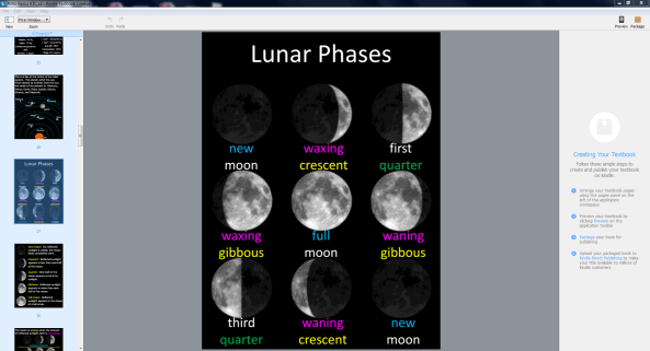
When you open a file (or when you use New Book to open your PDF), you’ll see thumbnails of all your pages on the left (the Pages Panel), and you should see the current page in the main workspace (the Document Window).

Note: Occasionally, the current page doesn’t show in the Document Window. When that happens, try highlighting a different page in the Pages Panel, then going back to that page (by again selecting the page from the Pages Panel).

VIEW/ZOOM

Go to View to adjust the view in the Document Window. I normally use the Fit to Window option, but you may want to zoom in more for a close-up once in a while.

ADD, REMOVE, OR REORDER PAGES

Really, there is only one thing you can do with the Kindle Textbook Creator in the way of formatting: Add pages, remove pages, and reorder pages.

But that’s okay. If you want to reformat your book, the logical thing to do is make another PDF. For example, just go back to your source file (e.g. Word or PowerPoint), reformat your file, and make a new PDF.

The Kindle Textbook Creator is designed for easy conversion from PDF to Kindle print replica format. It isn’t designed for reformatting the PDF.

Go to Edit to insert pages, remove pages, or change the order of pages. Just grab a thumbnail (on the left) and drag it to reposition it. You can highlight several pages and drag a group of pages instead of moving them one at a time. Click thumbnails on the Pages Panel while holding down the Ctrl button on your keyboard to select multiple pages; then you can drag them.

If you want to add a page, you first need to make that page into PDF, then you can insert it. You can’t insert jpegs, for example. But you can convert the jpeg to PDF and then insert it.

Note: Sometimes the arrow keys on the keyboard work for navigation, but not always. If the keyboard arrow keys don’t seem to be working, just click on what you want with the mouse.

If you want to drag one or more pages far, you must drag your cursor to the top or bottom of your view of the Pages Panel and position it carefully at the top or bottom. Until you get your cursor in the right position, it won’t seem like anything is happening. Once you hit the sweet spot, it will zoom along. Short drags are more obvious (so in the worst case, you can just drag it a few pages, then drag it a few more pages, etc. and you’ll eventually get there).

Remember, you can delete or insert pages. This is helpful, for example, if you’d like to create a new page for your book explaining that your book works with pinch-and-zoom. You just have to create the PDF for that page first (which is easy to do, for example, from Word).

LANDSCAPE IMAGES?

Watch out for any pages that need to be rotated into landscape view (see the tips section later in this article).

PREVIEW

When you’re happy with the page order, click on the Preview button. You can find the Preview button way over to the right side of the screen, near the top right corner.

This opens two new windows:

  • a smaller inspector window to switch devices, control navigation, or zoom.
  • a preview window that simulates the actual device.

With the inspector, you can select the following devices:

  • Kindle Fire HDX
  • Kindle Fire HDX 8.9″
  • iPad
  • Android tablet

The other devices are grayed out. Books created with the Kindle Textbook do not work on the grayed out devices. Exception: It will work on smart phones, PC’s, and Macs.

Note: The online previewer at KDP is different. The online previewer includes devices where the book won’t actually be available. The previewer that is built into the Kindle Textbook Creator, on the other hand, grays out devices that won’t support the e-textbook (except for smart phones, PC’s, and Macs—it will work on those). It won’t work on Kindle e-Ink devices.

You can zoom in up to 400% using the inspector window.

While you are zoomed in, place your cursor within the preview window, grab part of the screen, and drag the mouse to scroll around on the screen.

Actual customers will achieve the zoom and scroll effects using the pinch-and-zoom feature of the device. The preview lets you simulate this effect with the zoom setting and grab-and-drag with your mouse.

The inspector window also lets you advance from one page to another, or type in a number (and press Enter) to jump to a specific page. (The percentage may help authors who enroll in KDP Select predict where that critical 10% mark is for Kindle Unlimited, though it’s possible that the actual 10% mark in the end product won’t correspond exactly.)

Note: Sometimes the arrow keys on the keyboard work for navigation, but not always. If the keyboard arrow keys don’t seem to be working, just click on the arrows on the inspector window with your mouse.

Simply click on the X at the top right of the preview window to close the preview.

PACKAGE

When your file is ready to publish, first you need to package it for publishing.

If you haven’t already done so, click Save. This creates a folder with the .kcb file in it (along with a resources folder).

Click the Package button at the far right of the screen, or use File > Package for Publishing.

This converts your .kcb file to a .kpf file (Kindle package format).

You upload the .kpf file to Kindle Direct Publishing.

KEEPING TRACK OF THE KINDLE FILE TYPES

You begin with a PDF file. You uploaded that with File > New Book.

When you save a book with the Kindle Textbook Creator, using File > Save, this creates a folder. Inside that folder, you find a .kcb file and a resources folder.

When your .kcb file is ready to publish, you click the Package button at the far right (or File > Package for Publishing). This creates a .kpf file (Kindle Package Format).

The .kpf file is what you want to upload to Kindle Direct Publishing.

(You don’t get a .mobi file when you use the Kindle Textbook Creator. Use the .kpf file instead.)

PUBLISHING YOUR KINDLE E-TEXTBOOK

Visit Kindle Direct Publishing (KDP):

https://kdp.amazon.com

Login to KDP. If you already have an Amazon account, you can just use that.

Visit your Bookshelf.

Click the Add New Title button on the left.

Complete all of the fields.

Step 6 at the bottom is where you upload the .kpf file that the Kindle Textbook Creator made. (Don’t upload the .kcb file. You want .kpf.)

It may take a while, depending on your computer and browser (and internet traffic at the time). If you have functionality issues, try switching browsers (e.g. from Explorer to FireFox or Chrome); make sure that your browser is up-to-date.

If you receive an error message, try again. (I received error messages a few times while I was beta testing. That might be cleared up by now. I was able to resolve the issue simply by trying again.)

PROBLEMS

If you encounter problems, visit the KTC homepage and scroll to the bottom of the FAQ. There is currently a link to provide feedback.

If you have an issue with uploading the .kpf file to KDP, sometimes just trying again resolves the issue. Otherwise, try switching browsers (e.g. Explorer to FireFox or Chrome) and make sure that your browser is up-to-date.

UPDATE

Amazon now lets you insert audio and video with the Kindle Textbook Creator.

KTC SHORTCUTS

The Kindle Textbook Creator supports keyboard shortcuts.

WINDOWS

Ctrl + N to begin a new book with an existing PDF.

Ctrl + O to open an existing project (a .kcb file).

Ctrl + W to close the book.

Ctrl + S to save the book (.kcb format).

Ctrl + Shift + S to save as a new filename (.kcb format).

Ctrl + Shift + P to package the book for publishing (.kpf format).

Ctrl + Z to undo the last change.

Ctrl + Shift + Z to redo the change.

Delete to delete the current page from the Pages Panel.

Ctrl + = to zoom in.

Ctrl + – to zoom out.

Ctrl + 0 (zero) to fit to window (zoom).

Ctrl + 2 to fit to the page width (zoom).

MAC

The keyboard shortcuts are the same as for Windows, but use CMD instead of Ctrl.

KINDLE TEXTBOOK CREATOR FORMATTING AND MARKETING TIPS

READABILITY

If you’re a Kindle owner (or if you’re reading a Kindle e-book on an iPad or smart phone, for example), readability is important.

The longer the book and the more challenging it is to read the text, the more important readability becomes.

What kind of book do you have? Will reading one page of the PDF be difficult to do on the screen of any of the supported devices? If so, how many pages are like this?

If a customer has to read hundreds of pages, and if that customer has to pinch and zoom, and then scroll around the page to read it, that can become frustrating fast.

If it’s a shorter book, say 40 pages, reading one book that way isn’t too bad.

Or maybe most of the pages can be read well, and pinch, zoom, and scroll is only needed on selected pages. That’s much more readable.

Or maybe users will mainly need to just focus on one page at a time. Imagine students consulting the e-textbook to find homework problems on their smart phones, for example. With limited reading at one sitting, pinch, zoom, and scroll isn’t a problem.

But extended, continuous reading like that could become frustrating.

Who is your target audience? Students who already spend a great deal of time on cell phones might adapt to this reading experience better than others.

What is gained from the Kindle edition that may permit a small sacrifice in readability? Imagine an expensive print textbook that a student really needs. By making the e-textbook available, the student gains a much more affordable alternative. (The Kindle edition also makes it easy to highlight, collect notes from the textbook, study, read anywhere and on multiple devices, and look up words with a dictionary or Wikipedia. Students may not think of these things on their own, but you could use them as selling points.)

But any customer who is frustrated with the reading experience can still say so in a review.

So if there may be a convenient way of improving the reading experience, why not do it?

One way is to make the print larger, such that it can be read without zooming on all of the supported devices.

This entails creating a new PDF, and it may involve some changes to the layout. Ask yourself if you can change the font size in the source file and adjust the layout without much trouble. You don’t need to go overboard (e.g. in print, if you adjust kerning, tracking, widows, orphans, etc., this can be very time-consuming). It might not be too hard to increase the font size for body text and adjust the layout just enough so it’s reasonably presentable. You don’t want to publish a mess, of course; it needs to still look nice.

FONT SIZE

Is the font already large enough to read the converted e-book on all of the supported devices? It’s really easy to upload your current PDF. Then you can try to gauge how it looks. While the Kindle Textbook Creator has a built-in previewer, it might be worth testing it out on the same devices with KDP’s online previewer (the display size may be more realistic there). Nothing beats the actual device, of course, so after you publish, try to find out how your book looks on a variety of devices.

If you have a size 12 font in your PDF file, that may turn out to be too small to read on many devices without having to pinch-and-zoom and then scroll through every page.

The larger the font size, the more likely the book will be easier to read on more devices.

If you’re publishing PowerPoint lectures, if those lectures were displayed in a large classroom and students at the back of the class were able to read them, there is a much better chance that your font size is already large enough.

To increase the font size, go back to your source file (Word, PowerPoint, or whatever). If you use Select All, this will also impact headings and other text. (If you used Word’s built-in styles, changing the font size of each style is a piece of cake. Keep that in mind for future projects.) One way or another, you can increase the size of body text (and probably headings, too). You’ll probably have to adjust your layout somewhat to make it look more presentable (e.g. move figures around).

You don’t necessarily need to adjust the font size of all the text. It depends. If you have figures, you could leave the text as it is and customers can pinch-and-zoom for a better view. The fewer pictures you have, the less of an issue that will be (but then it’s also less work to adjust your images, since you have fewer of them).

Try to get feedback from customers you interact with, as that will help you gauge features that may or may not be worth improving. It’s best to have it perfect before you publish, but it’s always worth thinking of how it could be better.

LANDSCAPE

Every image needs to have the correct orientation in your digital book. In print, you can rotate an image 90 degrees and the customer can simply rotate the book to view it correctly, but this doesn’t work in Kindle. If you rotate a Kindle 90 degrees, the image rotates with it, so it’s either always correct or never correct (and the latter is quite frustrating to customers).

In the example below, I want Saturn to appear in landscape. In the print edition, I would do that by rotating Saturn 90 degrees. But in the Kindle edition, I had to rotate Saturn back. If you want it to have landscape orientation, it needs to look like landscape in the Pages Panel. If you’re facing your computer screen and you don’t have to twist your neck to see it right, that’s how it should look.

Test it out in the preview. The best thing is if you can try an actual Kindle device.

KTC Landscape

LOOK INSIDE

Amazon’s Look Inside feature can be a powerful selling tool. (But it can also be a sales detractor. The potential is there, however.)

Unfortunately, books created with the Kindle Textbook Creator presently do not display a Look Inside. I was informed that this may change soon.

Update: As of December, 2015, KTC published books are beginning to generate an automatic Look Inside for the Kindle edition.

Don’t count your chickens until they hatch, though.

With that in mind, don’t rely on the Look Inside to come later. What if it doesn’t? And what about now?

In the meantime, customers can download the free sample to their actual Kindle device. Many customers instead shop on Amazon and send the book to their device if they make a purchase.

Make a print edition and get it linked to the Kindle edition. That way, customers can visit the print edition’s product page to get some idea of what to expect. That’s better than nothing.

ADD INSTRUCTIONS

Not all customers understand their devices well.

Your book has pinch-and-zoom. Amazon will mention the print replica format on the product page.

Yet some customers won’t realize that they can pinch the screen to zoom in on images, or that once they do so they can then scroll around on the page.

It doesn’t hurt to help educate your customers.

What can you do? Create a page that briefly explains that this book is equipped with pinch-and-zoom. Briefly describe what this means.

Even better if you can use a picture to illustrate this. (Marketing tip: Use a picture from one of your other books and you get yourself a little exposure for another book.)

Make sure that these instructions show up past the start position. When a customer opens a new book in a Kindle device, it doesn’t start at the very beginning. Often, it jumps straight to Chapter 1. If you put this note on the page after Chapter 1’s beginning, customers are more likely to find it. (Is it worth interrupting the text? Good question. You have to decide that.)

Note that reading on smaller screens, like some smart phones, is optimized if the device is read in landscape orientation. (If this point is critical for your specific book, it might also be worth mentioning in a brief note.) Students often read with cell phones, but have the habit of holding the device in portrait orientation.

EXPLORE YOUR OPTIONS

I know, you’re eager to try this new tool out and publish your book.

But there is something so very simple that you can do to try and improve your book’s chances for success.

Browse through the educational market in the Kindle store for print replica books. Try these books out. See how they work. See what other authors and publishers have done.

When is the font size too small? Which books are more readable? Why? Look for possible features that you hadn’t thought of.

List things you like. List things you don’t like. If you were a student, what would you prefer?

After you publish, view your book on a variety of devices to find out exactly how well it came out. Get feedback from your audience.

EXAMPLE

Here are two of my shorter books (40 to 50 pages) where I converted the PDF of the print edition to Kindle using the Kindle Textbook Creator.

These are just the basic conversion (presently; I may improve them further), so you can see how this came out. Ask yourself if you might have changed the layout and design to make them more readable. The astronomy book has a larger font; the book on the fourth dimension is much smaller (though that book is largely visual, and was designed for the reader to spend time contemplating the images on each page, i.e. not to be read straight through).

You don’t actually have to buy these books to check them out. If you have a supported device (not just Kindle Fire, but also smart phone, tablet, Kindle for PC, Kindle for Mac), try downloading the free sample.

Full Color Illustrations of the Fourth Dimension: Tesseracts and Glomes


Basic Astronomy Concepts Everyone Should Know (With Space Photos)

For comparison, I have a more detailed astronomy book in reflowable format. Back then, I had actually uploaded a Word file (if I ever revise this book, I’ll go into the HTML and make some improvements).

Chris McMullen

Copyright © 2015

Chris McMullen, Author of A Detailed Guide to Self-Publishing with Amazon and Other Online Booksellers

  • Volume 1 on formatting and publishing
  • Volume 2 on marketability and marketing
  • 4-in-1 Boxed set includes both volumes and more

Kindle Ebook Formatting Example

Ebook

KINDLE FORMATTING EXAMPLE

I just published a new Kindle e-book and it occurred to me that it might be helpful to show on my blog how I formatted it.

This way, you can see an actual example of the formatting in action. You can also check out the free sample if you have a Kindle to see how it turned out. (Or the whole book, free if you have Kindle Unlimited; just 99 cents to buy.)

It’s a fun little book (by fun, I mean it involves puzzles—word scrambles, but not the usual variety: these have a Romance theme). But even if you don’t like the book, you can still check out the free sample to explore the features and how they were made. After all, this article isn’t about word scrambles; it’s about formatting Kindle e-books.

Formatting a puzzle book or a workbook for Kindle poses several formatting challenges. We’ll explore some of these in this article.

If you’re self-publishing a novel or nonfiction book, even though it’s somewhat different from a word scramble book, it involves many of the same formatting features. So this article and the book itself serving as an example can help you see firsthand how to implement those features on Kindle.

It’s 2015 and publishing is dynamic. What worked well for Kindle in 2009 or 2012, for example, may not be quite the same in 2015. Some things have stayed the same, but much has changed.

Plus, the more books you design for Kindle, the more your eye for the design of digital books changes.

This book has a different look and style compared to my other e-books. It has some features that I feel are better. I’ll describe a few design choices along the way, and a few features of Kindle design that I’ve come to regard as ‘better.’ But remember, when it comes to style, ‘better’ is just an opinion. One designer’s ‘better’ is another designer’s ‘worse.’ 🙂

CONTENTS

I’ll begin with some basic Word formatting for Kindle. If you already know how to format a Word document for Kindle, you can skip the first sections below (though you never know when you may learn something you didn’t know before).

Then I’ll introduce a book to serve as an example of my Kindle formatting, and I’ll discuss a few design issues. I’ll also describe a few improvements that can be made rather quickly beyond Word to Kindle formatting, showing my recent book as an example.

You’ll find specific directions for how to quickly implement some formatting tricks toward the end.

MICROSOFT WORD KINDLE PREP

I began the Kindle formatting with a simple plain text version of the book. (It’s also available in paperback, so ultimately I needed one file for Kindle and a totally different file for print. Yet at the same time, it’s important to have identical content for both.)

I used the Replace tool in Word to remove:

  • two consecutive spaces. I put two spaces in the Find field and one space in the Replace field. I continued to hit Replace until there were no matches found.
  • blank lines. I typed ^p in the Find field and deleted everything from the Replace field. There isn’t a single blank line in the book, yet there is space between some lines which creates the same effect. More on this later. You may also want to put ^l (lowercase L) in the Find field in case you have another kind of line break.
  • tabs. Type ^t in the Find field and make sure that the Replace field is empty. (There were none to be found, of course, as I know not to use the tab key in the first place.)
  • page breaks. Put ^m in the Find field to remove ordinary page breaks. (If you have section breaks that are also page breaks, you want to remove those, too.) My book does have page breaks, but I make them a different way in the Kindle edition.

I don’t have headers, page numbers, or other print-only formatting features in my original Word file for Kindle.

You also have to be careful not to use any unsupported symbols.

What about the formatting? Don’t worry; we’ll get to that.

IMAGES IN WORD

I even removed all of the images from the Word file. You can leave them in Word, but I like to apply a simple trick to improve the way that pictures are displayed (revealed later in this article), and as long as I’m doing that, I just save all the pictures for later. I just write things like “Pic1” or “Pic5” on their own lines where I want the pictures to go later. Well, I did put one figure in, just so that Word would recognize the file as containing images, which I replaced later. (If my trick is new to you, things will be simpler if you leave the images in Word.)

If you prefer to leave the images in Word, or if you intend to upload a Word document to KDP, here are a few things that you may wish to know:

  • Word may reduce the size of your image when you insert it. Word wants your picture to fit in the margins shown on the screen, so if necessary, it will reduce the width. Right-click on the image, choose Size and Position, find the Size tab, and enter 100 for the width (and height). This may cause your image to appear larger than the page in Word, but don’t worry about that, as that isn’t how it will look on a Kindle.
  • Setting the width to 100% in Word does NOT make the image appear full-screen on Kindle devices.
  • Right-click the image and change Wrap Text to In Line With Text. Place the image on its own line.
  • Use Insert > Picture to insert your images; don’t use copy/paste from outside of Word.
  • Crop, size, and format the picture with image-specific software before inserting into Word. If you do these things within Word, note that these features won’t be saved and propagated through to Kindle with Word’s default settings.
  • If you upload a Word file, sometimes a drop shadow appears along the edge of one or more images. If so, the simple solution is to upload a compressed zipped folder instead (described later in this article). If you opt to do this, it also gives you the flexibility to make your images display better.

WORD FORMATTING FOR KINDLE

The key to predictable and consistent formatting from Word is religious use of the paragraph styles.

In Word 2010 (and 2007 and 2013) for Windows, these appear on the top right half of the Home ribbon at the top of the screen.

It’s a mistake to highlight a paragraph and apply formatting directly to what’s highlighted. If you’ve already done that, you can find a Clear Formatting button on the Home tab.

The way to format a paragraph is to create a style, format the style just the way you want, and simply associate that style with the desired paragraph(s). Place your cursor within the paragraph and simply click the style button to apply that paragraph style to the paragraph.

You can highlight a word, phrase, or sentence that’s part of a paragraph and apply formatting, like italics or boldface, to that. But don’t do this for an entire paragraph. To format an entire paragraph (or a chapter heading, like Chapter 1, which is a paragraph), instead format a style and apply the style to the paragraph.

The Normal style is the default for body text. Once you’re typing body text with the Normal style, simply pressing the Enter key will let you type another paragraph with that same Normal style.

Right-click a style to modify it. Click the funny-looking little arrow-like icon in the bottom-right corner of the group of styles on the Home ribbon. This opens up a window of styles at the right side of the screen.

Styles Location

Styles Options

Find the three buttons at the bottom of this new window. The left button lets you create a new style. When you create the new style, give the style a name that will help you remember which style is which. Choose which current style the new style will be based on.

MICROSOFT WORD’S STYLES

The Normal style is designed for the majority of your body text paragraphs, though you’ll want to modify the settings of this style before using it. You may need one or more variations of the Normal style, for example a similar style for the first paragraph of each chapter (e.g. if you don’t want to indent the first paragraph of each chapter, as is common among most traditionally published books).

Use Heading 1, Heading 2, Heading 3, etc. styles to format headings that you’d like to be used in navigation. Kindle tends to automatically use your heading styles for built-in navigation (though it may take some time after publishing before this is done). You may want to use the Heading styles for chapter headings (like Chapter 1, Chapter 2, etc.) and some front or back matter sections (e.g. Introduction, Appendix), for example.

Think about other kinds of paragraphs that you may want to be formatted differently. For example, you might want a block of text for quotes that is indented from both the left or the right. Or you might want a centered line for figures or for text that you don’t want to be used in navigation.

Modify the Normal, Heading 1, and Heading 2 styles, and then create new styles—as described in the previous section. Once you have all the styles for the variety of paragraphs that are used in your book (including “paragraphs” that only consist of a few words or an image on one line, or lines from your table of contents, for example), then you just need to apply the appropriate style to each paragraph.

Except for the Normal style, you can check a box so that any changes you make to that style automatically apply to every paragraph of that style when you modify the style. Otherwise, and for the Normal style, if you want to update every paragraph of that style, open the style box on the right of the screen (see the instructions in the previous section), place your cursor on a paragraph of the style you want to modify and update, right-click the style in the box at the right (not the top), choose Select All, click Modify, and then update the style and the changes should propagate throughout.

FORMATTING WORD’S STYLES

For each style (Normal, Heading 1, Heading 2, and variations of these that you use), you need to modify the style to adjust the font and paragraph settings.

Leave the color set to automatic, except where you need to create text a different color. For example, if you want a heading to appear in red or blue, you can change the color for that heading style. Don’t set the color to black for body text; leave it set to automatic. (Note that colored text may not appear as nice on black and white devices; for example, red stands out in color, but appears gray on black and white devices).

The default Word font style (Times New Roman or Calibri) is simplest. This will allow the user to choose a font to his or her liking. There is a better way to treat the fonts, as I’ll describe later.

Font size is something that you must set in Word if you intend to upload a Word doc, but which the user will ultimately take control over. So font size is relative. The points don’t translate perfectly from Word to Kindle. Kindle doesn’t discriminate between some close font sizes. If you use 12 pts for body text and want a heading to appear twice as large, you might try 24 pts, for example. Some trial and error is wise. If the font for a heading is too large, for example, a long word (like INTRODUCTION) might not fit on a single line on some devices (though when a user chooses a very large font on a cell phone, that’s virtually unavoidable), so it pays to test it out. There is a better way to set font size than by doing so within Word, as I’ll explain later.

To adjust the font in Word, don’t highlight an entire paragraph and change the font for that paragraph. Instead, right-click a style to modify it, click Format, choose Font, and modify the font for that style. Then simply associate that style with the desired paragraph(s).

You must similarly adjust the paragraph settings. Right-click a style, click Modify, choose Format, and select Paragraph.

This is where you can set Space Before (or After, but I prefer to use Before only), if you would like headings or the first paragraph of a chapter (only if you create a separate style for it) to have space above it. This is better than inserting blank lines with the Enter key. Why? Because it looks funny when a blank line happens to appear at the bottom or the top of a page, or a blank line that you’d like to serve as a section break may not be visible in such a case. (Using asterisks, * * *, centered on a line by themselves, or a glyph, provides a section break that won’t get lost. Pad your glyph with space on the sides so it doesn’t zoom to full-width on old devices, perhaps a clear background with a .gif, with black or sepia user options in mind.)

Instead of inserting manual page-breaks, you can include this in a style, too. You also find this in Modify > Format > Paragraph for a style, then choose the Line and Page Breaks tab, and check the box for Page Break Before (but note that most of the other options on that tab don’t propagate through to the Kindle; page-break works, though).

The paragraph setting is also what you need to use, within the style itself, to treat indents in a way that will work predictably and reliably.

HOW TO INDENT FOR KINDLE E-BOOKS

The wrong ways to indent lead to inconsistent indents in Kindle e-books:

  • Don’t use the tab key at all.
  • Don’t use the spacebar to create indents.
  • Don’t rely on automatic indentation.
  • Don’t go to the paragraph dialog box and set First Line for a particular paragraph. Close, but no cigar. You need to do this for a style instead to achieve the most reliable and predictable indents across all devices and the challenging, yet all-important, Look Inside.

Right-click a style to modify it, click Format, Select Paragraph, change Special to First Line, and enter a value for the indent there.

  • Do this for all non-centered styles, including justified and left-aligned (ragged right) styles.
  • Do this for Normal and variations of Normal that will be justified or left-aligned.
  • Set the indent to 0.2″ or 0.3″ for indented paragraphs. The default value of 0.5″ appears too large, especially on small devices like a cell phone. (There is a better way, which I’ll describe later.)
  • Don’t choose (None) for paragraphs that you want non-indented (like the first paragraph of a chapter, if you have a special style just for those paragraphs, or the lines of your table of contents page). This won’t work. Instead, set First Line to 0.01″ to create non-indented paragraphs.
  • For centered paragraphs, do set First Line to (None). This only works for centered styles. (You don’t want centered styles, like Heading 1, to include indents, otherwise they’ll appear off-center.)

OTHER FEATURES FROM WORD

There are two different ways to format a table of contents in Word for Kindle. There is a table of contents tool, or you can create bookmark hyperlinks. There is yet a third way to do it if you wind up exporting Word’s HTML to create an epub or mobi file. On top of this, Kindle may build in navigation (after a lengthy delay once your book is published) based on h1, h2, etc. tags (Heading 1, Heading 2 in Word).

You can also create other bookmarks for built-in navigation. For example, if you type “See Section 4,” you can use bookmark hyperlinks so that when the reader clicks Section 4, it takes the reader directly to that section. If you have external hyperlinks, e.g. the url to a website, you can similarly activate these.

Footnotes and endnotes in Word also propagate to Kindle.

MY KINDLE EXAMPLE

Below is a picture of how a portion of my sample e-book appears in Microsoft Word. If you look above Contents, you can see “pic 2” on a line by itself. Later, I turned that line into a picture. Remember, it’s not how the book appears in Word that matters, it’s how it appears in Kindle that counts. Later in this article, I’ll describe a few ways to improve the formatting from how it appears in Word.

Ebook Word

Here is how the beginning and introduction look in the actual Kindle e-book:

Ebook Kindle 3

I’ll discuss some design choices and a simple way to make further improvements. In case you may want to check out the free sample to see the example firsthand, click the image below:

Click the image to view at Amazon.

DESIGN ISSUES

DECORATIVE IMAGES

There are four decorative images in the front matter. The paperback edition includes some visual elements, so the hope was to incorporate a taste of that visual impression into the Kindle edition.

However, square images (like a heart), full-page images, or tall images take a great deal of room on a screen, which can impact the readability. For one, it serves as a long gap between the text that comes before and after the image. Also, you have limited control over where the paragraphs of text preceding and following the picture will appear. You can wind up with a lot of white space on the screen prior to the image, or you can have one line of text above or below the image, etc. When an image is a crucial part of the book, you do your best to work with it. But for decorative touches, I didn’t want to use an image that may cause such issues.

So I went with wide, short images. These don’t take up much space vertically. You can see one of these pictures in the previous section. (An alternative would be a glyph, padded on the sides so it doesn’t blow up to full-width on certain devices.)

FRONT MATTER CHOICES

Another design choice is which sections to include in the front matter. Some people move the copyright notice and table of contents to the back matter in order to maximize the potential of the Look Inside. A few cram extra stuff into the Look Inside, hoping to make it easier for customers to reach that 10% mark, so crucial for Kindle Unlimited. Neither of these reasons appealed to me.

I included a short, basic copyright notice in the front. I feel that customers generally expect to see this; it’s a standard part of a book; I didn’t want its absence to stand out, and I believe its inclusion, if done well, can help signify that professional touch. Virtually nobody will read the copyright page, but everyone will notice it briefly while passing by (except when they first open the book in a Kindle, where Amazon starts the book after this position; but I’m more worried about the customer on Amazon’s website, checking out the Look Inside).

I also opted to include the table of contents in the front. This book has 88 pages of puzzles. I didn’t want to include 88 entries in the table of contents. So I divided the table of contents up into Puzzles 1-8, 9-16, 17-24, etc.

FRONT MATTER ALIGNMENT

Both the copyright notice and table of contents in this book are centered. For a multi-level table of contents, I would format it left aligned (ragged right) instead, and use indents (through styles) for the various levels. I might use left alignment for most tables of contents, in general, but if you look at this puzzle book, very much of it is centered (including the puzzles), so this kind of fits.

Many traditionally published books center the copyright page, while others are justified and yet others are left aligned (ragged right). In the past, I’ve often used justified or left alignment for the copyright page, and I’ve often noted formatting issues on one or more devices. For example, the last word (like the line with the title or subtitle) might wind up on a line all by itself, or when justified, there can be some large gaps (or one line might not even justify, in the extreme cases). These problems tend to occur more with many copyright pages, and if you include it in the Look Inside, you want this section to look good. Some of these issues can be avoided with proper centering. (Don’t center each sentence of your notice; put it all in one centered paragraph; but the title lines and copyright date lines need to be on their own lines.)

HEADING & SUBHEADING ALIGNMENT

If you have any lengthy chapter titles, headings, or subheadings (for large fonts on small screens, it doesn’t have to really seem ‘lengthy’), you can run into similar issues, deciding between centered or left aligned. (Definitely, don’t justify the headings.) (Another thing to note is that left alignment, i.e. ragged right, can sometimes be a little tricky to pull off if you upload a Word document; it’s more reliable if you just go a quick step beyond Word, as shown later in this article.)

FORCED LINE BREAKS

Sometimes, it pays to force a break to avoid a bad break. For example, the authors are listed as Carolyn Kivett & Chris McMullen. I spread this onto three lines (with the & on its own line). Why? Because on a smaller screen or with a larger font size selected by the user, we could wind up with Carolyn Kivett & Chris showing on one line and McMullen on the next line, which would look unnatural. Separated on three lines avoids that possibility. You can’t do such things with body text, but everywhere else you can keep such things in mind.

But be careful. If you take something too long and break it in half, you might get bad breaks in between. For example, suppose you have two short sentences and decide to place each on its own line. This sounds good until you see the last word of the first sentence wind up on the second line all by its lonesome on a smaller screen or with a larger font.

Remember, don’t try to force breaks in body text paragraphs. It will surely backfire on some devices.

PARAGRAPH ALIGNMENT

Novels and most nonfiction should have indents, but no spaces between paragraphs, in the body text. (But the first chapter of each paragraph is ordinarily not indented.)

My example is a puzzle book. The puzzles themselves are centered, as is much of the front matter. I formatted the Introduction with block paragraphs, i.e. it has space between paragraphs, but no indents. This isn’t your standard nonfiction book, so these block paragraphs fit in with the design.

Definitely, don’t use indents and block paragraphs, or your book will stand out, probably not in a positive way; readers just aren’t accustomed to that.

Readers expect novels and most nonfiction to have indents, but no space between paragraphs. A few kinds of technical books, for example, tend to have block paragraphs (space between, but no indents). If you have a nonfiction book, see what’s common among very similar books.

DESIGN CHALLENGES

One of the challenges in designing a puzzle book or a workbook is that in print, answers are usually collected in the back. That’s just incredibly inconvenient in an e-book.

It’s more convenient to use footnotes for the answers. Unfortunately, if you publish a workbook or puzzle book with answers in both print and digital editions, this would entail much restructuring. (But if you’re really handy with programming, you might be able to restructure your book efficiently that way. I actually went into Excel and efficiently restructured the book there to move the hints and answers from the back of the book into their respective puzzles, but let me warn you, it’s much more straightforward to restructure this with programming than to do it with Excel.)

Another challenge with puzzles and workbooks is that you can’t write in an e-book (well, maybe you could create an ‘app’ instead of a ‘book’). A crossword puzzle, word search, or Sudoku puzzle can’t be ‘read’ as a ‘book,’ for example. But you can do a word scramble in your head.

My biggest struggle with this book was that each puzzle contains 6 word scrambles plus a theme (also scrambled). Since all 7 words go together, it really makes sense for all 7 words to lie on a single page. That’s the way it looks in print (the print edition also includes nice visual decoration). But it’s a big problem for Kindle.

The only way to guarantee that all 7 word scrambles for each puzzle would appear on a single ‘screen’ in Kindle is to format the entire page as an image, but then it wouldn’t likely be readable on a great many devices. Unfortunately, one or more words for a puzzle will go onto the following screen on smaller devices, or any device with a large enough font size selected.

I could have tightened the space between puzzles, but I preferred to add space between the lines of each puzzle (using Space Before, in the styles, not with the Enter key), as readability is important to help focus on one word scramble at a time.

I made a draft without using page-breaks at all, and I rather liked how that looked and read, but in the final product, I included page-breaks. Since each puzzle has a theme, a page-break seemed the natural way to collect the themes together.

IMPROVEMENTS

I took a few quick and simple steps to improve the Kindle formatting.

Below, I show you exactly what I did and how I did it.

You can follow the same steps. Really, there is nothing to learn. You just have to follow directions. 🙂

It will improve the formatting.

FILTERED WEBPAGE

In Word, Save As a filtered webpage (don’t choose single-file webpage), then open the file in Notepad. (An alternative is Sigil, which can help you create an epub, but there is a learning curve for using Sigil.) I’ll describe minimal changes to look for in Notepad. Don’t open the filtered webpage in Word.

If your file has images, there is another step to take before you open the file in Notepad. Find the file on your computer (in My Documents, or wherever you saved the filtered webpage). Right-click on the file, click Send To > Compressed (zipped) folder. This creates two folders: one with images and one zipped folder. Find the image folder (you may have scroll to the top) and drag it into the zipped folder (both folders have the same name as the filtered webpage file).

When you want to edit the file in Notepad, open the filtered webpage, and after saving the filtered webpage, find it and drag it into the zipped folder to replace the old file.

STYLES

When you open the filtered webpage in Notepad, you find the styles at the top.

I delete the font definitions: Everything beginning with /* Font Definitions */ and just before /* Style Definitions */.

I next improve the styles that you find under /* Style Definitions */.

Be careful to type everything exactly (or use copy/paste, as typos here can create havoc). Don’t forget the semi-colon (;) at the end of each line.

The top of each style (Normal, Heading 1, etc.) should include:

margin-top:0in;
margin-right:0in;
margin-bottom:0in;
margin-left:0in;

Exceptions: (1) When you want to include space before a paragraph, change margin-top from 0in to 2em, for example, where an ’em’ is a helpful unit in typography. (2) When you want to a create a block indent, e.g. for quotes, change margin-left and/or margin-right to 2em. This indents every line from the left (or right, or both), not just the first line.

For styles where you want a page-break before (perhaps a chapter heading style), include this line in the style definition:

page-break-before:always;

Control paragraph alignment and indents with lines like these in the styles:

text-align:justify;
text-indent:0;

The word justify could also be left or center, depending on how you want that style to be aligned. Heading styles are often centered. Most body text is usually justified.

Set text-indent to 0 for any paragraph that you don’t want to be indented. While zero doesn’t work in Word, it does work here.

For the Normal style or any other styles that you do want indented, I recommend 2em (two em’s), as in

text-indent:2em;

This way, your indent size will depend on the font size that the user selects. While a percentage seems like it would better match the screen size, it comes out way too big in the Look Inside, which is your main selling feature.

However, you should control the font size with a percentage, such as

font-size:100%;

Regular body text should be 100%. I used 150% for headings.

I remove all mention of font families by changing these lines to:

font-family:;}

You should only have the closing brace } if this is the last line of the style’s definition.

There are other changes that I make, and other things I do to clean up my file; I’m taking a minimalist approach here to keep things simple.

IMAGES

Find the paragraphs that call your images. One way to format them better is like this:

<img style=”width: 100%; height: auto;” width=”2048″ height=”342″ alt=”” src=”Filename/Picname.jpg”>

Only include the “width: 100%; height: auto;” if you want the image to fill the width of the screen. (Note that older Kindles automatically fill the width anyway, so if you don’t want an image to zoom full screen, you should pad it instead.)

Don’t use 2048 and 342. Use whatever size the image is (most likely, if you have multiple images, they will differ in size; find the sizes of your images).

It may seem redundant to also include the width and height size if also setting the width to 100%, but this may speed things up on some devices.

Word can resize your images on you, so you should check the point values in the HTML and also in your compressed image folder. If it was resized, you can delete an image from the compressed image folder within the compressed zipped folder and copy/paste it back in (based on your original).

If the src= part at the end doesn’t specify your file location correctly, the image won’t display in the Kindle e-book. (So you should check every picture when you preview it.)

The img style should be part of a paragraph, like:

You’ll probably have a p class instead of a div class. I use the Replace tool in Notepad to change every <p into <div and every </p into </div throughout the file.

OTHER

There are more things you can change, but again I’m trying to keep the changes to a minimum for simplicity.

If you want to see how clean your Word file is, try using the Find tool and looking for span, font, color, <br, clear all, and things like that. If you have a lot of spans (other than endnotes), it probably means you had a habit of highlighting text or paragraphs and applying formatting to what’s highlighted. The more you get in the habit of using styles for paragraph formatting, the more that will reduce those spans. Those breaks (br) and clear all’s can arise from manual page breaks, Enters, etc.; these come out cleaner when you build the page-break into the header style and when you use Space Before in the paragraph style instead of using the Enter key (don’t add these features to every style; just figure our which kinds of paragraphs should have space before and add it to paragraphs of those styles). If you find the word font (other than in your style definitions), it probably means that you highlighted text or paragraphs and selected a font style, size, or color. Try to break that habit (except when you need a portion of a paragraph, rather than the entire paragraph, to format differently).

CONSISTENCY AND PREDICTABILITY

It’s worth browsing through your p-tags. They begin <p class=, such as <p class=MsoNormal>, unless you changed all the p tags to div tags like I do, then you’ll have things like <div class=MsoNormal> or whatever you called the style.

Your HTML will tend to produce more consistent and predictable results if you don’t have overrides in your paragraph tags. Examples of overrides in your paragraph tags include <p class=MsoNormal align=center> or <p class=MsoNormal style=’text-indent:.3in’>. These are contradictions. The Normal style says to justify, while your p tag says to align center. Unfortunately, when you have contradictions like this, the Look Inside doesn’t always choose the way you’d like.

These contradictions come about when you don’t use the styles religiously. If you highlighted a paragraph and changed the alignment to center, you create a p tag like <p class=MsoNormal align=center>. What you should have done is create a centered style and simply associate that style with the paragraph to create a p tag like <p class=Center>. Similarly, don’t highlight a paragraph and change First Line for the highlighted text, as that creates a p tag like <p class=MsoNormal style=’text-indent:.3in’>. The better thing is to create a new style with the indent you need, then simply associate that style with the paragraph. If you see overrides in your paragraph tags, you want to change your habit of formatting highlighted paragraphs and use the styles instead. That will give you the most reliable formatting.

Chris McMullen

Copyright © Chris McMullen, Author of A Detailed Guide to Self-Publishing with Amazon and Other Online Booksellers

  • Volume 1 on formatting and publishing
  • Volume 2 on marketability and marketing
  • 4-in-1 Boxed set includes both volumes and more

We Had a Publishing Dream

Flag

Flag border from ShutterStock.


Who doesn’t dream of freedom?

Though no dream of freedom may be more famous than the one by Martin Luther King, Jr.

With no intention of taking away from the holiday related to King’s famous dream, I wanted to write a humble poem about another kind of freedom that has come about recently.

We had a dream of writing,

Of putting pen to paper,

Of sharing our written words with others,

Of publishing.

We had a dream of publishing,

Without fear of rejection,

Without jumping through hoops,

Without knowing the right people,

Without wasting energy on queries and proposals.

We had a dream of publishing freedom,

Where all books are given opportunity,

Where all authors have potential,

Where readers decide what is or isn’t worthy.

And then one day, several years ago,

I was shopping at Amazon,

I discovered a link to CreateSpace,

I learned about Kindle Direct Publishing,

I tried out self-publishing,

And I found that some dreams do come true.

Self-publishing brings authors together,

Connects readers with authors.

Self-publishing is open to everyone,

No matter who you are.

(And if you don’t want to publicize who you are,

You can even hide behind a pen name.)


Copyright © 2015 Chris McMullen

Which FONT Should You Use for Your BOOK? #pubtips

Images from ShutterStock

Mock covers created using ShutterStock images.

FONT SELECTION

Whether designing a book or just the book cover, the choice of font is a very important design element.

  • The right font on the book cover helps to attract the specific target audience.
  • The wrong font anywhere on the book can be a sales deterrent.
  • Overused fonts, like Times New Roman, Arial, Papyrus, Algerian, etc. can make an unfavorable impression with those who recognize them.

Fonts come in many different shapes, from rectangular to curvy. They can be simple or complex. They can be serif or sans serif (the little decorations that you see on the ends of letters). They can be thin or thick, light or bold.

So which font should you use for your book or book cover? That’s the million-dollar question. It’s worth taking time to consider it carefully.

It’s not hard to find a free or low-cost font that allows commercial use. It just takes a little knowing what you’re looking for and investing the time to do a thorough search.

CONTENTS

I will begin with a discussion of font use in book design, both inside and on the cover, including font tips.

Then I will focus on genre-specific fonts, including:

  • sci-fi fonts
  • fantasy fonts
  • romance fonts
  • horror fonts
  • western fonts
  • and other fonts

In addition, I will illustrate this with several examples of genre-specific fonts.

BOOK FONTS

Different fonts are used in different parts of the book design:

  • The cover font may be different for the title, subtitle, author name, and back cover blurb. The title keywords and the author name should be abundantly clear in the thumbnail. The title may use a fancy font to convey the genre, but not at the cost of inhibiting readability. The other fonts should be simple, so as not to clash or detract from the main font. All the fonts need to go together. Avoid using more than three fonts on the front cover (two may be better, in general).
  • The body font used inside a print book needs to be clear and easy on the eyes. Don’t use a fancy font for the body text. It may be worth going with a popular novel font like Garamond or Minion, rather than a genre-specific font, since the main feature of the body font is easy reading.
  • Inside the book, you may also have a different font for headings and drop caps, for example. The drop cap is typically fancier, but should fit the genre, yet still needs to be clear. Especially, any drop caps in the Look Inside must be very legible. Focus more on clarity than fanciness for the headings.
  • It may be best not to embed a font for the body text of an e-book, as readers are accustomed to having the freedom to choose a font of their liking.

FONT TIPS

  • Study the covers and interiors of top-selling books, including self-published books, in your specific subgenre. This will help give you a feel for how the font style should look on the cover, drop caps, headings, and body text.
  • Black fonts on white backgrounds are probably easiest to read (but you have to choose the font color that’s appropriate to the visual element and background). Keywords in the title really need to stand out in the thumbnail. Red text on black often doesn’t come out clear enough (and it’s a common mistake because red, black, and white make for a good three-color rule, just not with red text on a black background).
  • Some fonts require kerning. This refers to the space between letters. An extreme example is the Papyrus font, which is not only overused, but very difficult to kern properly. Kerning is most important for your cover fonts and heading fonts. There is an option to kern fonts in PhotoShop or InDesign, for example. Even Microsoft Word has kerning options. Place your cursor between two letters, click on the funny-looking arrow-like icon in the bottom right corner of the Font group on the Home tab, select the Advanced tab, change Spacing to Expanded or Condensed, and play with the point value. Some letter combinations are more extreme than others, such as the WA in WATER.
  • Don’t rely on the font selection to convey the genre all on its own. Phrase your title so that the genre is clear from the wording. Then the right font helps to reinforce this signal. (A subtitle can help, when necessary.)
  • Take the time to research cover fonts and drop cap fonts that suit your genre. Google things like, “perfect font for a romance novel,” and variations like that. Also, see below for some tips on selecting fonts for a few popular genres. Check the font license to ensure that commercial use is permitted (in some cases, you can purchase a license directly from the font designer or from a website that sells fonts; there are also many fonts that allow free commercial use). You do need good anti-virus software and caution when downloading any fonts.
  • Title keywords are even more important for nonfiction books. These need to be large so as to be clear in the thumbnail. Readability is most important.
  • Emphasize the right words. Essential keywords should be larger (or at least no smaller) than unimportant words like “to,” “the,” “and.”

FONT MISTAKES

  • Don’t use a cover font that signifies the wrong genre. That makes it difficult for your book cover to attract people who may actually be interested in your book.
  • Avoid overused fonts like Times New Roman, Arial, Papyrus, Algerian, etc. Though the much bigger mistake is an inappropriate font or using a font that’s too extreme, fancy, or unreadable.
  • Make sure that your fonts are clear and readable. The body text font should be very clear and easy on the eyes.
  • Keep fanciness to a minimum. Readability is more important. If a font is too fancy, you might use it just for one keyword, or one letter (but the corresponding fonts better be a great match).
  • Avoid arranging text vertically, diagonally, and in ways that impair easy reading.

SCIENCE FICTION FONTS

Sci-fi fonts need to look futuristic in some way. A common way is for the letters to be made up of mostly straight lines, i.e. no curves (or only subtle curves).

Think like a rocket. The sides of a rocket are straight, like most of the letters of sci-fi fonts. If there are curves, they need to feel spacey, perhaps like the smooth arch of the rocket’s apex. A metallic feel for the color may help (but not necessarily).

You wouldn’t want to use a sci-fi font for an entire novel (unless it’s subtle enough that it’s very clear and readable), but a good sci-fi font can help the cover send a harmonious signal.

The following Space Age font illustrates the spirit, though note that not all of the letters are clear. Avoid this font for non-obvious words, or when many of the letters of a word happen to be hard to read. (This particular font doesn’t allow free commercial use, though the cost may be affordable. You can find out here: mickeyavenue.com/fonts/spaceage/license.php. I have no connections with the font licenser; I simply found this font during my research. Personal use is free, however.)

Font Sci Fi Space AgeThe Space Marine font below is bolder and easier to read, though not quite as suggestive.

Font Sci Fi Space Marine

The following Orbitron font has sci-fi character, and is still fairly easy to make out.

Font Sci Fi Orbitron

My last example of a sci-fi font is Mashine, but don’t simply pick one of the few examples I used. There are dozens of others to choose from.

Font Sci Fi Mashine

FANTASY FONTS

Unlike sci-fi, fantasy fonts tend to be curvier, but not as much as romance fonts. This gets a bit more complicated with paranormal romance, for example. Remember that the color scheme can help a little with the differentiation (red, for example, is common in romance, though it may be the image that’s red, not the font).

A fantasy font may have a magical or other-worldly feel to it.

You have to be careful with the most extreme fantasy fonts, which can be harder to read.

There are different kinds of fantasy books, so the specific font you choose needs not just to be a good fit for fantasy, but for your specific content.

My first example of a fantasy font is Auriol (which is not free, by the way, but I purchased a commercial license for $30):

Font Fantasy Auriol

The Endor font shown below has some extreme touches. It’s more readable with some words than with others, so use it wisely.

Font Fantasy Endor

This Merienda font illustrates how the shape of the font can look more like fantasy than like romance. The strokes themselves are indicative of some romance fonts, but the shape makes it fantasy instead.

Font Fantasy Merienda

My last example of a fantasy font has some straight edges typical of sci-fi, yet the shapes of the letters look more ancient than futuristic, which makes it fantasy. Remember, there are many other kinds of fantasy fonts than just the brief sample shown here.

Font Fantasy Becker

ROMANCE FONTS

Romance fonts tend to be curvy, sometimes in a script, but not always. Beware that the script fonts are often harder to read and aren’t always available with a bold stroke.

Another consideration is that teen romance, paranormal romance, contemporary romance, historical romance, etc. are different subgenres, which may require different title fonts on their covers. It’s worth researching the top-selling books, especially those that are self-published, in your specific subgenre.

The Lust Script font below illustrates some of the curviness of romance fonts, along with some of the touches that you often see on capital letters and the ends of some letters like r’s and v’s. This font won’t come out well in all caps, by the way (though there is a non-script variation).

Font Romance Lust Script

Here, I used the same Lust Script font for the first letters and combined it with Lust (the non-script companion) at a reduced size. The result serves as a good reminder that you need to manually kern the title fonts (compare the large gap between the NA of Naughty and the RO of Romance).

Font Romance Lust and Script

The following Pollen font is more subtle. You may not want to use an extreme romance font for the title, subtitle, and author name. You need to do some research to find combinations that work well together.

Font Romance Pollen

There are many, many romance fonts to choose from, and some fonts work better in some romance subgenres than others. It’s worth doing some research to see what your options are. Script is not uncommon, but place emphasis on readability and ensuring that all your cover fonts work well together.

I made the following fancier option using pictures from ShutterStock (artist Augusto Cabral). You wouldn’t want to make much text fancy like this, but one short keyword that is easy to read might work.

Font Romance ShutterStock

Of course, you could do the same in other genres, too. But you really have to be careful not to go overboard. Using images or very fancy fonts can be hard to read, and they can detract from the main visual element of the cover. Keeping the cover fonts simple, but relevant, is a good philosophy.

But let me illustrate one more example of using imagery within the font itself. The following image is also from ShutterStock (artist Mr. High Sky).

Font Romance ShutterStock 2

WESTERN FONTS

Western fonts should look like something you’d see in a wanted poster or in a western movie, for example.

They should have a more rugged feel. The color scheme might look more like a desert or the sun (red, orange, yellow), though that doesn’t mean to make the font one of these colors. Search for some authentic western posters, books, movies, etc. to see what is common.

The following Rosewood font has some familiar western character.

Font Western Rosewood

So does this Smokum font.

Font Western Smokum

There are a variety of other kinds of fonts that clearly have a western style. Do some research to find the best one for your needs. But beware of a few that go overboard (like being entirely made out of rope).

HORROR FONTS

One way to illustrate horror is a small degree of fading. Too much fading renders the font unreadable.

Another way is to add dripping blood, but it’s not easy for that blood to look right.

Fortunately, there are many bloody, faded, and other chilling fonts to choose from, so you can find the font that fits your book perfectly with a little research. Filter out the ones that are overdone or which don’t quite pull the effect off correctly.

This Misproject font illustrates a small amount of fading away. It’s still readable.

Font Horror Misproject

Here is one more example of a horror font. This is American Shopworn.

Font Horror HWT American

While the Chiller font installed on your computer might seem convenient, it may be worth taking time to find something more appropriate. Again, don’t just limit yourself to one of the two examples that I provided to help illustrate the horror genre: Explore your options thoroughly, and also browse top sellers in your subgenre.

BODY TEXT

The body text needs to be very clear and easy to read.

Times New Roman may be overused.

Garamond, shown below, is a popular alternative.

Font General Garamond

There are other good fonts for body text, like Minion, which follows. Look at the ‘a’ and the ‘e’ to see the difference. Both of these are serif fonts, which have little marks at some letter ends to help aid in the reading.


Font General Minion

Georgia is a bolder font than Garamond, but is sometimes confused with Times New Roman.

OTHER GENRES

Another consideration, besides the genre, is the book’s era and setting. For historical fiction, it may help to signify the period more than the subgenre. For example, you might find a good font to represent the Victorian era for a Victorian novel.

The distinction between mystery, thriller, and suspense can get a little tricky. For mystery, you may be able to find a few icons to help serve as a guide, especially if your novel is similar. For example, check out the fonts used in the Murder She Wrote t.v. series or Agatha Christie’s mysteries. Whatever your genre is, you want to browse the covers of top sellers to get a feel for what the font is trying to convey and how they pull it off. Use my examples as a guide to get you thinking (e.g. sci-fi is futuristic, western is rugged, fantasy is magical or other-worldly).

For nonfiction, a very clear light serif or sans serif font is common on the cover. Clearly conveying the keywords in the thumbnail can be a valuable marketing tool for many nonfiction books.

There are many places to browse for fonts, but it may be best to start with a variety of genre-specific inquiries with Google, and remember to browse the covers of top sellers in your subgenre. Be careful where you download material from the internet. There are many sites, like Font Squirrel, Da Fonts, and fonts.com, offering free or low-cost fonts for commercial use, or you can buy font collections. Even Adobe offers a selection of fonts through TypeKit (Creative Cloud users can use TypeKit for free).

Chris McMullen

Note that I made up the names of the sample titles used to illustrate fonts. Any resemblance to any covers of books that actually use these titles or similar ones is purely coincidental.

Chris McMullen, Author of A Detailed Guide to Self-Publishing with Amazon and Other Online Booksellers

  • Volume 1 on formatting and publishing
  • Volume 2 on marketability and marketing
  • 4-in-1 Boxed set now available for Kindle and in print

Is a book worth more than…?

Book Worth

WHAT IS A BOOK WORTH?

How much money do you spend on…?

one roll of toilet paper

a box of screws

a candy bar

popcorn or soda at the movies

one greeting card

tipping a waitress

diapers

baby formula

a pack of underwear

pencils

a gallon of gasoline

one dozen eggs

garbage bags

a book of stamps

vitamins and supplements

a cup of coffee

lightbulbs

hair dye

a pack of condoms

diet pills

a book that becomes your focus and source of joy or inspiration for weeks

Copyright © 2014 Chris McMullen

Offline Book Marketing

Juror 1389

OFFLINE MARKETING

A new indie author’s best asset may be offline marketing.

Many new indie authors either (A) don’t market at all or (B) only market online because that seems easier. With many thousands of authors marketing online, it’s hard to stand out, and the top online marketers have already built up huge followings.

There are great opportunities offline. There is less competition for discovery offline, which gives you greater chances of success.

Plus, there is a huge benefit that’s on your side when you market offline.

It’s more personal.

Personal interactions, especially where the prospective readers enjoy that interaction, are more likely to:

  • Check out your book.
  • Review your book.
  • Recommend your book to others (if they enjoy it).
  • Ignore critical reviews on your Amazon product page (so if you run into bad luck with your first few reviews, this is your best chance of stimulating sales despite those reviews). The shopper has interacted with you personally, while those reviewers are unknown sources.

There are many different things that you can do with offline marketing.

Each book is unique, and so is each author. There isn’t a one-size-fits-all offline marketing strategy. Explore your options. Try a variety of strategies out. Get a feel for what appears to work best for you.

BOOK MARKETING TIPS

Here, I will describe a variety of offline book marketing ideas, and I will use a real author as an example.

I bet you’ll find a few useful tips with strong potential that you hadn’t thought of before.

G.T. Trickle, author of Juror 1389, has done some amazing things in the way of offline book marketing. I will highlight some of these amazing things to serve as examples and inspiration. If you’d like to learn more about G.T. Trickle, please see below.

I will also show examples of specific challenges that G.T. Trickle faced in her offline marketing and how she dealt with these challenges. Strengthen your will and you, too, will find a way.

Tip #1: Improve your sphere of influence.

Wouldn’t it be great to have other people helping to spread the word about your book?

Well, you can recruit help without begging for people to advertise your book for you.

The first step is to choose beta readers wisely. Think about it: They’re reading your early draft, sharing their ideas, developing a vested interest in your book. They become intimately acquainted with your book and want to see your book succeed.

If you’re just using friends for beta readers, you may be greatly diminishing your potential sphere of influence.

G.T. Trickle contacted book clubs with courteous requests for beta readers. She also searched for beta readers among social groups (like churches or community groups) and other people who had influence among readers in her target audience. Imagine people who might recommend your book to dozens or hundreds of other readers in person. That could be huge!

You actually prefer to have strangers in your selection of beta readers. For one, friends share a similar sphere of influence as you do, so strangers help you get beyond your friends and family. For another, strangers can give you that brutally honest criticism that you really need (and you have to prepare to cope with it so you don’t ruin this potential help).

You get a second benefit from beta readers who are involved in clubs or organizations. You can offer their groups a discount. Pass out business cards, bookmarks, or brochures with info regarding how to contact you and order directly at a discount. If they’re local, they also save on shipping. One advantage of selling directly is that you may be able to entice the reader to attend a book signing, which helps to populate an event.

G.T. Trickle didn’t call them beta readers. She created the 1389 Project Team (for her book, Juror 1389). The readers feel like they are part of a team, really involved in the project, rather invested in the project. They want your book to succeed. G.T. identified one team member with a large sphere of influence, and designated this person the 1389 Ambassador. The “ambassador” received a magnet featuring the book cover and “1389 Ambassador” on it, and the ambassador placed this magnet on a golf cart. This magnet suddenly became a conversation piece, as people asked the ambassador about the magnet.

Another great way to improve your sphere of influence is to create an IndieGoGo or Kickstarter campaign. It’s not just about raising funds for your book, but about raising awareness and creating buzz for your book. The packages you offer can include free copies for people who again feel invested in your book’s success, and who may therefore recommend your book to others (if they like your book).

When your book launches, identify people with influence among readers in your target audience and consider giving free copies of your book to them.

For children’s or educational authors, try to get input from teachers, educators, homeschool teachers, and librarians beginning at the developmental stages. They can be valuable in your sphere of influence.

Tip #2: Take advantage of the setting and other unique features of your book.

Where is your book set? If it’s a real location, people who live there (or who would like to visit that locale) may be interested in your book.

In G.T. Trickle’s book, a huge retirement community in Florida was featured in the book. G.T. Capitalized on this as a marketing opportunity. She made arrangements to make an appearance at the rec center. The rec center didn’t actually permit back-of-the-room sales (most venues do), which presented a unique challenge. To combat this, G.T. visited the local Barnes & Noble. The manager verified that Juror 1389 could be ordered in the store through Ingram, and G.T. also spoke to the manager about a possible signing and stocking copies. It’s hard to get into chain bookstores, but some managers make exceptions, but the main thing you want from a chain store is support. Show them that you’re professional and at a minimum strive to foster a supportive attitude from the management and staff in case customers visit the store to order your book. G.T. was targeting retired seniors, many of whom prefer to buy or order in a store rather than Amazon, so this was important.

A book can actually feature multiple locales in its plot, which helps to expand your marketing opportunities. In a locale featured in your book, approach local bookstores and other businesses for possible support. Small local stores are more likely to stock your book. Research how to prepare a press release kit. Start small and local to develop experience and confidence. Some stores will buy your books outright, others prefer consignment. You might be able to sell your book for a discount of 40 to 55% off the list price, or leave them at consignment for 35 to 40% off the list price. It’s a negotiation. You also need to discuss returns, and what happens to lost books left on consignment?

If your book features a real city, this opens the door for a creative marketing opportunity. For example, G.T. Trickle created a promotion based on businesses that a character, Dorsie, visited during her book. G.T. recruited local businesses to display Dorsie was here! posters in town. This is a good selling point for businesses, too, so it’s mutually beneficial. Readers would find the signs in participating businesses. They could get a small freebie (or a discount works, too) by identifying what Dorsie ordered at the business in the novel. Small local businesses tend to be supportive, and like you, they’re looking for creative marketing opportunities. This strategy has the added benefit of helping readers “meet” the character and really immerse themselves in the story.

It’s not just the setting. Where you live is also an asset. Go for local support from bookstores, other stores that may sell books, and local press (small newspapers and radio stations).

Tip #3: Identify your specific target audience.

Your book may have a few specific target audiences. For example, the book may be for mystery readers, but the plot may revolve around a popular sport, which gives you two different audiences to target right off the bat. For a book that involves golf, for example, golf course pro shops and golf stores may be willing to stock your book. Every book has one target audience in terms of genre, but may also have additional target audiences in terms of topic or subject. You want to market your book to all of the specific audiences which are a good fit for your book.

G.T. Trickle knows her specific target audiences well. She identified them and found many opportunities to reach them through offline marketing. She was targeting anyone who followed the Casey Anthony trial, seniors, people who reside in the book’s settings, and local readers, for example. There are several sizable audiences here, and each one can be targeted differently.

She created a 1389 Reader Trivia Contest (the 1389 because the book is called Juror 1389), which required people to read the novel to enter and which was relevant for a specific community in the target audience. Seniors enjoy entering contests (one of G.T.’s target audiences), so this enticed direct sales at offline marketing events.

Another creative marketing opportunity that G.T. Trickle capitalized on was a 1389 pizza night at a local pizza parlor, where she was able to offer free beer to anyone bringing in a book for a signing. That’s an imaginative way to help populate a signing (and to get people to buy the book for the signing).

Tip #4: Press includes more opportunities than you might realize.

You should research how to write a press release and prepare a press release kit. You should contact local newspapers and radio stations. You should think of various angles that can make you or your book newsworthy.

But you should also think outside the box.

G.T. Trickle sought coverage in newsletters from clubs and organizations relevant to her specific target audience. Now look back at Tip #1. If you have a beta reader (I mean Project Team member) who might feel invested in your book simply from being included in the process and who also has influence in a club or organization relevant to your target audience, this improves your chances of getting featured in a valuable newsletter. For those clubs or organizations where you don’t have beta readers, a free copy of your book as part of a press release kit may be enough to garner support.

There may also be magazines or minor television stations that are a good fit for your book. There are many online opportunities, too, among bloggers, online magazines, book reviewers, indie journals, etc.

Tip #5: Strive to create successful events.

You can have a reading or signing, book launch, or other event. Local bookstores, other stores, and libraries may offer some support, but you can also recruit help from coffee shops, restaurants, or theaters (who may benefit from the customers you bring in by selling drinks, for example), and there may also be public places like parks (great for a zombie race), but you may need to check with the city or county first.

You can’t just show up as a no-name author and expect people who don’t know you to show up. Getting the support from other people as described in Tip #1 is a good way to find people to help populate a few events and to help recruit others to attend. But you don’t just want a few people to show up to an event, and you can’t expect the same group to show up to all your events. Friends, family, acquaintances, and coworkers can help a little, but you really want some strangers who are genuinely in your target audience to show up. The busier your event is, the better impression it will make on those who attend (and pulling in strangers who inquire about what’s going on), and the more people who didn’t already know about your book who show up, the more effective the event will be. You need to focus on how to draw in strangers from your target audience as well as how to recruit attendance and people with influence to help recruit attendance. You really need to build good connections in your community and to have good personal interactions.

Your project team and other people who can help expand your sphere of influence (recall Tip #1) can help you hold a successful book launch. G.T. Trickle worked very hard to assemble her project team and build connections for a wide sphere of influence, and she also contacted local press with a press release kit. The result was a festive book launch with the press attending.

Tip #6: Seek duplication.

When you interact with people in your target audience, they see your message once.

What you really want is to duplicate your message, but not by repeating your message yourself.

You’d really like to have other people sharing your message.

This helps to brand an image for your book or for you as an author.

People are more likely to buy a product they recognize.

People are more likely to trust recommendations from people they know.

The way to help with duplication is to recruit support from other people. Tip #1 is particularly helpful with your project team. But you can also get valuable help from local press, people with influence to whom you send free copies, online bloggers and reviewers, etc.

Tip #7: Add the personal touch.

You want to interact with people in person.

Personal interactions may be your biggest marketing asset as a new indie author.

The personal touch shows that you’re a human. It helps to generate interest in your book. It helps to generate interest in you, which can translate to interest in your book.

People who interact with you personally and who enjoy that interaction are more likely to check out your book, buy your book, review your book, or recommend your book to others. They’re also more likely to ignore any critical reviews on your product page.

Think discovery, not advertisement. What I mean is, if you walk into a room, don’t say, “Hey, I’m an author and I just wrote a book,” but spark up an interesting conversation and try to get someone to ask you, “What do you do for a living?” That’s a golden opportunity to mention your book.

Appear confident, but balance this with humility. It’s a difficult balance to achieve, but can be quite effective when done well.

Tip #8: Print bookmarks.

You could make business cards, brochures, posters, bumper stickers, and a host of other promotional items.

One of the more effective promotional tools for authors is the bookmark.

Why? Because readers are more likely to actually use a bookmark, but are far more likely to throw your business card in a junk drawer.

Business cards are nice, too, as they fit in a wallet. If you can find people willing to put your business card in their wallet, go for it. But you can acquire many more business cards than will fit in a wallet, in which case that bookmark may actually get used.

The bookmark should be visually appealing and while it should feature your book and online marketing platform, it should also not seem like an advertisement.

Overnight Prints, Vista Print, iPrint, and a host of other sites print promotional items fit for authors. Some of these have nice holiday pricing right now, too.

Posters can come in handy if you can get support from local businesses.

But you want to give something to everyone you mention your book to, so they can easily find your book and learn more about it.

Tip #9: Sell directly, too.

If you can achieve consistent sales on Amazon.com, that will be huge.

But that’s not easy to do when you’re starting out. And even if you do get consistent sales from strangers at Amazon.com early on, it will still help to supplement this by reaching readers offline.

Selling directly won’t impact your Amazon sales rank directly, but enhancing your readership may give your more online and offline sales in the future.

Selling directly does give you the chance to earn a higher royalty, and it also allows you to offer a discount while still earning a good (possibly still higher than Amazon) royalty. That discount can help to attract customers, and customers buying in person also save on shipping.

Buy more copies than you need and buy well in advance. In the worst-case scenario, you may need to exchange defective copies, and you may need replacements for replacements. Better safe than sorry. You can find horror stories on the internet from authors who’ve booked successful events, but who hadn’t ordered extra copies or placed their orders far enough in advance.

Another benefit of selling directly is that you can sign the book.

Yet another benefit is that you can offer a discount to clubs, groups, or organizations (return yet again to Tip #1).

Tip #10. Seek feedback on your offline marketing.

You become a better marketer through experience and feedback.

So don’t be afraid to ask for feedback.

When you approach your first few local stores, ask for advice on your approach and pitch before moving onto the next store.

In general, people like to give advice. You also need to be wise about which advice to take.

Also seek advice from people who know or respect who attend your events.

Tip #11. The book itself includes marketing.

In offline marketing, you need the front cover, spine, and back cover to make an excellent visual impression.

People will see your book stacked up at your event. It needs to attract your target audience.

People will pick it up and check it out. It needs to look appealing inside. The front matter and beginning of the first chapter need to sell your book. The back cover blurb needs to compel readers to look inside.

The better your story, the more likely people are to recommend it to others. Not just the story, but also the way it’s told.

Selling print copies gives you added benefits. One of these benefits is that people will see your book on coffee tables, in planes, on trains, on buses, at airport terminals, and anywhere else somebody might be reading your book. The better your cover, the more likely people will ask someone about your book, and the better your story, the more likely you’ll get valuable recommendations.

CHECK OUT G.T. TRICKLE

G.T. Trickle is the author of Juror 1389.

She has largely focused on direct sales and bookstores, though of course her book is also available from Amazon.com, BN.com, and other online stores.

Check out her website here: www.gttrickle.com.

Check out her book at Amazon here: http://amzn.com/0990541606.

Read Tuesday

Imagine a Black Friday type of event just for book lovers.

You don’t have to imagine it. It’s called Read Tuesday: www.readtuesday.com.

Chris McMullen

Copyright © 2014 Chris McMullen, Author of A Detailed Guide to Self-Publishing with Amazon and Other Online Booksellers

  • Volume 1 on formatting and publishing
  • Volume 2 on marketability and marketing
  • Boxed set now available for Kindle and in print (limited time offer: Kindle boxed set currently 80% off the price of buying separately)

Follow me at WordPress, find my author page on Facebook, or connect with me through Twitter.

Comments

Click here to jump to the comments section:

https://chrismcmullen.wordpress.com/2014/12/07/offline-book-marketing/#comments


Great Time for Authors to Shop for Promotional Supplies

Author Michelle Proulx’s cool bumper sticker.

CYBER MONDAY

Black Friday. Cyber Monday. It’s a great time to enjoy holiday savings.

But not just for t.v.’s, clothes, and gifts.

Authors can find great deals on promotional supplies, too.

It’s a great time to order bookmarks, posters, business cards—even domain names.

Look for great deals at Vista Print, for example.

Don’t get so busy shopping for gifts that you forget to look for great deals on author supplies.

I discovered author Michelle Proulx’s bumper sticker recently and thought it was pretty cool.

Michelle is currently running a successful IndieGoGo campaign, which includes this bookmark in the Swag Bag option.

http://michelleproulx.com/2014/11/29/perk-spotlight-imminent-danger-bumper-sticker

The featured book, Imminent Danger, is a great read. If you enjoy space opera, look for its re-release: It will be worth the wait.

Read Tuesday

Imagine a Black Friday type of event just for book lovers.

You don’t have to imagine it. It’s called Read Tuesday, and it’s free: www.readtuesday.com.

Chris McMullen

Copyright © 2014 Chris McMullen, Author of A Detailed Guide to Self-Publishing with Amazon and Other Online Booksellers

  • Volume 1 on formatting and publishing
  • Volume 2 on marketability and marketing
  • Boxed set (of 4 books for the price of 2) now available for both Kindle and paperback

Follow me at WordPress, find my author page on Facebook, or connect with me through Twitter.

Word Is Good Enough

Good Word

MICROSOFT WORD

If you’re self-publishing, Microsoft Word is good enough.

Whether you’re publishing a print-on-demand paperback through CreateSpace or an e-book through Kindle Direct Publishing, for example, it’s possible to create a well-formatted book using Microsoft Word.

Of course, it’s also possible to create a document that looks rather unprofessional, but that’s possible with any software. Word can produce excellent results, but it’s necessary to first learn how to make Word do this.

Some ‘experts’ like to advertise that Word isn’t good enough. There are a few simple explanations for this:

  • They may not be aware of all the little tricks that are possible in Word (like kerning and tracking, or how to prevent Word from compressing your images). Once somebody prefers different software over Word, there is no longer any incentive to master Word. So why should people who prefer other software become and remain up-to-date on all the little tricks that Word can do?
  • They may not be aware that each version of Microsoft Word has become more compatible with Kindle and CreateSpace, for example (partly from improvements in Word and partly from improvements from the publishing platforms). When Word 2007 first came out, .docx files led to formatting issues compared to .doc, but now .docx files from 2010 or 2013 in many cases work better than .doc files. Those who learned to prefer .doc in the early days may have not continued to test .docx over the years.
  • They may have an ulterior motive. Somebody who earns a living formatting books might want to advertise that Word is unsatisfactory. Some people may have a financial interest in another software program.
  • Authors or publishers who don’t use Word may wish to sell the brand that their books are better. A professional looking book does have better formatting, but all that matters is how it looks to the customer, not the process by which it was created. The truth is that if you master Word formatting, you can produce excellent formatting with it.
  • A couple of features are more convenient in other software programs, like creating different headers or page numbers in different sections. There is a straightforward way to do this in Word, but it just doesn’t seem straightforward until you learn how to do it. On the other hand, sometimes other tools that should be easy to use in other software programs don’t seem intuitive.
  • There are a couple of subtle improvements that can be made by using other software programs. For example, you can gain better control of images and you can work with em’s or percentages instead of pts in an e-book by working with HTML. If these subtleties are important to you, it doesn’t mean that you must work with different software. For example, you can save a Word file as a filtered webpage and then make these subtle improvements directly. Similarly, if you need a PDF file for your print-on-demand paperback, you can find a Word to PDF converter and print to PDF (using the convenient Save As PDF option leads to images with less than 200 DPI—but this is just one of several steps needed to avoid images with less than 300 DPI).

Microsoft Word doesn’t make formatting foolproof. For example, if you use tabs, your e-book could be a disaster (but if you simply learn how to use First Line Indent instead, and research other ways to produce good formatting—or avoid poor formatting—this won’t be a problem).

But it does provide a convenient method of formatting self-published books, and it can lead to good formatting for those who learn how to use it well.

There are many points in its favor:

  • fairly economical
  • very accessible
  • easy to get help (free tutorials from Microsoft, numerous online tutorials on Google, knowledgeable Word users on author community forums, etc.)
  • excellent formatting is possible (doesn’t matter that it was really designed as a word processor, it has grown to include the features needed to format a book quite well)
  • most features are very intuitive (and it’s easy to find helpful tutorials for anything that isn’t)
  • flexible for self-publishing as it serves as a great starting point for both print and e-book publishing
  • use of the built-in styles on the top of the Home ribbon make it easy to convert from print to e-book or vice-versa (those styles are also imperative if you want to achieve reliable e-book formatting from Word)

There are good alternatives to Word for those who prefer something else.

For print publishing, Adobe InDesign is considered by most to be top of the line. It’s not nearly as intuitive as Microsoft Word, but if you take the time to learn it, this will only be an issue for your first book. Serif Page Plus and Scribus are two other publishing software programs. Open Office is a free open-source alternative to Word.

There are a variety of alternatives for e-books, such as Jutoh, Atlantis, Calibre, and Sigil. Many of the alternatives are actually begun in Word using the styles and then improved with other software programs, even by some experts who are in the habit of faulting Word.

Read Tuesday

Imagine a Black Friday type of event just for book lovers.

You don’t have to imagine it. It’s called Read Tuesday, and it’s free: www.readtuesday.com.

Chris McMullen

Copyright © 2014 Chris McMullen, Author of A Detailed Guide to Self-Publishing with Amazon and Other Online Booksellers

  • Volume 1 on formatting and publishing
  • Volume 2 on marketability and marketing
  • Boxed set (of 4 books for the price of 2) now available for both Kindle and paperback

Follow me at WordPress, find my author page on Facebook, or connect with me through Twitter.

Comments

Click here to jump to the comments section:

https://chrismcmullen.wordpress.com/2014/11/29/word-is-good-enough/#comments